HOME | DD
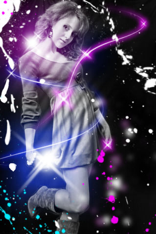
 InkingLove — Mecha Signature

Published: 2011-06-12 17:23:15 +0000 UTC; Views: 1912; Favourites: 95; Downloads: 45
Redirect to original
Description
Another graphics competition. Didn't win but i liked mine. Theme was cyan, blue and magenta.Related content


Comments: 67


.... there just some thing about women and cold hard machinery that i just love.... FAVED
👍: 0 ⏩: 1

Thanks xp
I'm been in a mecha mood lately.
👍: 0 ⏩: 1
np :3 i might try to draw some mecha but i not very good...
👍: 0 ⏩: 0

Haha i wish. Dont remember who but they did like a pattern.
👍: 0 ⏩: 1


")


Love your work!! The colors and the graphics are incredible.
 (Smile)")
👍: 0 ⏩: 0


Haha ew but i think thats a good thing, so thanks :3
👍: 0 ⏩: 0


")

they are absolutely nuts for not letting u win it looks great to me , looking forward to see what u come up with next as u never know theres always a win around the corner !!!
👍: 0 ⏩: 0

Dramatic - nice hues with uniform tones. I want more (larger canvas - work big). My eye is drawn to the figure - light amid dark - but the foreground has less contrast, where it seems like more contrast would make sense. I guess the figure is the real focus, but the perspective gives the blaster nearly half of the space. Difficult composition to work with - it's base, right?
👍: 0 ⏩: 0

Good, but it's very simple and could have had more fusion
I like it!!
👍: 0 ⏩: 0

Very dynamic! I also like the use of colors in this : D.
👍: 0 ⏩: 0

you didn't win but u certainly could,
this work is amazing, u can really creat a 3D impression and the gun is brutal
👍: 0 ⏩: 1

Absolutely superb!! Action, Composition, Color pallete.
Just Superb!
👍: 0 ⏩: 1

maybe you could do human girl vs orc girl in this style of sorts.
👍: 0 ⏩: 1

the depth on the leg where the skin and torn fabric could have been better, seem as though it cuts more into the skin but not 2 much but thats the only part i can c that needs to be critiqued
👍: 0 ⏩: 1
Thats how it was supposed to be.
👍: 0 ⏩: 0

The colours blend beautifully.They add a sense of depth & emotion.
👍: 0 ⏩: 1


OH MY GAWD THAT IS SOOOO AMAZING!!!!!!!!!!!!!! <33333333
👍: 0 ⏩: 1

WHAAAAAAAAAAAAAAAAAAAAAAT!?!?!? DINT"T WIN!?!?!?!!? HOLY COW I WOULD HAVE TOTALLY SAID YOURS IS THE WINNER!!!!!!! DONT CARE YOU ARE A WINNER!!!! GREAT JOB!!! YOUR #1 to me!!! (^_______^) d
But....if you dont mind telling me
What did you use to do the digital stuff what program O_O?
👍: 0 ⏩: 1
I used photoshop. Thanks a lot haha
👍: 0 ⏩: 1
I have a question then my artistic friend, how'd you get the metal look in the gun through photoshop? I've been tring to figure that out for the longest time O_o?
👍: 0 ⏩: 1
If you look closely its just strokes of grays and whites to make it look like a shine.
👍: 0 ⏩: 1
AHHHHHHHHHHHHHH!!!! I SEE NOW! WOW INTERESTING!
👍: 0 ⏩: 0
| Next =>