HOME | DD
 Inkthinker — EXALTED : Nexus Dojo

Published: 2006-11-26 05:53:26 +0000 UTC; Views: 9894; Favourites: 65; Downloads: 0
Redirect to original
Description
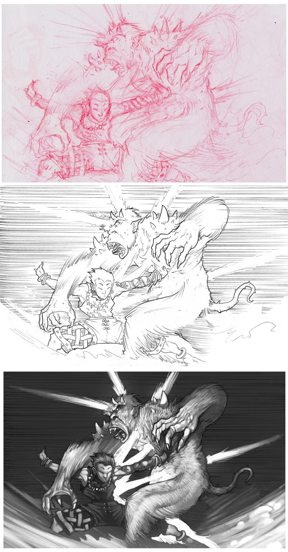
Here's another of the several drawings I did as a subcontractor for MESS Studios on White Wolf's "Exalted" RPG supplement, Scroll of the Monk (available now). This one depicts a Nexus gang sparring in an abandonded hall that they've converted into their dojo.As with each of these, the first two illustrations are my own (rough sketch and pencils), while the final represents the greyscale final as it appears in the book. The greys for this were done by Jeff Simpson.
The nature of the job was such that they wanted a quick, rough style... hence the lack of my usual preference for polish. On the up side, they took much less time to do.
")
Related content


Comments: 32

Woo!!! Exalted Rules!!! Yea!!! XD
Ejem... good work... XD
👍: 0 ⏩: 0


... This is an instant fav. When I grow up, I want to be like you...
Btw, I like your new avi... well... the different speed of it anyway. It looks smoother, I mean it was smooth at first but I think it looks a lot smoother.
👍: 0 ⏩: 0


Freaking awesome.  (Smile)")
Rock on!
((I am also a "red" person, but my red pencils have ran out so I am trying to adapt to blues. The horror!))
👍: 0 ⏩: 1

Welll... not "perfectly". A jack-of-all-trades is a master of none, and so forth. But I keep trying. Thanks!!
👍: 0 ⏩: 0

is it my imagination or you started to change to manga style man, luv the feeling on this page nice way of working
👍: 0 ⏩: 1
Man, you just don't watch my work closely enough. You hurt my feelings, bro... *waaahhhh*
No, I've had a Japanese influence in my art for well over a decade, now. Go poke around in my Gallery and look at the older stuff, espescially the things I draw for myself. The difference here is that "Exalted" is a game in which they WANT me to let that influence shine, as opposed to every other job I work where they want me to suppress it (musn't be too "anime").
Also, I read a lot of different stuff growing up... a lot of old American comics like Krazy Kat and Pogo that came before the superheros took over, and then a lot of Euro stuff from my dad's Heavy Metal collection, and then you mix that up with the manga that I've been reading since I was about 15... I'm artistically schizophrenic.
I can turn style off and on pretty easily to adapt to the needs of the job. You want cartoony? I can do cartoony. You want Western superhero? I can kinda do that, though I don't like to shade the way, say, Jim Lee does. And if you want manga... baby, I can do manga.
👍: 0 ⏩: 0


This is your quick rough style?! Gebus!
LOVE the composition and values. I also really like that pole on the far right.^^

👍: 0 ⏩: 1
Well, keep in mind that I only drew the linework... the tonal values are largely Jeff's work. He's quite good, too... we both worked really rough here, but when he polishes it shines.
👍: 0 ⏩: 1
Oh really? You guys work together so well!
👍: 0 ⏩: 0


Very good work, Takes me back to My last Exalt charicter, Zenth in Nexus. Thoughhe went with Supper heavy orichalcum plate, Artefact sheild, and Diklave and may the Unconquerd have mercy on any Imaculates who dared defy him... Fun charicter, suble as a brick though.
I like the bakground details, the grafiti and Spectators cheering, gives that anarchic feel the city needs.
👍: 0 ⏩: 1
Subtlety-schmublety... gimme a 6-foot iron sword over a 6-inch stiletto any day.
I'm glad you dig it... up to this point, I hadn't worked on any official Exalted stuff, but I always thought I'd mesh well with the material. Hopefully I'll get to do a lot more of it.
👍: 0 ⏩: 1
Well Ive played it, and DMed it, so if you need any ideas I'll be glad to help (and if you like My Ideas you could mebie sneak a few if my Charicter or Npcs in to senes as extras or the like?  (Wink)")
👍: 0 ⏩: 0

oh man, this bring backs bad memories, when got my ass kicked...
")
👍: 0 ⏩: 0
Check out the tone artist, then, , he deserves those props.
👍: 0 ⏩: 1

oh lol i didn't read the text you wrote.
props to both of you then ^^
You inspire me to draw dude ^^
👍: 0 ⏩: 0

thats awesome. and.. is that cloud over there on the left pillar? lol.
👍: 0 ⏩: 1
Only insofar as all Exalt characters have a little Cloud in them, somewhere.
👍: 0 ⏩: 1


I really have to buy that book.. soon.
An my Dawn Cast character would so be there
👍: 0 ⏩: 0

seeing the cretive phases this went through is really quite interesting. for example, we can see how the setting tottaly changes,becming far more encloused as the vanishing point shifts while the expressions go through a last minuet change.
one thing inperticualr that i really like about this is the real 'gang' feel it's got to it. there's the emotive reaction from the on lookers, as conveyed by the range of poses. All those fists beng punched in the air along with t5he open, cheering mouth gives this the feel of being a bit of good sport (evenm if the two combatants might not be thinking that.) I especially like the vibe coming from the gorp sttin o the raised walkway up to the left. something else that realy adds to the gang vibe is the way in which the grand, temple setting has been shamelessly tatooed with grafitte, along with the banners. that's just a really neat bit of attention to detail in my eyes.
in reguards to the pair sparing, the expressions on their face givethe imapression that they're giving it their all, what with the way they're so wonderfuly contorted.the lines on the fist give a real sense of motion, something that's enforced all the more by the flow of the hair on the other. that gives a real sense of hi throwing himself back in an attempt to doge. the stance indicated b the strange possitioning of the kees also works to give the feel that theyes people know what they're doin and are currently indulgin in some martial arts.
👍: 0 ⏩: 1
Thanks for the in-depth crit! I don't get enough of those, and I'm always glad when people recognize the various visual cues and such that I put into the piece.
👍: 0 ⏩: 0

its actually reall nice to see how you work, why red pencil? for the scanner, and is it better then using blue pencil?
👍: 0 ⏩: 1
With modern technology, the concept of a "non-repro" pencil has become less demanding... almost any primary color can be easily stripped out in Photoshop using a basic Hue/Saturation shift. Red is a wider band of the visual spectrum, so I find it easier on my eyes than blue.
The basic premise is the same, though... you use the colored pencil to lay down all the lines that you need to construct the drawing... the basic framework of the building, so to speak. Guidelines, sketch lines, this is the stage where you're free to make mistakes as much as you need to, and that's a pretty awesome thing right there. I often end up with fairly messy red drawings, because I might try out a couple ideas on the page simultaneously (and red doesn't really erase well... it tends to leave a bit of pink smear). It doesn't really matter how messy the red gets, though, because when I go in with a regular pencil, that's all that will remain after the scan and process through Photoshop.
"The freedom to fuck up", as I've put it (pardon my francais), has possibly been the biggest change in the way I've drawn in the past five years, and it's the primary reason I've really been drawing a lot in a digital environment using a tablet. It lets you try ideas and make mistakes without the fear of ruining the page, or wasting hours of work.
👍: 0 ⏩: 0
