HOME | DD
 Inkthinker — Manners_redsketch
Published: 2006-02-16 07:49:03 +0000 UTC; Views: 2055; Favourites: 17; Downloads: 351
Redirect to original
Description
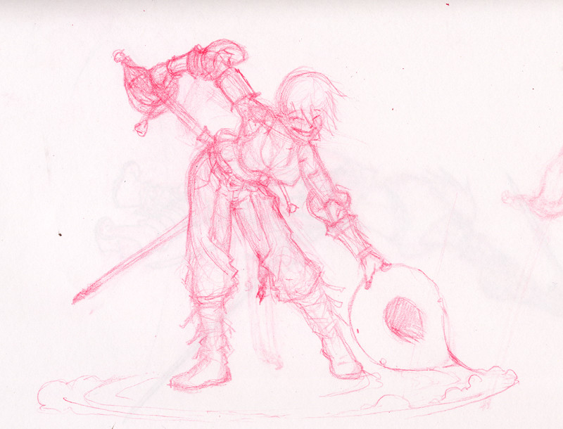
Another in the recent set... I stopped at this point for the evening, and thought it might make a good example of what I mean when I talk about using a red pencil to rough out illustrations. I do this for pretty much EVERYTHING now, and you can see I get pretty messy with it. The levels on this are tweaked slightly, but overall this is about as smudgy and so forth as it gets. You can see ghosts of ideas that the eraser never really removes and so forth in there...Anyhow, I'll strip out all the red in Photoshop for the final, and you'd never know it was there. Ticonderoga red "checking" pencil (available at office supply stores) on sketch paper, original size about 5x4, about 20-30 minutes time.
Related content


Comments: 10

I'm not understanding where the rest of the sword that she has her hand on is going? The tip has seemed to disapear. I know it's just a sketch, but you have advanced crit on, so...there it is. Other than that I think your sketch is cool!
👍: 0 ⏩: 1

It goes behind her back, but the sheath is made os flexible leather so it falls as she's drawing (or sheathing) it... the point is just visible above her hip, and the sheath is falling behind her leg... the other sword is almost completely concealed by her position.
This is a good example of a point where placing things where they OUGHT to go is bad for the actual composition. I'm fairly certain I'm right in the placement of things, but important elements (namely the swords and part of the action) are being hidden and that's no good. When and if I clean this up, I ought to cheat the sword positions/lengths a little and see if I can't clear this up.
👍: 0 ⏩: 1
That's cool. I never considered that the sheath was soft. All the ones I've ever seen in the museums were hard leather, but they were usually for larger swords. But I agree that sometimes you have to cheat the 'real' to get an image that 'looks right'.
Nice stuff. Keep it up.
👍: 0 ⏩: 0

Great expression... Nice how she's got her hand on her weapon (is she drawing it or sheathing it?) and swept a circle in the dust with the feather of her hat.
I sketch in the same fashion, but use regular graphite pencil most of the time, or a repro blue. In a way, it's like sculpting, building layers up to create form. I usually use graphite pencil because it erases easier/better, and it's usually what's at hand.
She looks quite the rogue... (roguette? That sounds like a french pastry...)
👍: 0 ⏩: 1
Y'know, i don't know myself if she's drawing or sheathing... depends on whether or not you like this better as the end or the beginning of a fight, I suppose.
👍: 0 ⏩: 0

you warnt kidding when you said "rough" ")
would you use a digital inking? i was looking for eazy inking programs but all i have are image editing and painting programs, none of them does the work of a good pencil ^^
👍: 0 ⏩: 1
Well, I'd use a pencil on this next, I think. For digital inking I tend to go with Manga Studio EX... it just came to America from Japan, finally (I was on an early beta and fell in love with it), and I wrote a bunch on it in the Journal entry on the front page.
Mind you, it's not particularly easy or anything... just a tool package, like Photoshop, but dedicated towards inking. It's still only as good as your understanding of the tools and the content of your subject.
")
👍: 0 ⏩: 1

I found Macromedia Flash MX can be good for inking, i only just discovered it on a tut i read on website. You really have to have a tablet though.
👍: 0 ⏩: 0

The amount of mess in my sketches is a lot worse, I assure you. Even I stop being able to see what I've drawn lol >.< It's a very well developed sketch for 20-30 minutes. I love the attitude you always seem to give this lady!
There's only two things that seem a bit...off to me. From the p.o.v of the viewer her right (hat) hand, I can't seem to picture the placement of the rest of her fingers from where the thumb is on the rim. That's most likely just my lack of brain skills for position. The other thing is the line defining her hip, although looking at it again and again I can't pin point WHY I think it looks odd x_x so don't worry

👍: 0 ⏩: 1

I'm not much of an artist myself, but it appears to me that her fingers would curled into a fist on the other side of the brim.
👍: 0 ⏩: 0