HOME | DD
 Inkthinker — Portrait of an Unnamed Dwarf

Published: 2005-12-27 21:22:06 +0000 UTC; Views: 21273; Favourites: 391; Downloads: 2019
Redirect to original
Description
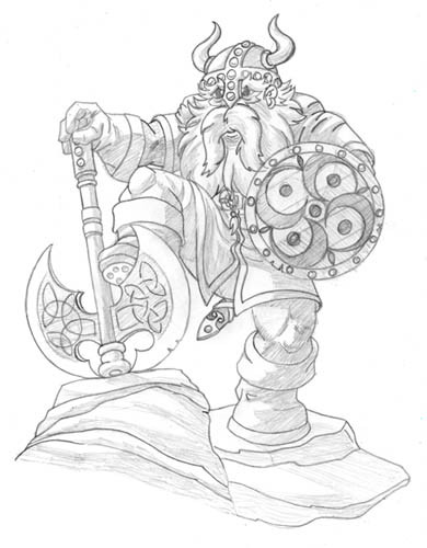
Ah, the joys of Deviation categorization... does this belong in Fantasy or Portraits? It's a portrait of a fantasy subject... oh, well, if someone wants it changed then we can change it, I ain't picky.ANYHOW, seeing as my computer is still the most expensive paperweight you ever did see, I had a little time in the evenings and I've been pushing myself along easy paths... if you leave me alone, I generally fall into a tendency to illustrate pulp-fantasy material like this fella here. I'm fairly pleased with this guy but he has a few imperfections... so I'm wobbling on whether or not to build this up further or let it alone and move on. It's not as though I get paid to draw this stuff...
Pencil, 14x15, Bristol. No digital tools whatsoever, but I did strip out the red pencil that I use to rough everything out, so don't think I did this without a LOT of underlying sketch work... it's just hidden away.
He's your archetypical Tolkienesque D&D dwarf, short and scarred and lookin' pissed-off even when he's just having a quiet smoke. There's not much depth to this portrait, but I took it as an exercise in hiding cute crap in the details. Expect a detail collection (much like I did with the Alleyway) to come along at some point. I'm not 100% pleased with the head on that weapon, but I done with it what I done with it, and it's pretty done. I think I probably should have done something more detailed in there, though, something in a frieze or bas-relief sculpture around the hammerhead. Dunno if I want to try erasing that pencil, though...
And of course, he needs a background. Just because they're a bitch doesn't mean you can call a shot finished without one.
My animation work is very focused right now, and it's about as far from this sort of thing as you might imagine. Given that it's consuming a good amount of my time and energy, I plan to be pretty self-indulgent with my personal work, so if you're not a fan of this sort of crap then I don't know what to tell ya... I'll try not to fall into a complete rut.
")
- MAJOR EDIT - 010206 -
As I'm inserting a whole background and whatnot for this fellow, I also added a bit more detail and decided to replace the previous version with the new one. Detail was added to the pickhammer head, for the most part, and little else on this version has changed. This version is a little less clean, if only because now is not a good time for me to clean it up, but it's also cropped somewhat closer to the character, resulting in a slightly larger version of the image overall, I think. I may replace this one final time with a cleaned version, but for now this is the only "character only" version of the image.
You can take a look at the preliminary background and get a little peek at how the process goes by checking out the WIP version of this in the Scraps. Let me know what you think of the updated version!
- EDIT 2 - 032706 -
FINALLY finished the BG on this, at least to an acceptable degree. Check out the complete piece at >> [link] << and see what you think.
Related content


Comments: 90

I have to say this has inspired a character and as such a miniature to go along with it thinking to cobble a few minis together and see what i can come up with. Outstanding work truly one of my favorite pieces. I must ask is there anyway to get a physical copy or if not at least permission to print the physical image for use in for some of our weekly gaming?
👍: 0 ⏩: 0

That's interesting... I have a book with this dwarf on the cover illustration. The world is small after all. It's also interesting how a picture of an US American artist gets on the cover of a German book. Globalisation, I guess.
👍: 0 ⏩: 1

Yep, "Dwarf and Uber-Dwarf" if I remember correctly.
Mostly I remember that they never did pay me for that.
👍: 0 ⏩: 1
Really? Is that even legal? I mean, they earned a lot of money with that, probably, at least the 10 € I paid for the book. And let me tell you: The picture did its job to convince me to buy it.
👍: 0 ⏩: 1
Legal? No, but it happens. They didn't just take it, but they failed to follow up after obtaining an agreement.
👍: 0 ⏩: 1

Maybe our lil' bearded friend should pay them a visit... with the pickaxe. I'm pretty sure that will increase their interest in paying their dues...
👍: 0 ⏩: 0

if i had the money.... Id make that pick ax.... no joke
👍: 0 ⏩: 0

Ugh... Guuuuh... Sorry about that, let me just...

👍: 0 ⏩: 0


"I don't always smoke, but when I do, I prefer expensive-looking masterwork pipes."
👍: 0 ⏩: 0


LOVE. And I LOVE the updated one with a background! Absolutely stunning work.
👍: 0 ⏩: 0

Wow, amazing!
Great details!
You sure can have a fav
👍: 0 ⏩: 0

Wow! This is great. You should do some more art with this character.
👍: 0 ⏩: 0

Nice and original details, here! I love the War-Pick!
👍: 0 ⏩: 0


awesome character. love the facial expression. theres a bit too much "weight" on the right side... i mean the head is central but the hammer just puts the focus more to the right half of the picture... probably some smokeline in the free area would have helped not too detailed cuz it would look overfilled.
awesome babes on the stick of the hammer ^^
👍: 0 ⏩: 1
Sometimes I think this whole drawing was really just about that hammer haft.
👍: 0 ⏩: 0


Its all about the pipe!
If you are asking for advanced critique, i would say, the right arm : The bicep doesnt split at that point, the Deltoid and Brachia meet on the far side of that arm. No matter which way the forearm is turned the Bicep stays on top of the Humerus in this pose. The part where the Deltoid divides the Tricep and Bicep would not be visable at this angle.
As for the right forearm, the Flexor Carpi Radialis, thats the big muscle on the underside of the fore arm, that bulge should be about 1 full third lower.
Other than that, it is really a well excecuted piece, please don't take offense to my observations!
👍: 0 ⏩: 1
Yep, guilty of fake anatomy. I've gotten much better at it since this, but there was a time when "close enough" was "good enough".
Not anymore, though.
👍: 0 ⏩: 1
I dont doubt you at all, maybe this critique wasn't right for me to do since it was on older work!
Take care man! The "Joe is Japanese" animation was cool too!
👍: 0 ⏩: 1
I appreciate good feedback, and honesty is always taken to heart. Feel free to crit whenever it strikes you.
👍: 0 ⏩: 0


I started colouring this incredible image some months ago and have literally just completed it after a long hiatus.
Hope you like.  (Smile)")
👍: 0 ⏩: 1

Wooooooo!!!!!!!!!!!!!!!
It´s a magnific work!!!!
I´m without word:

👍: 0 ⏩: 0

hi inkthinker, i colorize this image on photoshop, for training, but i liked the result , can i post it?
👍: 0 ⏩: 1

oh man!!!.. .you fucking rule!!...
you make me want to keep everyt one of your drawings in my pc...
an I think I´m gonna practice my painting with them....
👍: 0 ⏩: 0

Bwahhaha! I lOVE the shaft of his warhammer/axe! Beautiful level of detail in this.... why isn't someone paying you to do this work?!
👍: 0 ⏩: 1
On occasion I do get paid for it, but the market is generally pretty tight in my experience... not a lot of jobs for this sort of thing going around, and the ones that are out there generally get snapped up quick.
👍: 0 ⏩: 0

...damn... your pieces makes me want to redo all of mine, lol.
👍: 0 ⏩: 0

AMAZING...I've liked your work for some time now, and dwarves are my fav
👍: 0 ⏩: 0

Wow! It looks like you just went crazy drawing that thing.. splendid job!
👍: 0 ⏩: 0

you've brought out a charater here, that's for sure. there's something wonderfully craggy and pissed off about his face that suggests a short fuse and it would not take much to convice him that it was a good idea to put that hammer to use. as always, your attention to detail can't stop the jaw from dropping; i don't even want to think about how long it took you to draw out the handle on the hammer but it creates a great effect. the inscriptions on the warhammer's head and embroidery on the clothing also gives a sense of culter and i find that the under-extensuive shading dosn't take away from the overall image.
👍: 0 ⏩: 1
I dunno 'bout all that, but the handle wasn't too bad... once I had the idea it was just a matter of staying between the lines. It's essentially the same figure drawn over and over again, and it's so tiny that it doesn't have to be perfect.
👍: 0 ⏩: 1
ah yes, good point. i'll keep that in mind if i ever go into hyper-detail.
👍: 0 ⏩: 0

exellent drawing!!! you are very talented! it's realistic and really nice!
👍: 0 ⏩: 0

Stellar detail in your pencil work as always, sir. That's why I always click on your stuff. Amazing.
👍: 0 ⏩: 0

How very cool... I really like the depth you've given this fellow, but there's somehting that's causing me issue with his hands. What it is, I can't say, perhaps the gnarly'ness of his knuckles is throwing me off. As for the weapon, VERY cool. You stated that you were thinking of more ornimentation, but anymore would feel linda elvish more then dwarvish.. and anyhoo, I can imagine it's hard to pick brain matter out of a bas relief hammerhead.
Crazy detail, from the fellow's keys on his waist, the tats, the stitching on the bags, is scars. Great stuff that just begs for a story.
👍: 0 ⏩: 0

your intricate details are amazing...though honestly i dont know why i comment, since i cant citique a thing
👍: 0 ⏩: 0

I just got done drooling over your Drizzt pic, and I can't help but think that this guy is of clan Battlehammer maybe, and the hammer bears a striking resemblence to Aegis-Fang.
You guys have better eyes than I do. I had to look really (really) close to see the nude carvings. Nice work there man! Definately needs some background, if for no other reason than to establish scale, cuz yeah he does kinda look like a possessed Santa on a bad day.
As always love the detail work.
👍: 0 ⏩: 1
I don't think Aegis-Fang would have that heavy pick on the back end of the hammer, though. But yeah, he could be a Battlehammer, there's certainly enough of them. Then again, he could be a son of Moria, too, fantasy Dwarves are somewhat interchangeable like that.
👍: 0 ⏩: 1


Excellent... as always.
The work on the line weights is particularly impressive...
👍: 0 ⏩: 0
| Next =>