HOME | DD
 Inkthinker — Takedown WIP - Elf
Published: 2007-04-15 01:00:08 +0000 UTC; Views: 21163; Favourites: 614; Downloads: 0
Redirect to original
Description
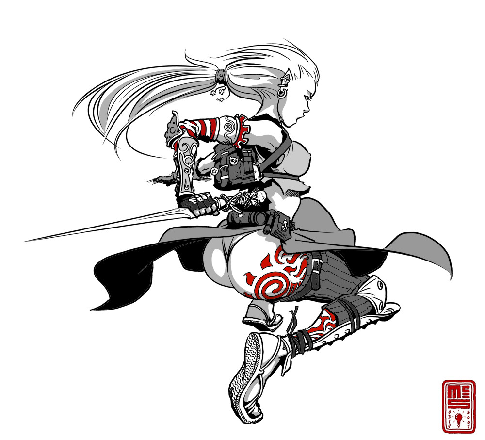
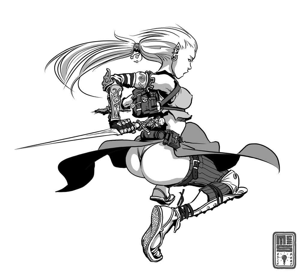
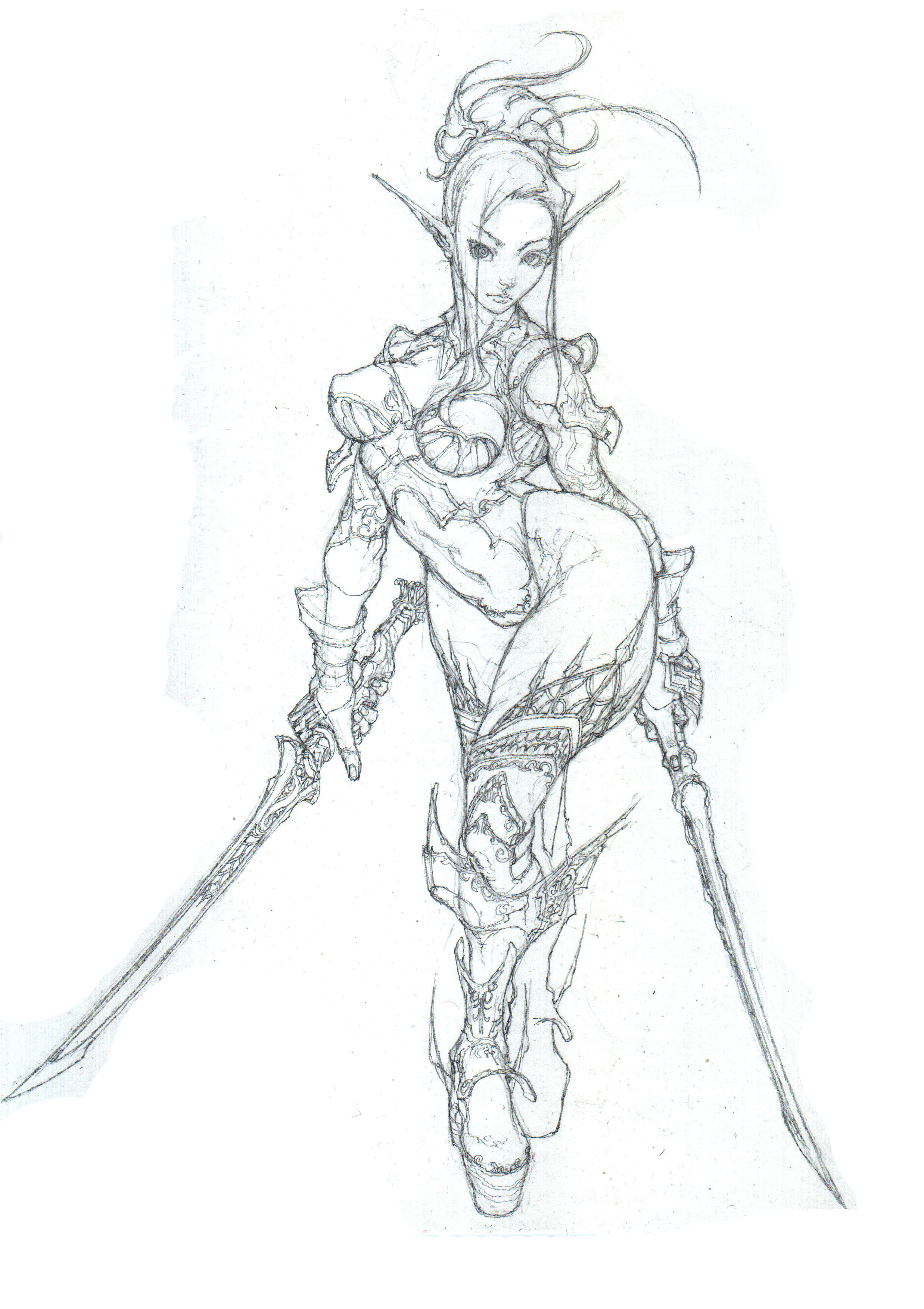
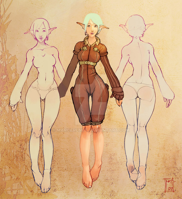
Well, probably more like a half-elf. This is one Layer from an ongoing WIP drawing that I'm FINALLY putting some time into, because I want to bump the ol' portfolio a bit. The tones may likely stay, the red will likely go, but it's fun to see how a small section of a larger illustration can stand on its own.There's a plain greyscal version of this in my Scraps, and the original sketch to the final drawing is in there somewhere as well.
Drawn entirely in Manga Studio EX with a 9x12 Intuos, in about 3 hours. Done mostly with the G-Pen set to about 5mm, tapers off, correction 3.
-EDIT-
Did anyone notice what a complete crackjob I made of her upper arm? I'm downright ashamed of myself that I didn't notice until now, and it's eating into my brain. Of course I'm fixing it, but holy crap... how did I miss it for so long?
Related content


Comments: 95


She is wonderful, quite enjoy her tattoo and her sense of grace.
👍: 0 ⏩: 0


I like the effect on the outlines...
Great job
👍: 0 ⏩: 0

Insane....awesome design....i love the tatoo...
i love it ....really awesome...

👍: 0 ⏩: 0

such a good drawing i like it very much
👍: 0 ⏩: 0

I like the Red, black and white... it goes really well.
👍: 0 ⏩: 0


Simple yet detailed. Very nice. Also, i think the red adds depth and also creates some interesting focal points. It should stay in my opinion.
👍: 0 ⏩: 0


Ages since you did anything like this, good to see it again!
👍: 0 ⏩: 0

I like the hidden logos thing. Great way to trademark your stuff without making it too obvious. Aside from the tat logo, I also see the one on the roll on her belt, and there is one hanging from her hair band.
As always, you have a beautiful product. When you ink in Manga Studio, do you use a tablet? I have a Wacom, but there is some weird offset when I am drawing in Studio that makes the program unusable with the tablet.
👍: 0 ⏩: 2

That's all of 'em for this segment, I think. I'm trying to make them relatively unobtrusive, but yeah... it's one way of "signing" work beyond slapping a mark on it.
👍: 0 ⏩: 0
Yep, I use a Intuos tablet. It takes a lot of getting used to, but it's got its advantages.
Try downloading the latest driver set from the WACOM site and seeing if that helps your offset problem. Manga Studio can interact oddly with the basic drivers, but the updated versions available on the net might set you right.
👍: 0 ⏩: 0


Awesome costume (and I'm not just sayin' that because of the exposure)! You have a great sense of shape and design. Looks really cool.
👍: 0 ⏩: 0


you say that like it's a bad thing
👍: 0 ⏩: 0
Bubble-butt. It only works in cartoons.
👍: 0 ⏩: 1


ooooooh. i really like this one. the movement in it is really dynamic!
👍: 0 ⏩: 0

Awesomely done! I still haven't gotten the handle on that program. How did you get the sword so straight?!
👍: 0 ⏩: 1


Very nice line art; like her hair and face in particular--you convey a great deal with a simplicity of form.
 (Smile)")
👍: 0 ⏩: 0

I love you inking skills. My own inking doesn't come out anywhere near this professional looking. That and your stuff is so clean looking. Very nice economy of means.
👍: 0 ⏩: 0

lmao, she must like you a lot to have your logo tattooed on her ass XD
you are my hero.
👍: 0 ⏩: 1
When this is done, it's going to be a fun game of "find the logos", 'cause I'm hiding at least a couple on each character.
👍: 0 ⏩: 1
hahaha i love that game ")
👍: 0 ⏩: 0


 (Wink)")

I'll say this version is better. Tatoo's a nice touch.
👍: 0 ⏩: 0

Nice little piece here! She's got quite the booty!
Can't wait to see how the final turns out!
")
👍: 0 ⏩: 0

wow i love it ^^ nice job with the tattos. 

👍: 0 ⏩: 0

<= Prev |