HOME | DD
 Inkthinker — Takedown WIP - Elf+grey
Published: 2007-04-15 01:29:22 +0000 UTC; Views: 1943; Favourites: 28; Downloads: 0
Redirect to original
Description
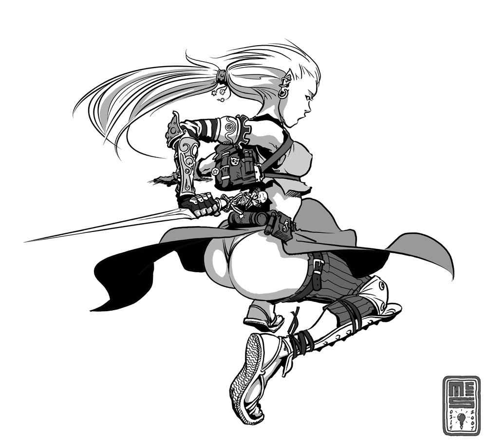
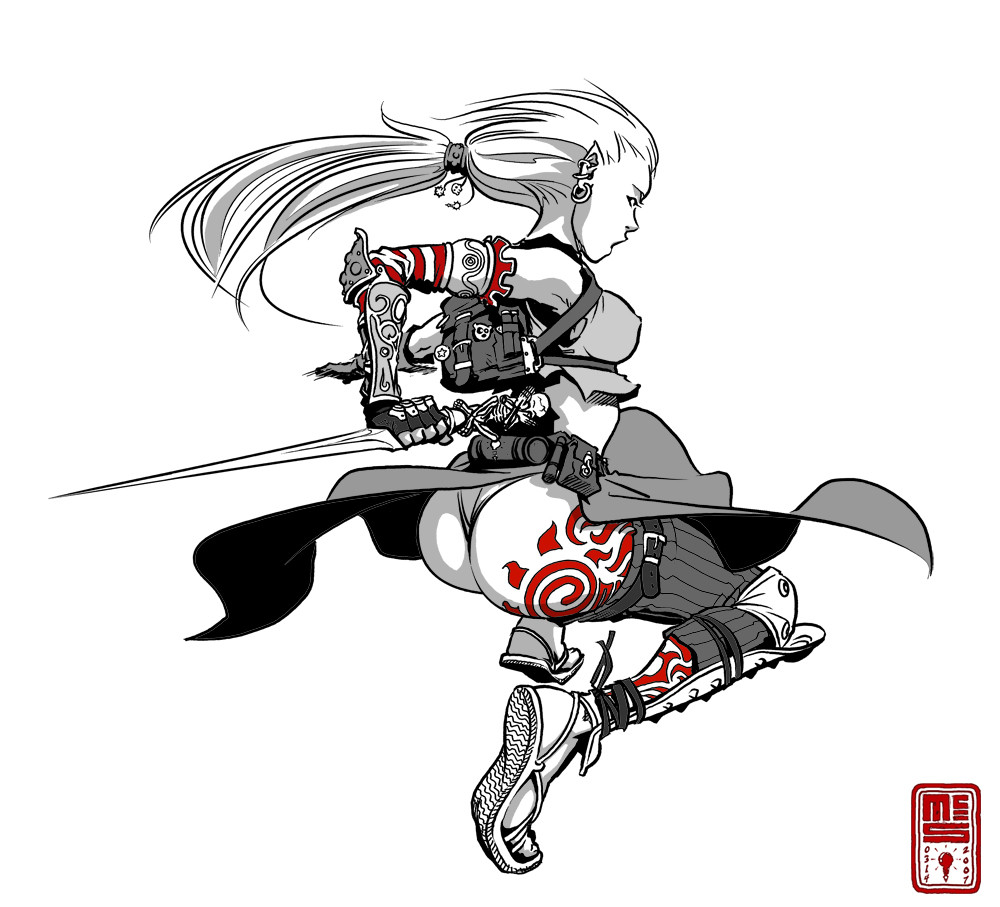
Same image as this one without the red spot colors. I also removed the tattoo from her tush.I'm making an attempt to include tone value in more of my drawings as a general matter of course. Let me know which version you like better.
Related content


Comments: 9

The pose and design are interesting...really nice....good job...
👍: 0 ⏩: 0

I like the rendering style. And the line work. I think the ass is a bit gratuitious and it cheapens the image's value by being so forced. But it's at least a well rendered ass.
👍: 0 ⏩: 0


I like it. The buissy_ness of the the back pack, arm, legs, is nicely contrased by the ... smooth ... o_O ... yah good work.
👍: 0 ⏩: 0

I think this one is better, the other one forced my eyes on the tattoes - it felt like I was missing out on the small things.

👍: 0 ⏩: 0

I always have fun checking out your logo snuck into the tiniest of details, each drawn with the love it so deserves.
")
👍: 0 ⏩: 0


I like both equally the same. Love the looseness to the inking.
👍: 0 ⏩: 0