HOME | DD
 inque77 —
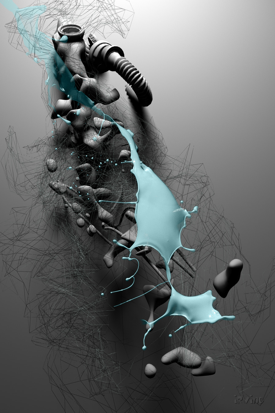
The Split
inque77 —
The Split

Published: 2010-02-25 15:42:44 +0000 UTC; Views: 9497; Favourites: 391; Downloads: 0
Redirect to original
Description
.Related content


Comments: 30


 - :D")


Perfect interpretation of my fever induced nightmares!
Great Piece!
👍: 0 ⏩: 0

Looks awesome! ^_^
Kinda reminds me of one of the PS3 commercials, except better.
👍: 0 ⏩: 0


 - =P")

I'm sorry but how the hell was this DD'd?
I recommend adding clearer detail in general. The whole things really blurry(LOW HQ), the positioning seems so random along with the lines. The lower opac'd c4d's in the back also look random or maybe they were put there in an attempt to add "depth?". I'd remove the red circles because they look pretty pointless, and the white brush spots along the c4D look like they don't belong. Maybe paint over the c4d to give it richer texture?
👍: 0 ⏩: 0


That's beautiful, even if it's abastract I find it full of emotions ^^
👍: 0 ⏩: 0


oh man, it's a crazy piece, fantastic work!
I enjoy so much black and white abstract shapes!
👍: 0 ⏩: 0


sieht absolute hammer aus, ein sehr dickes design!
👍: 0 ⏩: 0


 (Smile) - :)")
 (Wink) - ;)")

jau um das "futuristische" etwas zu unterstreichen
👍: 0 ⏩: 1

.. dachte schon Du hättest 2+3 verwechselt .. hähäh ..
cool anyway, faved! ..
👍: 0 ⏩: 0


 - :O")
