HOME | DD
 insomniaprojects — Locutus of Borg - Star Trek Redesign
#startrek #borg #startrekthenextgeneration #startrekfanart
Published: 2017-11-30 03:07:02 +0000 UTC; Views: 3257; Favourites: 31; Downloads: 0
Redirect to original
Description
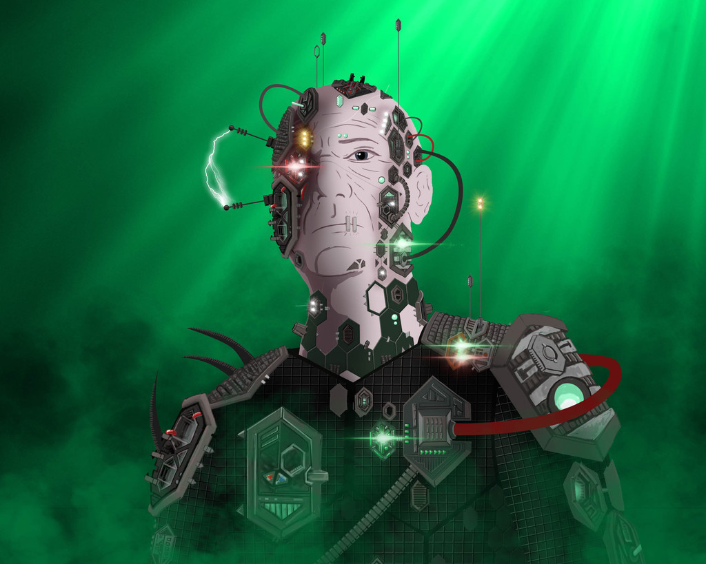
For my Borg redesign, I went for a hexagonal motif for the implants, wanting to imply both the hive nature of the Borg and a series of interlocking pieces of technology that didn't always fit together perfectly.Related content


Comments: 9

👍: 0 ⏩: 1

👍: 0 ⏩: 0

👍: 0 ⏩: 1

👍: 0 ⏩: 1
👍: 0 ⏩: 0

The electrical current and the antennae give this an almost retro feel. Unlike your other redesigns, I could kind of imagine a Borg looking like this, considering their appearance evolved over time and they didn't all have a uniform look. I like the effect of the green light cutting through the smoke.
👍: 0 ⏩: 0
Thanks, I was going for a technology as spreading disease meets Frankenstein's monster. Note the bolts-like nodes on the neck.
 (Smile)")
👍: 0 ⏩: 1

Oh, yeah... nice! I see the electric arc also invokes a "Frankenstein's monster" look too. To be honest, this is my least favorite of your series but that doesn't mean it's bad. Knowing you had that style in mind does give it more appreciation for me of it.
The creeping hexagon implants up the neck are especially well done. Comes off as organic and artificial.
👍: 0 ⏩: 0