HOME | DD
 invaderjohn — Desktop 08-12-08

Published: 2008-12-08 22:03:17 +0000 UTC; Views: 6778; Favourites: 15; Downloads: 285
Redirect to original
Description
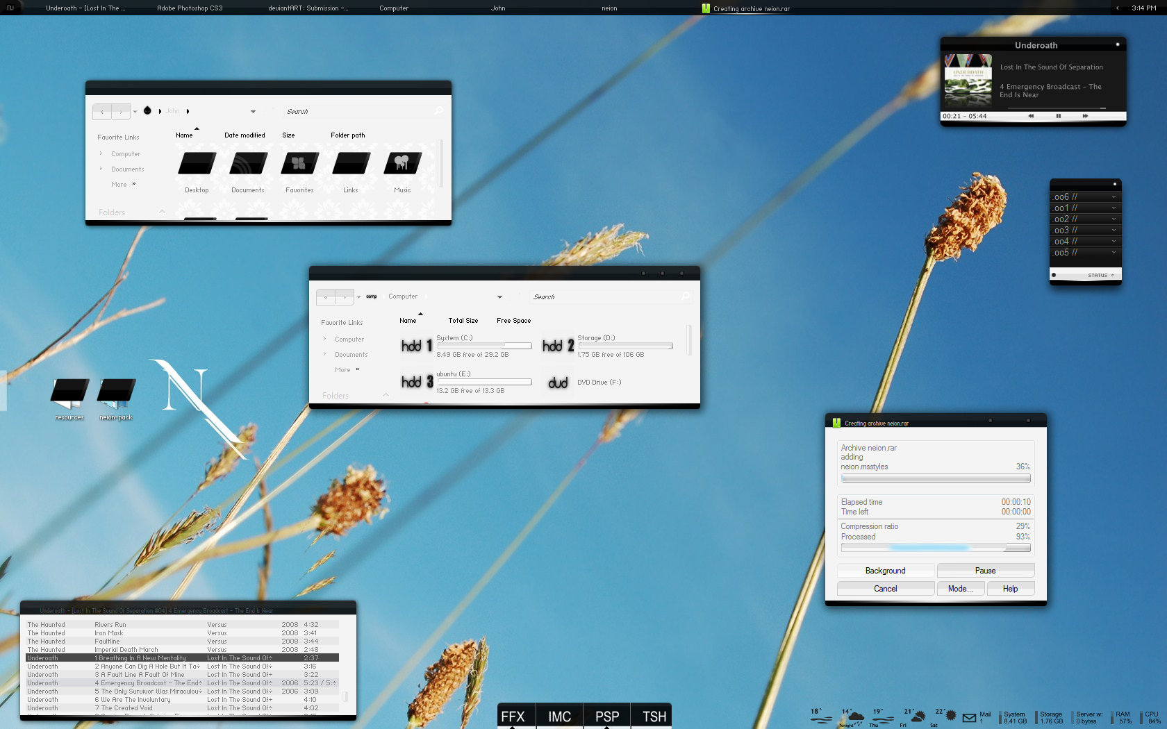
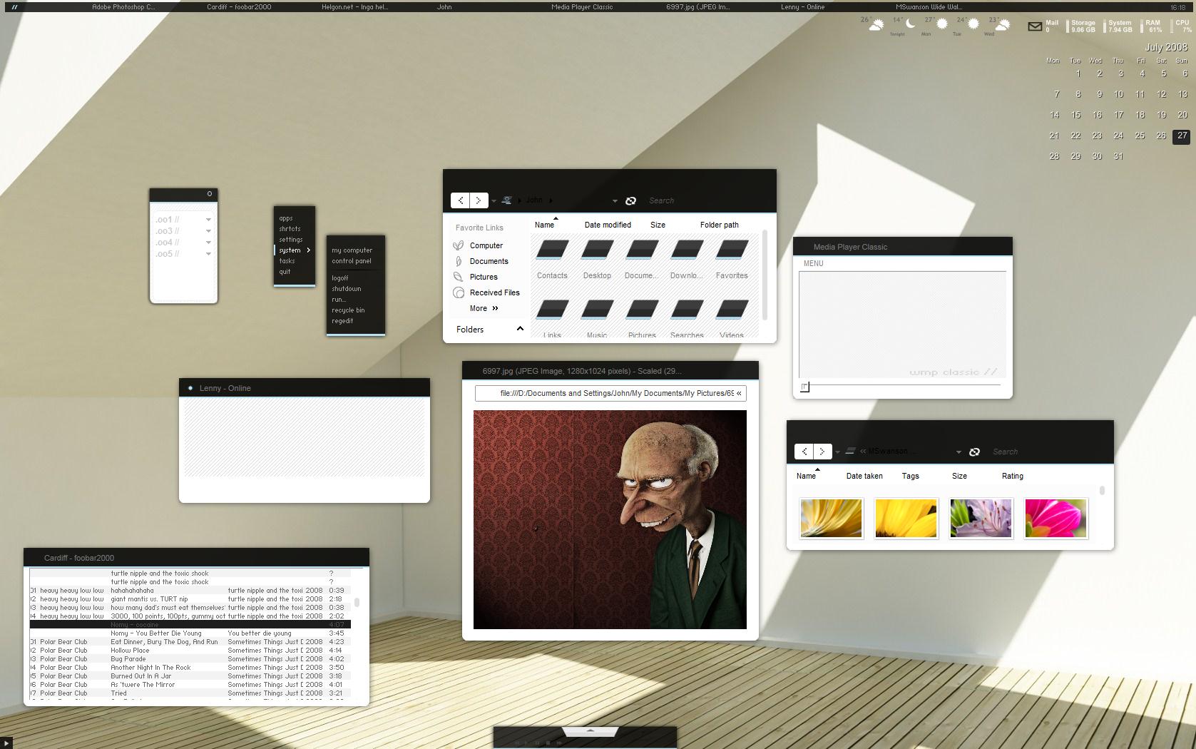
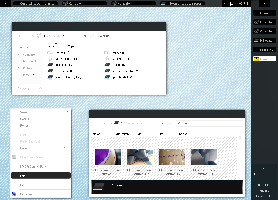
my current desk.everything is WIP, codename "saturn"
hope u guys like it!
Related content


Comments: 95


Looks to be like another fav.
But not feeling the buttons min/max/close buttons.
They stick out too much, such a clean minimalistic theme, but the buttons kinda ruin it.
👍: 0 ⏩: 1

Cmon john do a visual style using something else than White and silver on the inside of the windows... is hard to see some times.
my eyes hurt... ><
👍: 0 ⏩: 1

what would u recken?
its not easy when u dont want stuff to stick out to much
👍: 0 ⏩: 1

crikey man! your burning through VS's here.
Looks good.
👍: 0 ⏩: 1

nice! looks alot cleaner than slanXP!
i love it.
👍: 0 ⏩: 1

amazing work, well done!!
having a try now! gradient on the taskbar is way cool, i love it.
well done bud!!
👍: 0 ⏩: 1
thx alot bud
btw.. havnt done the icons yet cuz i havnt been home until late today.
but il check on it 2moro
👍: 0 ⏩: 0

my dreams are becoming reality, this is the VS ive been always dreamed of ")
👍: 0 ⏩: 1
yeah i have alot of work left on it  (Smile)")
👍: 0 ⏩: 0

finally, another nice set of dock icons
👍: 0 ⏩: 1

Looking great... though there seems to be something a little strange about the minimise, maximise/restore, close buttons
👍: 0 ⏩: 1
Not sure... they just seem a little harsh.
👍: 0 ⏩: 0

Looks good, other than the fact that if you are going to have the outlines of the caption buttons, why not put symbols in there too?
👍: 0 ⏩: 1
ah yeah i just havnt got that far yet ")
but thx bud
👍: 0 ⏩: 1

jup, the boxes really need the symbols immediately.
👍: 0 ⏩: 1


Im looking forward to this coming out
👍: 0 ⏩: 1

Love the glossy effect and the dock icons are really clean!
👍: 0 ⏩: 1


Really nice once again....
I like the startmenu buttons!!
👍: 0 ⏩: 1

THis startmenu is the cleanest one I've ever seen. Even cleanest than the original aero one.
Awesomeness. Good job on the gradients btw.
👍: 0 ⏩: 1
thx alot bud
👍: 0 ⏩: 1


It's OK...wht wallpaper r u using?
👍: 0 ⏩: 1
my own wallpaper
👍: 0 ⏩: 0