HOME | DD
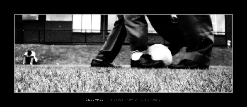
 invariant — Secluded (BW)
Published: 2004-11-17 09:00:54 +0000 UTC; Views: 152; Favourites: 1; Downloads: 38
Redirect to original
Description
"Secluded" in BW (thanks to ~fuckbucket for his help.. (Smile)") )
)
Related content


Comments: 25

I think i prefer this B&W version alot more, emphasises the atmopshere and emotion alot better
👍: 0 ⏩: 1

hmmm lol im still not sure.. but thanks
👍: 0 ⏩: 0

I think you lose the 'school boy' effect in this version. I saw this first and didn't even recognise that it was in a school setting.
Cheers! Good work on both products!
👍: 0 ⏩: 1
interesting observation.. still unsure about which one i like
👍: 0 ⏩: 0

")

great work, nicely composed
good choice on the border and typing too, really helps this shot stand out

👍: 0 ⏩: 1


")

a cool shot...interesting perspective.. I like the guy in the background..
👍: 0 ⏩: 1

show the contrast/disntancing : the near main subject of the two with the ball and the far-away one sitting at the corner alone
special perspective

👍: 0 ⏩: 1

Hmmm... they're both good. Not sure which I like better. The B&W suits the mood moreso than the color image, but the color has more aesthic appeal (love the shade of green).
What did you do aside from a simple desaturation? It looks like there were more changes than that, but I can't tell what it was.
👍: 0 ⏩: 2

i can answer that, since i edited it for him
i desaturated it, then upped the contrast using curves, then applied a "digital soft filter" photoshot equivilant of the real thing (soft filter), to do this u duplicat the layer and then gausian blur the new layer, not to much, and then reduce that layers opacity to your desire to get a look u want
u can also then increase the contrast of the blured layer to enhance the look
 (Wink)")
👍: 0 ⏩: 1
Thanks so much for the thorough details! I've saved off you message for the next time I have an opportunity to fiddle in Photoshop.
👍: 0 ⏩: 1
heh no problem, im always here to help
👍: 0 ⏩: 0

