HOME | DD
 Inventor — Adverse Geneses

Published: 2004-04-25 11:49:57 +0000 UTC; Views: 969; Favourites: 17; Downloads: 244
Redirect to original
Description
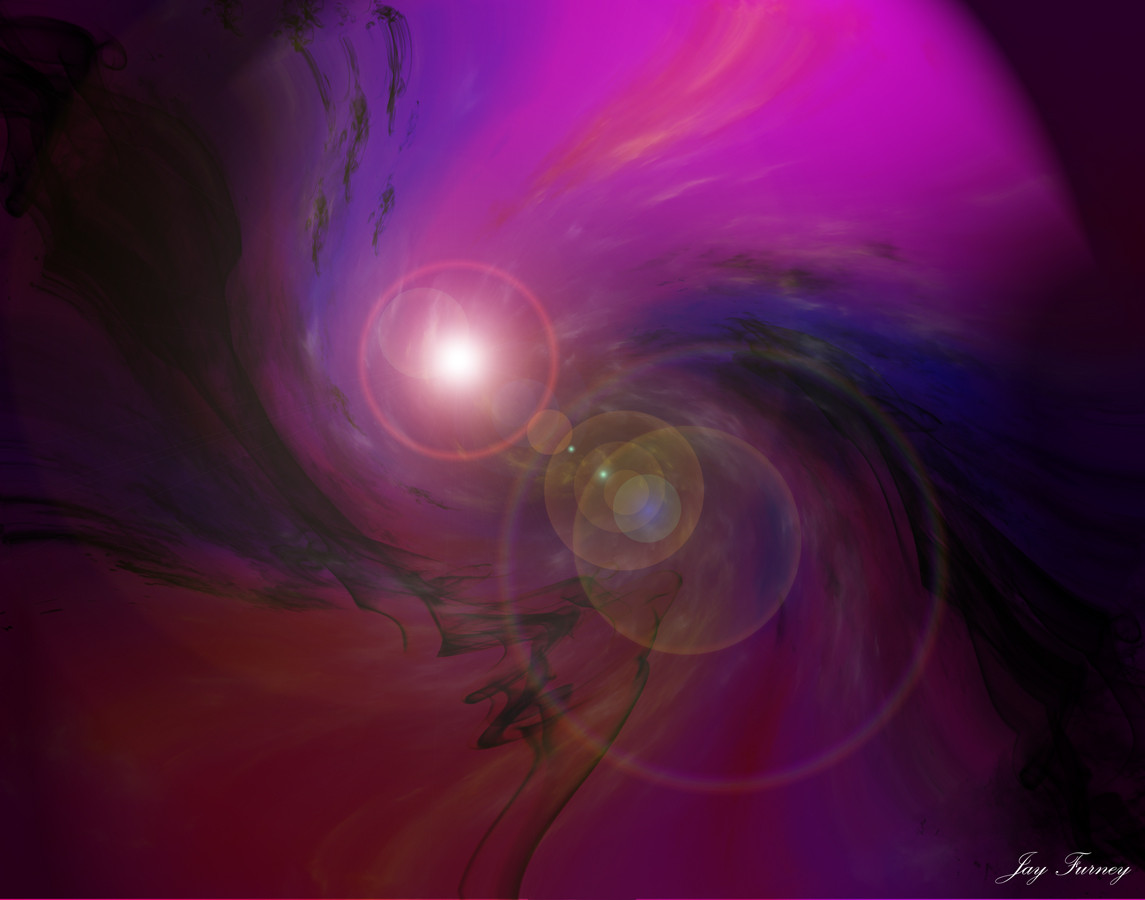
This is finaly the collab with this lovely artist: *Onorok He was already done a few weeks ago but it first has to release in a pack but the pack didn't come ... so here it is.*Onorok did the space part
I did the see and the sky.
i hope you like it and comments and fav are welcome, FULL view is a must !
Related content


Comments: 27

this one is similar to my latest deviation.
really nice. comment mine if you want
👍: 0 ⏩: 0


Nice, you guys...that's really awesome. The planets could use a little more defined texture, but heck, it's a great picture, I think.
👍: 0 ⏩: 0


never liked space-art at all this one changed my mind...
but still
"I'm just not a spacecowloverboy"
The space barrier formed by the clouds pwn.
The big planet is just over the top ... covering the high part & lots of the (awesome)lightning effects should be supported by something else.
Not the most original re-using material is very risky for "bashing art comment in to the ground".
But great collab, you did a great job helping each other out.
read the comments .Setfocus on the comment from meta474... that should help you out.
can't wait untill new art (maybe a up date that would be lovely showing that you can aprove)
---
Unhostiled? Greetz Daemon
---
👍: 0 ⏩: 0

Wicked collab guys. Both of you did an outstanding job.
👍: 0 ⏩: 0

")


Jesus sweet christ, Deviantart is a piece today. Sorry about the 3, my browser told me the sending failed...
👍: 0 ⏩: 0
This is pretty good, but I have a few suggestions (Purveyor of ground-to-sky images such as I am):
The top does not feel like part of the bottom. I'm not sure why, I think maybe it has something to do with the light -- the planets are lit roughly properly, but maybe it's the color of light, or hmmm. The clouds form a kind of barrier, maybe because there's no fall-off, it's just there and gone. Perhaps have the clouds lit on the top/backside by the blueish nebula light, or have less of an empty space barrier between clouds and first planet.
The planets are also lit a bit funny--the edges of the crescents are blunt, and it should be a perfect crescent (Sphere minus another same-sized sphere subtracted from it.-- I'm referring specifically to the largest planet.
But good work none the less - don't take anything I say badly, I wouldn't spend time commenting like that if I didn't like it and think you did a good job.
👍: 0 ⏩: 0


Great pic dude.. I really love the lighting .. keep it up
👍: 0 ⏩: 0

hmm don't like that u used apophysis again, not original, planets are okay (Smile)")
👍: 0 ⏩: 0


Verry Nice done The planets,Brushes,the land.... ALL OK !!!
________________________________________ _
Checkt my Dark art @ [link]
👍: 0 ⏩: 0

nice terragen there inventor. fractals r beautiful, i like thme a lot. the big planet is good, but the smaller ones look too flat, just like an inner glow, and nothing else.
👍: 0 ⏩: 0


wwoooooonderfull colaboration, those clouds, water, planets, starfield, it all fits with each other, amazing, 
👍: 0 ⏩: 0

Unreal. I love Onorok's stuff, it's amazing.
Is that a render of the sea/clouds or a photo? The colors are awesome nevertheless.
Great collab, nice work
👍: 0 ⏩: 1

its a render (the see in terragen ) with a photo (the sky)
👍: 0 ⏩: 0
