HOME | DD
 ipholio — Lolly Journal CSS

Published: 2007-09-10 22:37:58 +0000 UTC; Views: 7540; Favourites: 57; Downloads: 0
Redirect to original
Description
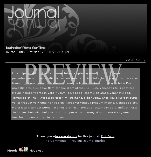
My entry for $lolly 's CSS Contest .Here are the features (including all the ones he asked for):
 Large Lolly logo at top Top menu with main links (with bg image on hover) Side menu with community links Side area for stamps Blockquote area for thumbs, quotes, etc
Fully coded version coming soon.
Related content


Comments: 53


Hey +ipholio ,
Very nice work on this, have you finished the coded version?
Thanks
 (Wink)")
👍: 0 ⏩: 1

There won't be a coded version as this didn't win the contest.
👍: 0 ⏩: 1
Too bad, even it didn't win, I think $lolly probably use it as well, no?
👍: 0 ⏩: 1
i doubt it...but i could always note him and check.
👍: 0 ⏩: 1


")

👍: 0 ⏩: 0

")


Pretty big font used for those "100 Comments | Previous journal entries." Otherwise very nice.  (Smile)")

👍: 0 ⏩: 0

Well. I was going to enter, but there's no way I can beat this 
👍: 0 ⏩: 0

If this doesn't win it'll be a criminally insane crime.
👍: 0 ⏩: 2
Well it's official...a criminally insane crime was committed.
")
👍: 0 ⏩: 1
Aww. What won? I can't find the news post anywhere.
👍: 0 ⏩: 0
Haha well we'll see...I put plenty of time and thought into this one so hopefully it will have a good chance.
👍: 0 ⏩: 0


Looks awesome! I love the colors and everything looks so smooth/clean! ")

👍: 0 ⏩: 1
Thanks for the comments...I'll be making a few minor changes, but this was the clean look I was aiming for.
👍: 0 ⏩: 1


Simple and Effective! Keep up the awesome work!
👍: 0 ⏩: 1

big links for the comments and previous journals, a little bit too big in my eyes. but I like the other parts, great journal!
👍: 0 ⏩: 1
Yeah I'm thinking about reducing the size of those...probably will do that soon.
👍: 0 ⏩: 0

Great design. This seems perfect for the style of his journals

👍: 0 ⏩: 1
Thanks...I was hoping I integrated every element he would be needing in a journal.
👍: 0 ⏩: 0

Looks good, but I'd do a bit about Lolly's ugly mug up in the corner, I think the integration isn't that well. If you chose to leave it like that, you should probably fix that little bump in the right corner of the white circle. It's a little thing, but it's clearly visible.
I'd also suggest that you draw in the title of the journal from the right so that it doesn't space out over the sidebar. Section wise I think it's a bad composition to have it like that even tho it looks the best for balance. I'd shift the sidebar to the left side or eliminate it completely.
How are you going to integrate the mouseovers with the CSS? Negative position values?
👍: 0 ⏩: 2
If you're referring to the right side of the head where the white cuts out...I pulled this from the tshirt design of his and that's how it appears there as well. The title is right aligned, so it won't be overlaying the sidebar unless he has a ridiculously long title. For mouseovers, I'll either do negative positions or just a different background-image on the :hover.
👍: 0 ⏩: 1
That's not what I meant about the title. You know about the rules of association? Objects aligned with each other will be associated with each other. If the title starts way to the right above the right sidebar, it'll essentially become the title to the sidebar, and not the content itself.
Check this [link] out for what I mean. I know it'll basically bugger up the design with the lolly logo in the left, but I think it'd be a better solution. Of course, that's all up to you.
👍: 0 ⏩: 1
Ah ok...yeah I totally missed the jagged part of the circle there, thanks for pointing it out. For the title though...I might just switch that sidebar to the left side so that the title can still stay right aligned with the 20px or so padding on the top and right sides.
👍: 0 ⏩: 0

mouseovers are easy lol
👍: 0 ⏩: 1
lololo, o rly? (That's sarcasm)
I can certainly tell your CSS skills from the mess of your journal and website, you're a .. pro!
Sigh.. There's such a thing as optimization so a design doesn't take a million years to load, like yours do. Key to loading a website with external elements from other hosts is to minimize the load of data that's brought in like using only ONE picture for the mouseover. I won't elaborate further, I'm sure you can't grasp it.
👍: 0 ⏩: 2
What that totally necessary? He wasn't being rude at all...not sure why you went all jackass on him.
👍: 0 ⏩: 1
Couldn't help it, it just came over me. I'm a mean guy. My apologies for making a scene in your deviation.
👍: 0 ⏩: 0
oh i see your one of them people who was beaten at school every day, so now you go online to put others down for the lack of brains or understanding they have, i was not trying to be rude to you, as mouse overs are easy as far as on a journal in this site is concerned, but i see your quick to poke fun, well good for you, i hope that makes you happy, i'll just say this yes i suck at code sure i do i'm self taught and learned most of what i know from making these fucking journals. Yes i know all of what you said about loading externally etc, but knowing and doing are two different things for me, as i am not yet at this stage of understanding i design not code, but yea get over yourself already. oh and thanks for making me feel like utter shit.
👍: 0 ⏩: 1

very nice.
just one thing:
how will the top menu look like on smaller resolutions ?
( on a 1024 x 768px resolution the journal is only 450px wide when viewed on the userpage .. )
but apart from that,
sleek, stylish and creative.. very well done
👍: 0 ⏩: 1
I'll be fixing it to be compatible with 1024x768...no worries.
👍: 0 ⏩: 0


| Next =>