HOME | DD
 Iskander1989 — I'm not a trash!
by-nc-nd
Iskander1989 — I'm not a trash!
by-nc-nd
Published: 2013-02-09 02:25:02 +0000 UTC; Views: 11820; Favourites: 322; Downloads: 87
Redirect to original
Description
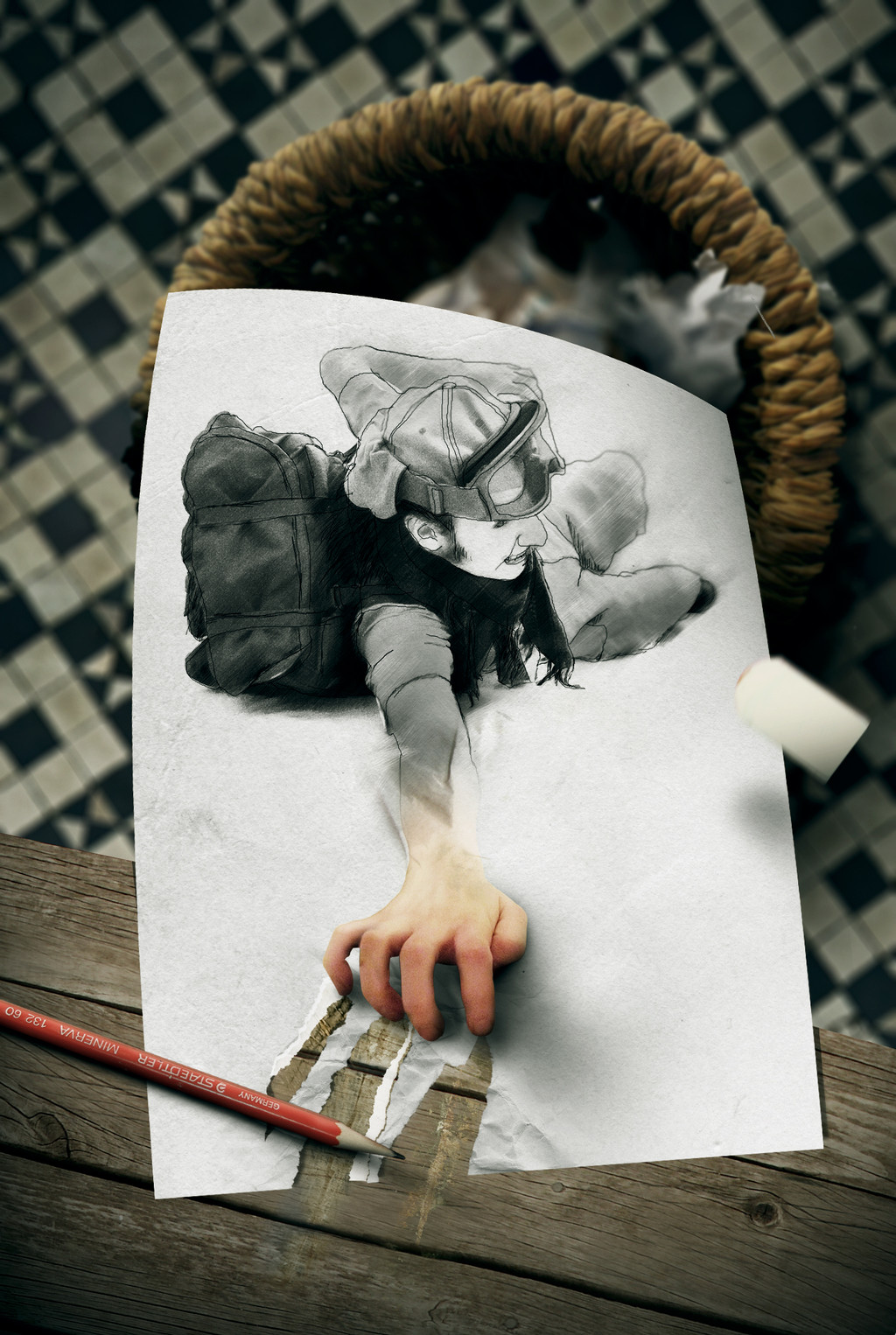
I really am enjoying doing this kind of jobs, but i'm afraid that my watchers stay tired about this...Well this time, i bring for you one more fun pic, hehe, i still tried to give a little of depht of field on the ground and basket... hope you enjoy it!
Update:
- Improvements on shadows;
- I took out the hand, 'cause i don't liked it where i put and was looking collage;
- More neutral collor on the paper;
- Eraser is on differnt position, to avoid merging with the color of the paper;
- Pencil is on different position, i think it it very better now;
- Litle bit os strech where the hand is turning off the paper;
- scratches on the wood added.
Link for the old: [link]
Hope you enjoy!
sources (thank for all support)!:
[link]
[link]
[link]
[link]
[link]
[link]
[link]
[link]
[link]
[link]
[link]
[link]
[link]
[link]
Related content


Comments: 66

Thank you so much! i'm very glad you like it, Anna!
👍: 0 ⏩: 0


The concept is GREAT.
I think you could have pulled it off better, though.
But I'm not sure how.
👍: 0 ⏩: 1
you mean about the man "off" from paper or the abstraction of the concept?
👍: 0 ⏩: 1
More the concept of the concept.
Maybe abstraction is the right word.
The composition of the concept?
Maybe "complexity"?
I don't know.
It's just that it's a really great concept, but the implementation wasn't as good as I think you could do.
But I don't have any concrete suggestions or anything.
It's more than fine as is. It's cool, but not Wow!
But maybe that's all you wanted it to be and intended it to be.
It is a more simple drawing in some ways than, for example, the one with the red ink spilled on the paper.
The composition and concept and presentation and implementation of that one is VERY nice.
But I'm no artist, or art teacher, or art critique, so what do I know.
👍: 0 ⏩: 1
yeah, i understand your point of view, thanks for the feedback!
hope you keep watching my next jobs!
👍: 0 ⏩: 0

No, such a good picture definitely isn't trash!
👍: 0 ⏩: 1

hehehe, sick because its sad?
")
👍: 0 ⏩: 1

Not sad at all. Your work rocks
👍: 0 ⏩: 1
hehehehe, i mean sad in the expression of her  (Smile)")
👍: 0 ⏩: 1


Great piece. Very humorous and well executed.

👍: 0 ⏩: 1
thank you friend!
👍: 0 ⏩: 0

Great piece of work!!
Thanks for sharing...
Featured in Daily Inspirations at hangaroundtheweb.com
👍: 0 ⏩: 1
thank you so much for sharing this, appreciate your feedback!
👍: 0 ⏩: 0

blanket86 [2013-02-15 11:29:22 +0000 UTC]
This is so beautiful! Very nice and interesting style!
👍: 0 ⏩: 1

This is very nice and impressive! You did an excellent job with the textures! I like it a lot!
👍: 0 ⏩: 1


I like the message , especially since I'm feeling like the last few days drawings belong in the trash
👍: 0 ⏩: 1
=d, glad to read this... thank for your comment!
👍: 0 ⏩: 0

This is a really cool concept! I love textures and the colors. The thoughts I have for it is, on the tips of her fingers I'm not sure if they are shadowed or dirty from smudging the pencil. If they're shadowed the should have almost all highlight judging from where your light source is coming from and I would darken the shadow of her whole hand on the paper. With a direct light source such as you have on here it just needs the shadow bumped up. Now if it's smudges, I would put some more up her fingers, or on her knuckles and maybe some on the paper.
Only one other thing, I'm assuming that it's an eraser falling on the right side? I would sharpen it just a touch more or change the color a bit because it's really close to the paper color. Maybe make it look more dirty? White's are a BITCH to work with.
Other than that I really love the feel and idea behind this. I love seeing photomanippers that don't do the same thing as every one else and try to tell a story rather than just make a pretty picture.
Hope that helped.
👍: 0 ⏩: 1
yep, the thing of fingers, i am already improving the shadow under that... now i will let the older files to show the improves i did in my jobs!
about the eraser, it is relly merging with color of the paper, good tip changing the color of that, ill do this!
thanks for your help and feedback!
👍: 0 ⏩: 0


 (Cool)")
👍: 0 ⏩: 0


a very cool design. Reminds me of how I've had characters and idea hang on after I've given up on them
👍: 0 ⏩: 1
hehe, thank you... XD interesting!
👍: 0 ⏩: 0
| Next =>