HOME | DD
 Itsuo — Linked

Published: 2009-04-07 23:08:54 +0000 UTC; Views: 3084; Favourites: 33; Downloads: 0
Redirect to original
Description
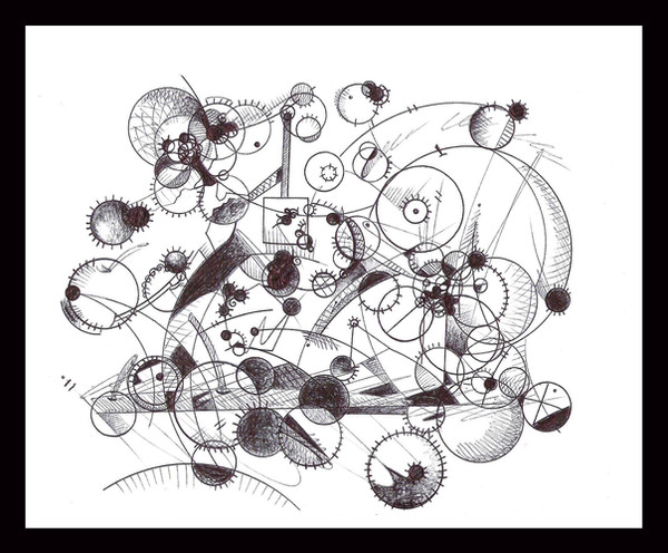
tried to keep things a little simpler than I normally do....Related content


Comments: 16

Thanks.
Yes...It was all ink penned. Mostly used Microns 01 03 and 05.
👍: 0 ⏩: 1

sweet, nice to have a generalised spread of pens. love the work, and the skill aswell!!!
")
👍: 0 ⏩: 0


That is different, less of the random details and you have very consistent patterns. I think the contrast is well balanced and the straw-mat pattern makes a good background. Nice work
👍: 0 ⏩: 1
Thanks...
I really wanted to try and simplify things a little, I think sometimes I go way overboard with the random details. In some ways working with consistent patterns seems a little more difficult as I have to plan a little more exactly how I want to piece it together.
Thanks again for the comments!
👍: 0 ⏩: 0

 (Smile)")

The smooth circles and the sharp triangles form a nice contrast.
The unique inner etchings of the circles is the best part of the piece. The interlocked circles reminds me of the Olympic image, with the etchings replacing color.
The "simple" background design is nicely varied and adds depth to the piece I don't normally see in your work.
The dark scale/oval etchings in the top right circle seems a little out of place, but that's the only thing I don't like about the piece.
👍: 0 ⏩: 2
i enjoyed your comment, i thin kthe dark etching on top is good for contrast!
👍: 0 ⏩: 0
Thank you
I know what you mean with the circle on the top right. That was one of the first one I did and it did have that out of place feeling once completed.
👍: 0 ⏩: 0

