HOME | DD
 ivelt —
PowerHouse - PSD + HTML/CSS

Published: 2012-09-09 07:52:52 +0000 UTC; Views: 23376; Favourites: 233; Downloads: 645
Redirect to original
Description
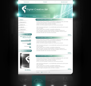
OverviewImpress people with this beautiful, clean design perfect for a corporate/business company. Many details and sections on each page gives a great overview of your product.
Easy to customize, easy to use, well organized and well done.
Made with the 960 grid system.
PSD's included
- Main Page
- About
- Project 84
- Services
- Contact
- Blog
- Blog post
- Login
- Register
- Extra
Fonts
Myriad Pro: www.cufonfonts.com/da/font/492…
Existence: www.dafont.com/existence.font
Geo Sans Light: www.dafont.com/geo-sans-light.…
Icons
IconSweets 2: www.iconsweets2.com
Microphone and knob: 365psd.com
Get it here, get it now:
Buy on ThemeForest
Buy on ThemeForest
Buy on ThemeForest
Buy on ThemeForest
Buy on ThemeForest
HTML/CSS version just released!
Buy on ThemeForest
Buy on ThemeForest
Buy on ThemeForest
Buy on ThemeForest
Buy on ThemeForest
Wow! A DD! I really appreciate it.. Thanks a lot `princepal and everybody else. This is great!
Related content
Comments: 37

An attractively designed website :
www.psd2html5.co/
👍: 0 ⏩: 0

You just got yourself a new watcher! Keep up the great work. Layouts like these truly inspires me to continue creating templates.
👍: 0 ⏩: 1

That's great to hear! It's comments like that that makes ME want to continue..
👍: 0 ⏩: 0

Design is sleek and simple to use, very cool!
Meanwhile, the content had me in a giggle fit xD Aye, if only!
👍: 0 ⏩: 0

faved for the placeholder. Yes, I know you'd like it better if it was for the design, but there are still too many discrepancies in there.
The placeholders on the other hand are a really nice idea and well thought-out.
👍: 0 ⏩: 1

I'd like any thoughts on the design you have
And thanks for the fav!
👍: 0 ⏩: 1

Okay, before I start, please understand that most (though not all) of what follows is just nitpicking. The overall design is okay-good, it's just that I'm studying this stuff AND am a perfectionist by nature which causes me to be so picky when it comes to design. The issues ain't going to be weighted, I'll just move top to bottom. Choose for yourself, what of the advice to take because I'm not going to be nice down there.
* All in all you lack a consistent grid. I'd assume you've tried to establish a 3-column-grid in the mid at "your body, our tech", but there are way to many elements which fall out of it, which gives the design a somewhat unsettled feeling. Especially obvious in the upper right corner, just count: how many y-axis-alignments do you have in there?
* The magnifying glass and the radio button at the bottom of the map: Those are the two only elements in the design which have a metallic look. It isn't as obvious right now because they fit the placeholder-images, but once those have been replaced with the actual ones, the glass and the radiobutton will feel very out of place.
* Your language-chooser is designed as slide-select (apple-user?). However, those usually highlight the active mode, not the possible other choices (think about it, how many sliders do you know where you have to slide away from what you want?). However, sliders don't work all that well anyway when they're static, so unless you want to animate all of it, you should likely just add a pressed-button for the English language.
* Login/Register-buttons I'll get to that later.
* Home etc.-Buttons: Those look actually pretty nice, congrats on that. However, the "Life with P84"-Menu is not a dropdown, it's a popdown. Forget the dropdown-arrow next to "Project 84", you don't need it; it just adds visual noise and suddenly shifts the text to the left. The Popdown itself looks good again and will most likely continue to do so with individual content.
* "Signup for Beta" <- exactly that sentence is way to hard to read. Add dropshadow, indention or whatnot to the text, or use the dark green textcolor you've used for the numbers further down on the page, but the most important button on the page shouldn't be that hard to decipher.
* The two fonts work good enough together. Given the headlines, one might expect a little bit more prominent as- and descenders, but granted, that would again reduce legibility.
* The numeration: is NOT the most important thing in there. The edges should really be used more decently, they take too much attention away from the content. They also lack a consistent lightsource. Having them alternate adds a nice touch to the page and makes it seem less formal, but you should really take the time and draw a second one for one of the sides, allowing for a consistent lightsource.
* The first two images also look a little bit too dominant, however, since this is a template one could argue that more detailed graphics, like the incidents-graph, need that much space. You might still want to consider giving the text a little bit more space, maybe even sticking to the 3-column-grid. After all, the images don't really add much info, but mostly just distract the viewer.
* Ah, here we have the blue buttons once again. At the Beginning of the Page you've established a beautiful buttonstyle with nearly sharp corners and a wonderful dark edge (talking 'bout Home, not Signup). Why throw it away now? The rounded corners and highlighted edge take a lot away from the professional feeling of the theme and make it seem cheap.
* Not done with the buttons yet. The blue doesn't fit you color-scheme, being way too dominant considering that green is supposed to be the most important one. I didn't check it, but I'd guess the blue is considerably more saturated than any of the greens surrounding it. It's good to add complementary colors, but they shouldn't try to steal the show. It may only be intended to be a placeholder, but the blues on the map would be way more fit to complement the green. (even though you don't have to tone it down that much, a less dractic change will most likely suffice)
* Connect with us: You haven't used circles in your entire design, so why now? It just makes them seem like they don't belong to the rest of page (which is pretty odd, considering it's about "connecting"). Try to maintain the rectangular, yet light style from the rest of the page, especially since four of those five are actually rectangular in shape (yep, skype is rectangular. just put it into a square and a circle and look which fits better). Also, I'm not sure those companies let you recolor their icons just like that, but don't take my word on that matter, I never really dug into that topic.
* The map has a similar problem; where do you take a large, dark grey and heavily textured area from, all the sudden? Again, it would be better to reuse visual formulas found earlier on the page, either the light green area-style from the graph, or a darker green with a distortet gradient similar to the corners with the numeration.
* Sign up: Well, this one sure is easy enough to read. Still, after updating the "Signup for Beta", you might want to apply the same style to this one. Cohesiveness, once again.
* By now, I've realised that the icons in the popdown-menu and the border of the "Sign up" are also supposed to be metal. That's still not enough to make it a legitimate element of this pages style, esp. since it doesn't really fit the rest of the style which is bare of faux-reality. (And even if it were, you should still get rid of it. metal never works on screen (at least not in 2d). Why? The only visible indication that something should be considered metal is it's reflection of it's surroundings. And a computerscreen simply doew not know it's surroundings.)
Well, that'd be my fourteen cents. I really hope you consider it to be helpful instead of just one long rant.
Also, was I right with my guess of you being an Apple-fan or at least -user? Because your design is full of Apple's design-elements, sadly including a few of their biggest mistakes (yes dear fanboys, apple does not equal perfect interface-design, get over it)
bw,
Tobl
👍: 0 ⏩: 1

Wow that was a lot of suggestions. Don't worry, I really appreciate it and I don't take it as a rant.
I am an apple user yes but I haven't really thought about all those apple inspired elements. Maybe it's all subconscious choices.
I agree with many of your thoughts and I too see many discrepancies. Sometimes I just get bored with a design after a while and try to freshen it up somehow but I don't always succeed.
I understand you study this? For how long? I've never studied anything concerning designing so I'd really appreciate your thoughts on future projects.. maybe even before uploading them so I can get rid of bad elements.
If you want, my skype is jonasgs11
Do you do designs yourself because I didn't see any in your gallery.
👍: 0 ⏩: 1

Yes, I'm studying interaction design, but I'm only about to start my third term.
Of course I'd like to take a look at your future designs if you want me to. However, most likely I won't be able to answer as extensively since education is about to start again and I'm also planning to get a few of my personal projects going. Let's talk about that on skype, okay?
And yes, of course I'm designing myself as well. However, there are several (read: two ^^) reasons why I don't upload any of that to dA. First, I'm still reading deviantART literally and just don't feel like uploading design here (nothing against people who do of course). Secondly, most of the designs wouldn't even work in here. See, we do produce interfaces, but we focus not on static screens, but on the whole interaction, meaning: how a user is guided through a complex system of screens and other interfaces, how the system reacts and every now and then we even include the hardware in our designs. A single image just wouldn't convey the design and a flash-prototype is often still not sufficient to represent the whole system, and even when it would be, often it's just too much effort that would be spent building a flash-prototype instead of improving the design. However, I'll have to make a portfolio sometime soon, I'll give you a link to that when it's done.
Also, you say that you agree with many of my thoughts. Which don't you? I'm still in training (and will be for the rest of my life), so I'm highly interested in opposing views.
bw,
Tobl
👍: 0 ⏩: 1

The blue buttons for instance. I like that they are a bit different.. they're still rectangle and pretty sharp and the fact that they are blue attracts the eye and encourages the user to press signup, to read more or whatever.
I like the subtle metal icons/elements. They aren't too obvious and I find that they fit quite well - I wanted something else than just plain white, which didn't really work for me.
The language select is not a slider, although it may look like it. At least it did to you. English is pressed right now.
I also realize with buttons and search, etc., the design is a bit heavy in that top right corner. Those elements and many others are just there for user options. See, on ThemeForest (you may know this or not) buyers want themes with many options. So they could delete the top section entirely or just leave the search field or whatever.
Those are just a few things.. but you're right about so many things and I did try many different things that I just felt didn't work. I actually tried squares instead of circles in the connect with us section but I didn't like it. And the about us page (not shown here of course) also has circles and it seems to work.
I do really appreciate constructive criticism like this because they are founded in something real..
Hit me up on skype if you feel like it. Already planning my next theme which should be pretty sexy.. I hope!
👍: 0 ⏩: 0

Beautiful design
But I seriously laughed my ass off at the content!
Sad thing is some people would probably want it 0_0
👍: 0 ⏩: 1

Anyone else thinking this could cause the borg here? I mean seriously I know I'm not the only trekkie here someone must be thinking of the borg at these place-holders!
👍: 0 ⏩: 1

I've never seen Star Trek... just the movie!
👍: 0 ⏩: 1

Ah xD Basically the borg are 'robot/androds' that put implants into people and turn them into 'borg' who go off and do the same xD
👍: 0 ⏩: 0

Oh man, this is awesome!!! Congrats on your beautiful desing!
👍: 0 ⏩: 0

I was thinking the same thing
"WHAT IF I DIE? WILL THERE BE CONSEQUENCES TO MY LIFE?"
"Yes, Sir, we assume so. Hopefully it won't be life-threatening"
👍: 0 ⏩: 0

I love the design, the placeholder subject creeped me out a little tho. I can imagine thinking something ultra embarrassing and in a milisecond it's on Twitter... XD
Great webdesigning work!
👍: 0 ⏩: 0

i like the design but i have to ask. thats fake right?
like people arent seriously trying to do this crap
...... right? like i know people can be stupid butt.....
👍: 0 ⏩: 1

Hahah! Yeah it's fake... I just thought I'd do some funny placeholder text!
👍: 0 ⏩: 2
And you succeeded, indeed. Project 1984 - genius
The design is neat. I like the textures veeery much. I feel a need to go through all of your gallery now :d
👍: 0 ⏩: 2

Haha cool! There'll be more stuff up soon.. planning on doing a lot of designs.
👍: 0 ⏩: 0

Holy crap *just got the reference* Is it sad that I found the placeholder text a lot more interesting than the actual design ^^'''''
👍: 0 ⏩: 0
