HOME | DD
 IzzyMedrano — Chronos Pandemonium
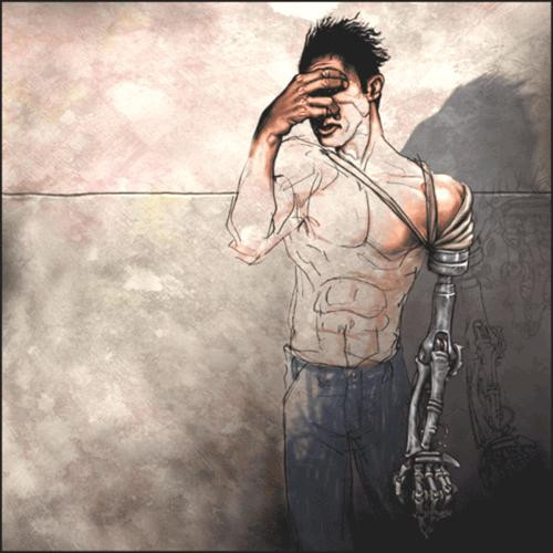

Published: 2003-06-09 06:01:31 +0000 UTC; Views: 5625; Favourites: 154; Downloads: 864
Redirect to original
Description
This is the clocktower in hell, it is really sparse because I didn't want to have to define the look of Pandemonium. That is up to the viewer. I also chose a cooler pallete for the background, to sort of pick the opposite of what is normally depicted as a hellish color set. The colors are in the people and demons, their wierd fashion disasters. Fuck.Related content


Comments: 71

painful..but sickeningly good technically.
u are truly an inspiration to me!
and ur anatomy is perfect... i better go study mine.. im always too lazy to bother... so i just clothe my charas most of the time.. or take quick glances at my self in the mirror
T_T ur incredible! your usage of such wonderful colours is killer!
PS: i love masked characters.. theres so much mystique surrounding them.. they are charming subjects in that way.
👍: 0 ⏩: 0


Slave to the clock
aren't we all...
superb deviation!
👍: 0 ⏩: 0


Holy crap, it just hit me.
At first, I thought the composition was very good, and I really liked the positions of the bondage straps. Then I saw the big picture and bam, it's a peace sign! Great great great job.
👍: 0 ⏩: 0

This is neat. But creepy too. o.o You did a great job coloring it. It's very original and I like the colors you used! =3 Great job!
👍: 0 ⏩: 0

reminds me of hellraiser, yaknow with tho hooks through the skin... he wouldnt make much of a cenobite but still lol looks like he could be one
👍: 0 ⏩: 0

you do know number four ain't written that way in roman letters??
It IV not IIII
since V is 5
U see.. if u put the I before the V it means it's V minus I
And 6 is VI.. V plus I
👍: 0 ⏩: 0

your artworks are just great and thats my favorite so far! I´ll watch your upcoming works.
👍: 0 ⏩: 0

really cool. concept, composition, palatte and everything.
but one thing, missing a shadow for the left arm? don't know if that was intentional or not.
👍: 0 ⏩: 0

god this is cool, wish it were bigger
👍: 0 ⏩: 0

Very cool concept and execution. I'm loving your style and the way you approach your work.
👍: 0 ⏩: 0

whoa this is really cool and original. you have a great style and lots of skill.
i see your new here to deviant art and i am looking foward to seeing more of your work. this is goin into my favorites and ur goin on to my devwatch.
👍: 0 ⏩: 0


to think I already faved...what?...4? 5? Heh...you rock. By now I dont know if I'm repeating myself. I look forward to more of your works now.
👍: 0 ⏩: 0

The clocktower in hell..wow. O_O That's so..original..annd beautifully drawn.. Nice emotion in it..I am in awe.
👍: 0 ⏩: 0

i really really like this. the way the skin is pulled, the colours, the muscle definition - everything. love it.
👍: 0 ⏩: 0

painful timetelling never looked so good... wonderful job. the colors are fantastic. i dont know what else to say... its great.
👍: 0 ⏩: 0
<= Prev |