HOME | DD
 IzzyMedrano — Chronos Pandemonium

Published: 2003-06-09 06:01:31 +0000 UTC; Views: 5641; Favourites: 154; Downloads: 864
Redirect to original
Description
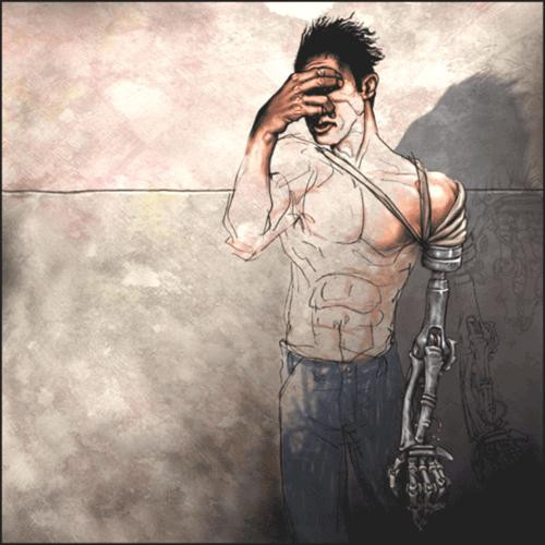
This is the clocktower in hell, it is really sparse because I didn't want to have to define the look of Pandemonium. That is up to the viewer. I also chose a cooler pallete for the background, to sort of pick the opposite of what is normally depicted as a hellish color set. The colors are in the people and demons, their wierd fashion disasters. Fuck.Related content


Comments: 71


is it 6:15 or 3:30 in this picture? meaning... which one is the small hand and which is the big?
👍: 0 ⏩: 0


have u seen evangelion...
this looks uncannily like the 1st angel in it...
if u manage to look at it ud be pretty freeked out by the similaarity dude...
weird.
👍: 0 ⏩: 1
really... isnt it hard to sneak in when ur big?

👍: 0 ⏩: 0

scarily, i did something very like this in highschool. it was not a favourite of my teacher's.
👍: 0 ⏩: 1

In college I found a similar response
👍: 0 ⏩: 1
at work i have the same attitude.
👍: 0 ⏩: 0

this is funny shit
hehe, the concept, no matter how hellish and macabre it may look, is actually funny ^^
heres this guy, he is living pain in the flesh! and he has the energy to be seriouse about what the time is
hahaha
i love the last thing you wrote too, "fuck". That pritty much summes it up
really nice concept, and awesome anatomy

 (Smile)")

👍: 0 ⏩: 0

WOW!!! 


👍: 0 ⏩: 0

I like this alot. Is it really digital or did you paint it? I'm favoriting this so i figured i could at least leave a comment. thanks for the art-
👍: 0 ⏩: 0

Damn do I love your style and grace, I'm not usually one for darker themed art... but I just can't not love your shaz.
👍: 0 ⏩: 1

Now this is good art! Such an interesting idea too. I like how simple it is and it's nearly monochromatic colouring. Gives it a nice and lonely feel, and I imagine it must get quite lonely up there hanging like that.
Beautiful work!
👍: 0 ⏩: 1

technically war-fool is not completely correct about the roman numerals.... sometimes even in Roman documents 4 is written as IIII. Granted, IV is the standard, but thats not my point now is it?
The colour palette on this is so subdued and menacing... its a great piece.
👍: 0 ⏩: 1


excellent. this is a smart, disturbing picture. +fav!
👍: 0 ⏩: 1

I love the idea! I like that when I am looking at the painting my eyes keep going back to the focal point. Great job!
👍: 0 ⏩: 0

that is so rad... i love the concept
Would love a larger image though-- let us see some of that detail.
👍: 0 ⏩: 1
Thanks.. I will try to post some details.
👍: 0 ⏩: 0


damn that's nice...you have some kind of imagination!
👍: 0 ⏩: 1
Thanks a ton! ^^ I am glad my messed up imagination is appreciated!

👍: 0 ⏩: 0

Mother of god, this is beautiful. Extremely well excecuted... such creativity and care. Damn good piece.

👍: 0 ⏩: 0

brilliant, and I love your choice to do a cooler aproach with your pallete as you pointed out.
👍: 0 ⏩: 0


I really like the color around where the hooks pierce. It really draws your eye to the nastiness of it. It's an amazing concept, and the colors really draw your eye to the "arms" of the clock and how he is fastened to the clock face. Great style...
👍: 0 ⏩: 0


There were mistakes made with the Roman Numerals, but the art itself kicks ass.. Damn good job here, man.
👍: 0 ⏩: 0

Dammit, hell is scary, and that's just the clocktower!
👍: 0 ⏩: 0

Lovely and gigeresque. By the way, I love all your works.
👍: 0 ⏩: 0

Looks like a very painful job especially since he probably doesnt get a bathroom break for the rest of eternity. And I do love how you used uncoventional colors to depict the hellish setting.
👍: 0 ⏩: 0

That is just fantastic, such great design and pain in this +fav
👍: 0 ⏩: 0

my only complaint is that the roman numeral 4 is IV none the less this is an amazing peice. so incredibly simple and technical at the same time ... good work
👍: 0 ⏩: 0


Your imagination is... is... beyond my imagination ")
👍: 0 ⏩: 0


if you were female i would beg to have your children... i dont know why im particularly drawn to his arms
👍: 0 ⏩: 0


too fucking beautiful for words, so i won't insult by attempting......just 'nother notch in your comment belt
arcAngle
a.k.a. Christine
👍: 0 ⏩: 0

| Next =>