HOME | DD
 J-Skipper — Batman sequential

Published: 2013-06-25 04:07:27 +0000 UTC; Views: 5898; Favourites: 135; Downloads: 158
Redirect to original
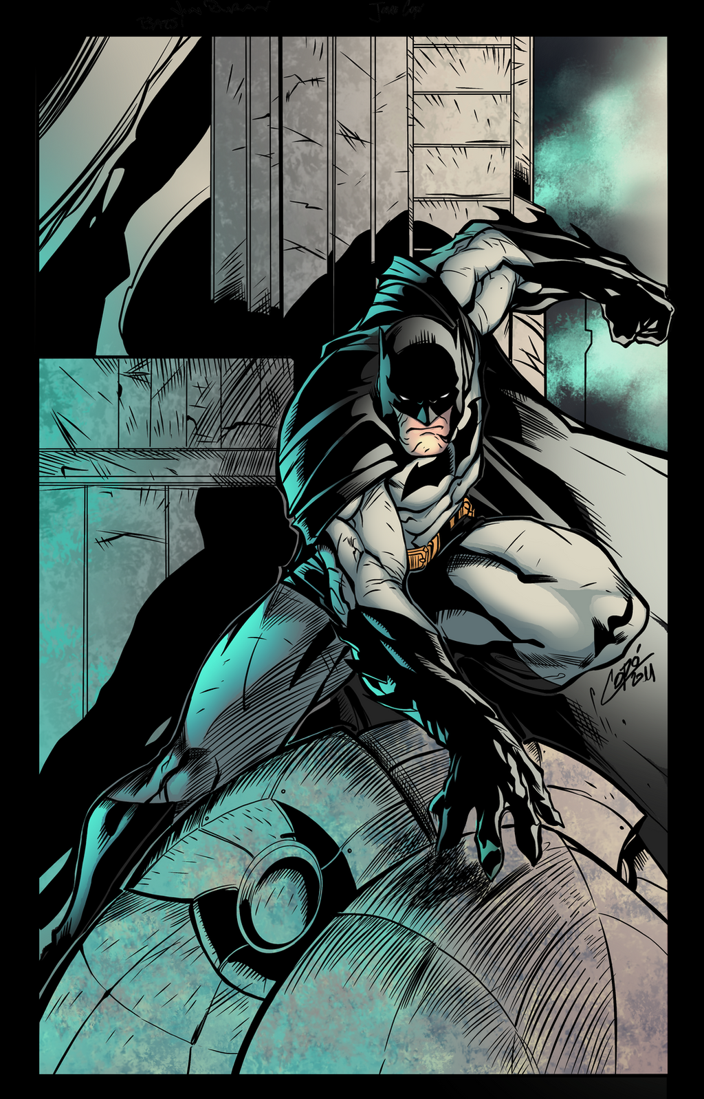
Description
My first ever sequential! So my question is, If this was a comic and I was the colorist would you read it or put it in the trash? I'm very aware that the art is just as important as the story and with the comic (that I'm going to be a part of) coming up I need to know if my sequential work is good enough?Please Critique and comment!
Pencils: Original pencils
Inks: Original Inks
Colors: Me
Check out my Art-Blog for WIP, news and more!
Also Follow me on Tumblr
Related content


Comments: 52


I love your colours! They really make everything...pop out.
Just one question (SPOILERS for anyone who hasn't read this comic yet (where have you been, by the way?)), but if it was really supposed to be Harley Quinn under the hood (pun intended) to dupe the Bat, shouldn't the wrist skin between the glove and cuff be white (you know, due to the DCNU reboot to her origin)?
👍: 0 ⏩: 1

Thanks!
I don't know.

👍: 0 ⏩: 0

It's good. You have space for improvement but I surely wouldnt put it in the trash. My opinion is that you need to add a little more detail. More shades. What do you think?
👍: 0 ⏩: 1
There's always room for improvement and I would try adding more shadows and re-uploading it if my Internet were working.
👍: 0 ⏩: 0

I really like your colors. They feel clean and dimensional without looking plastic or overly shiny. I feel like the space and surfaces are properly lit, not that the objects themselves are glowing, which is an important difference. Honestly, I would prefer your colors over the style that seems to be prevalent these days where everything seems all gleaming and radiant all the time.
Additionally, I really like the original art you colored, here, and I think your style suits these particular sequentials really well, because the art, inks, and colors work together to convey a complementary look and feel.
Ultimately, just based on this single page alone, I WANT TO READ MORE OF THIS BOOK. Usually I don't feel that. I think the art, composition, inks, and colors really communicate a strong, unified sense of story, and that's what I look for in any narrative art form. Also, having seen another Batman page you recently colored and the rest of your work in general, I would definitely love to see a whole book in your style.
Good luck with your upcoming project, and thanks for offering your work here on dA.
👍: 0 ⏩: 1
Wow! Thank you so much! That means a lot that you would say all of that!
👍: 0 ⏩: 0

Definite read - looks as good as anything I've seen in print.
My first impulse was that maybe the colouring was a little off on the Helmet - it's not helped by the fact that the batman reflection looks like a crack, but maybe if the colouring were a little less smooth it would look more like a reflective material? I'd always assumed it was made of a glass-like material but it looks closer to painted stone here.
Also I think the light on the glove at the bottom is coming from the wrong direction? They seem to be mostly lit from the windows which, in the bottom panel, would be to the left.
Those are just nit-picks though for an otherwise excellently executed colouring!
👍: 0 ⏩: 1
all take those nit-picks into account, Thanks!
 (Smile)")
👍: 0 ⏩: 1
Just keep in mind they are nit-picks... the much deserved praise should be kept in account too
👍: 0 ⏩: 1
Well I appreciate it. Thank you!
👍: 0 ⏩: 0

I'd read it for sure! I really like the subtle gradation of the colors. Nothing is too sharp and the subtlety is a breath of fresh air from most comics. It definitely looks like Legitimate DC colors!
👍: 0 ⏩: 1
Hey thanks! That's good to hear!
👍: 0 ⏩: 1

My constructive critics: I find the colouration excellent! I don't know how limited you are if you are part of a comic making.. I personally would try to add different colours as shades, for example. What you did with the light blue on the red cape thing.. But also in the dark parts. But ya, that would be the only thing that I'd see right now and would have as tiny advice. 
👍: 0 ⏩: 1
When you say "dark parts" what exactly do you mean?
👍: 0 ⏩: 1
Ehm, the shadows. For example when you have the huge area of red clothing.. You can play a bit with the shadows and shadow not only with darker red, but also lilac/ blueish, even dark green, or what just fits with the surrounding. (Sorry for bad English. >///< ) Do you know what I mean? To get a more vivid effect of it. .....I mean, I am very much a beginner and just try things like that out.
👍: 0 ⏩: 1
so you're saying, instead of doing a light red rim lighting color in the shadows like I did on this piece, do a dark color like green or yellow or a color to match the environment?
👍: 0 ⏩: 1
Mhm, kind of. Like, not making the things darker by using a darker tint of the same colour, but playing a bit with other colours.
I tried that here with the cape..: [link] The main colour is this weird light blue and for the effect of the fabrics I coloured it and used darker blue for shading/ 3D. But for the effects of shadows I tried dark grey, some green and purple. (As I said I am still beginner and trying around with it, but ya, dunno if it#s something that you might find helpful. ^^)

👍: 0 ⏩: 1
yeah, I'll play around with it. try some new things. Also I have to say for being traditional work this piece that you showed me is really good! better than I could do!
👍: 0 ⏩: 1

That's a good thing, I'm glad!
👍: 0 ⏩: 1


definitly READ dude your colors are great and work well with the pencils and inks
👍: 0 ⏩: 1
Awesome! That's good to hear!
👍: 0 ⏩: 1
")

Probably my favorite that I've seen form you thus far!
👍: 0 ⏩: 1
Really? Cool! Thank you! I'm glad people like my sequential work!
👍: 0 ⏩: 0

Thanks! Really glad you like it!
👍: 0 ⏩: 0

I WOULD READ THIS IF IT WS A COMIC
lol
(bad caps lock, bad!)
👍: 0 ⏩: 2
Really? Awesome! That's really good to here!
👍: 0 ⏩: 1
Great! I'm glad! Good thing too, because this is the coloring quality you're going to be receiving on your comic book. That's what my sequential work looks like.
👍: 0 ⏩: 2
Well then we're gonna have a good lookin' book!!
 (Wink)")
👍: 0 ⏩: 1

lol great answer. But yes you do good work. I would read this.
👍: 0 ⏩: 2
Awesome!! That's really great to here!
👍: 0 ⏩: 1
lol you did say you were doing the art and not the text... right?
👍: 0 ⏩: 1
| Next =>