HOME | DD
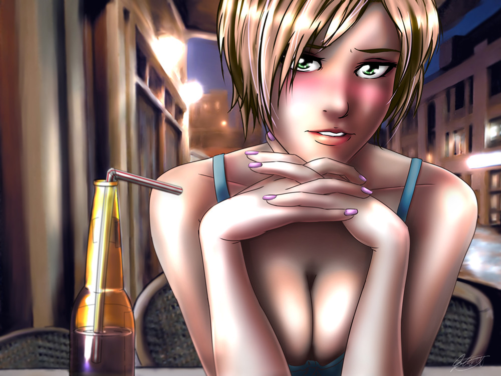
 jadeedge — First Date
by-nc-nd
jadeedge — First Date
by-nc-nd
Published: 2008-08-08 04:59:10 +0000 UTC; Views: 12451; Favourites: 557; Downloads: 416
Redirect to original
Description
Finally finished another piece...After the move, things are finally starting to settle down.
I could use a couple good critiques for this one.
Related content


Comments: 119


*Sigh* This STILL hasn't happened to me yet, and I'm 20!
👍: 0 ⏩: 1


I thought omg the coloring is ssssoooo amazing and soft, maybe you should try some colored outlines so it wouldn't be so bold~ just a suggestion
So awesome though, keep it up
👍: 0 ⏩: 0


I love this. Although i personally suck at art, I think i may notice something that seems a little off to me. All the lines in this picture are soft and and light....except the hair. almost looks like you cropped it on. or maybe you ment it that way. as i said, no artistic ability here XD
👍: 0 ⏩: 0

Very nice piece of art there. It's nearly perfect. The proportions and outlines are outstanding. There's just something about the nose and mouth but I can't quite put my finger on it. It's the lines, they're either too much or too little, or in the wrong parts, but I can't tell you which parts of them are for the life of me, sorry
👍: 0 ⏩: 0

-Look in the eyes-
-Look in the eyes-
-Look in the eyes-
--Look somewhere else--
=SLAP=
Very well done. Even though it's just a drawing, it gives some nervous feelings (as in "don't fudge this up"). A truly moving piece.
BTW What's the city in the background?
👍: 0 ⏩: 0

I really enjoyed this, Gives all all the feelings you might have on the first date with someone.. I mean i look at it and think look this girl in the eyes or you are asking for it.
👍: 0 ⏩: 0


how in the hell is the guy suppose to focus on the conversation when her boobs are practically gonna pop out? i mean they are just staring at your face man.
also, very nicely done. shadowing is pretty good and the eyes are quite nice. the top of the right hand is kind of off but the fingers are well done and the hair is really good. i wish i could draw like you.
*RAGES at how life is unfair.
👍: 0 ⏩: 0

very good. the lighting is decent, might want to tone it down a bit maybe. the contrast in color is strong. the pieces look great individually but together it looks a bit mismatched, if you were to go back and touch it up a bit i would suggest that you soften the character as well as the glare/light source. especially on the hair, the color is nice but the shine to it is too potent. the backround could use a harder shape to it but all in all it really is a very nice piece of work.
i commend you <3
👍: 0 ⏩: 0

The way the boobs pop out and are a distraction from her face are exactly how a boy would see a girl like that on the first date. xD The colours of the background affected by the lighting are gorgeous, like a real cityscape. And I like the soft, smooth shading on her skin, despite what other people say.
The only thing I see that needs critiquing is, as other people have said, the shape of her shoulders against the line of her collarbone; either her shoulders should be curved in a little more or the collarbone line should slant up a little. At least, that's what I think, I am not in any way a professional.
Very nice job with this
👍: 0 ⏩: 0

Cute. The 'lit' parts almost look like you erased all the color altogether, but then again, the big eyes kind of tell me you're not going for complete realism.
At any rate, I do like how you did the hair and blush on the face.
👍: 0 ⏩: 0


man this F ing rocks >>>>!!!
only thing that bugs me a little is her left index finger looks like is was broke or something,
and on the left top forward of the lights theres a porpotion problem u have a horazonial line where is should be going towards the center point with everything else.
love the painting feeling
oh and happy NEW YEAR ...... gave me a call sometime so we can hang out.

👍: 0 ⏩: 1

for the last time... I DONT HAVE YOUR NEW F#$%ING NUMBER!!! The next time you call. Tell me WHERE you're calling from!! Or send me a note here on dA.
")
👍: 0 ⏩: 1
omg!!! .... /em falls off cliff
OOORRRRZZZZ
1603 781 5325
sorry
~josh
👍: 0 ⏩: 0


the skin is way to shiny maybe darken it and cool it down with a bit of blue to give a more seductive feel?
👍: 0 ⏩: 0

im trying but i cant criticize it... it looks so gooood. she is gorgeous... i guess her neck, thas my only irk. if u get caught up in it... it makes her look a bit awkward. thats it tho... its friggin beautiful in my opiinion...
👍: 0 ⏩: 0

Damn, I love this one. The look in her eyes are just brilliant. like the background too.
👍: 0 ⏩: 0

I love the concept, I'm reminded of a first date, personally.
I can't decide if I like or hate the overwhelming CG and kind of hmm unreal?or plastic feel.
👍: 0 ⏩: 0


You have a marvelous skill, but my critique is to erm... perhaps give her an undershirt.

👍: 0 ⏩: 0

great colroing and every thing else looks great too!!
👍: 0 ⏩: 0


This is a pretty cute piece. The mood (and her knockers) are perfect.
However, the skin shading and hair light source leave something to be desired. The dark on the skin and unsubtle contrasts between light and shadow just look nasty. On the other hand, the bold linework and bright oversaturated colors of her hair gives off that fake, metallic look. The background and the light sources on her don't jive, and her head appears to be too big (even with the slight foreshortening). Finally, she's got a lack of definition between the trapezium and her actual shoulder which looks weird.
...Phew, s'been awhile since I've actually gotten to crit something hardcore.
👍: 0 ⏩: 0

As for critique I only see one thing I would have you improve.
I assume from the picture her boobs are like DD cup right?
Well in the picture, her arms would be covering her nipples, and her shirt would be way lower than that.
Just something you might want to think on, maybe you intended it that way
👍: 0 ⏩: 0

Aye, Faust here.
I'm honestly impressed by the background coloring, even by your standards, and the ridiculous amounts of detail put into places that we aren't usually going to look at (case and point, the windows) give this piece a more wholesome feel. My only gripes are that the blush seems a bit heavy (usually a bit under each cheek gives that rosy, "what's going to happen next?" feel), and her pose hides her neck, which is somewhat of an important body part for me, like the midriff. But hey, what am I to say? Maybe she likes that pose! After all, that could be one of many emotions conveyed (my vote goes towards shyness, but edging out into the open).
One final thing... in all your drawings of women, I notice this thing you like to do with the eyebrows... they sort of turn up near the center. Have you noticed that?
👍: 0 ⏩: 0

Alrighty, you asked for a critique and I live to serve ^_^
The good: The look in the eyes and the body language expressed with the arms and hands, the kinds of half covering and fidgeting shyness hammers home the first date feel, the reflections in the eyes and the glass of the bottle were well done as well.
The 'to be improved on' (As there is never any 'bad' art ^_^): I'd have decided on a dedicated light source for the highlights. In the background of the image it looks to be a roadside cafe at night or at least at dusk with lights running on the inside of an awning or the like, so personally I would have gone with less highlighting on the right side of the image (easy to alter with photoshop so you don't alter the original). Also to help hammer home the night time feel I'd put a slight shade over a good bit of it, but that's just me, I've never put any of my work up here, so take it with a grain of salt.
Those are the main points I could see, sorry if it was a bit wordy, I just like tying to help out as best I can ^_^
Again, great job, still love those eyes.
👍: 0 ⏩: 0

This came out really nicely. I think you might have made it look a little too shiny, but you made it fit in with the atmosphere. Nice work.
👍: 0 ⏩: 0

It looks great, as usual.
I just think that there might be too many light sources. It makes the picture look like she's at a photoshoot and all the lights are pointed at her. And I also think the blush might be too vibrant, almost like she's really tired after running or something.
But I love your shading style and the way you do your lineart.
You're one of my drawing idols :3
👍: 0 ⏩: 0

")
it looks even cooler coloured!
brilliant job and I like the shineys!! ")
👍: 0 ⏩: 0

wow i am loving the color version of this piece! love the blush on her face  (Smile)")
👍: 0 ⏩: 0

Personally, i think this piece is superb
👍: 0 ⏩: 0

haha! I'm totally insecure about my chest now. ")
Her arms have to be pressed pretty hard against her boobs for them to cleavage up like that, so maybe try to pay a bit of attention to the shadows between where her arms and chest meet? Right now her arms look pretty lightly pressed against them. (right especially)
This is me trying to give advanced critique. Haha. I tried to look for something to comment on, so that means at first glance it didn't bother me.
But overall, great!
👍: 0 ⏩: 0

*tries to occur in the eyes ,but finds it next to impossible and keeps one two back to those beautiful melons* it would be just like a girl to wear something like that on the first date and then try to have a serious conversation with you and get you to look her in the eye where you are obviously want to look elsewhere (that's why girls can be so evil ),LOL In any case wonderful job on the line work and the coloring not to mention the lighting effects
👍: 0 ⏩: 0


if only i could make such light effects...
👍: 0 ⏩: 0

I really love this piece; it came out so well! I love the coloring (mostly in the background; it looks so real!), although I must agree with some on the "bit too shiny" comments. Also, the blush seems a bit too prominent, but in all honesty, I think the picture can pull it off well.
Other than that, though, this picture is really great. Good job!
👍: 0 ⏩: 0


dunno if it was said before, but I advise you RECOLOURING the lineart. Black lines look quite out of place with the colouring style you were trying to attempt. Also, it's.. way... too.... shiny for a night scene, lay off on the white highlights.
Other than that, I love the way you coloured the background, nice use of colour to bring out composition and depth, but I'm a tad confused as to where the light source is... lights are from the back, but no indication, half of her face is in complete darkness yet both of her shoulders are completely and evenly illuminated, almost the same goes for her chest and hair... get me? You need a little work on that.
Other than that, the drawing itself is excellent. 
👍: 0 ⏩: 0

I love the artwork itself, and for the most part, the colouring is good too but... the whole things seems a bit too shiny. And the blush is sorta too emphasized.
it's not BAD, I love it actually. But erm... if I were to point out some flaws by being REALLY picky then those would be it.
👍: 0 ⏩: 0

I wish my first date had been like that.
The shading seems to have goten far better (not that I could ever fault it in the first place) and the backgrounds are rather nicely detailed.
👍: 0 ⏩: 0

ya, totally focusing on the eyes, i mean the boobs are barely even showing ")
👍: 0 ⏩: 0

awesome i like the drawing looks great coloereed in
👍: 0 ⏩: 0

| Next =>