HOME | DD
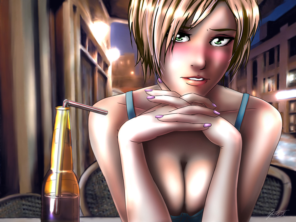
 jadeedge — First Date
by-nc-nd
jadeedge — First Date
by-nc-nd
Published: 2008-08-08 04:59:10 +0000 UTC; Views: 12437; Favourites: 557; Downloads: 416
Redirect to original
Description
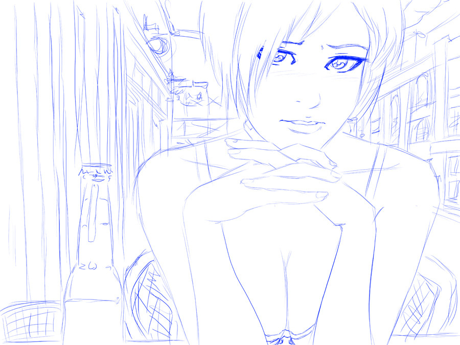
Finally finished another piece...After the move, things are finally starting to settle down.
I could use a couple good critiques for this one.
Related content


Comments: 119


i love this style. the soft background contrasting with the the sharp lines of the girl and the bottle in the foreground. what tools do you use for your art?
👍: 0 ⏩: 0

Well, it's totally
But if you want crits - blush is a little heavy, and I think I'd tone down the breasts a bit, put them in a bit more of a shadow, us fellas are gonna look there anyway, they don't need to scream at us.

👍: 0 ⏩: 1

Lol, oh yes they do.
👍: 0 ⏩: 0

I don't know what kind of critiques you're asking for, but there's a small thing I noticed. Her right shoulder is wider than her left. Otherwise wow. Nice work with the painting.
")
👍: 0 ⏩: 0

Wow, the lighting is pretty strong, but it looks good
The only thing I could have a problem with is how much blush there is ._.
And it's sorta tilted. But it STILL looks good xDD
👍: 0 ⏩: 0

To me it looks like the lighting looks a it over exposed. If it was just the tiniest bit darker, I think it could look better. Also, I agree with Vashperado. The shading is a bit too smooth. Other than that, awesome job.
👍: 0 ⏩: 0

I like the way the light falls on the fingernails, and I agree with others in thinking the bottle is well done. I also liked the way you shaded along the line of the nose, but the black line defining the edge of it could be extended a little bit more towards the bridge of the nose, and another line could possibly be included to define the side of the nose.
Just a point of interest to me: her blush seems to slant across her face, from her left cheekbone straight across her nose to her right lower eyelid.
Great piece. I like it. Keep going with the beautiful pieces.
👍: 0 ⏩: 0

The collar bones seem to end a bit too close to the shoulders, but that may just be me. I love the shading you did (it was hard to concentrate, as I am a huge fan of boobies), but she seems too brightly lit and shiny, compared to the background. You can probably get rid of the armpit line on her right (our left) shoulder.
Very lovely, though. Infinitely more talented than I.
👍: 0 ⏩: 0

pros :: almost everything.....awesome work!
cons:: i dunno how i and i repeat I feel about the collar bone, but i guess that if you saw the bone and sync it with the neck position that's how it would turn out, right??
anyway, that's my opinion... im not nearly as good as some people here, and i am also.... um not really good at anatomy, so...
thanks for the awesome pic and i hope you are happy since you moved!!
👍: 0 ⏩: 0


Very very good use of lighting, especially on the glass, it gives it a very nice realistic, smooth texture. The expression on the woman is also very appropriate to the title. The only thing I can really see you change possibly is the color palette used. There aren't too many contrasting colors except for the face with the red, which is one of the things I pick up first. The use of contrasting colors will help things pop, define shapes, and where to lead the eye next. But, since bright whites are used all throughout it helps to lead the around. I would add some cooler colors possibly. But, besides that... this is a great piece the coloring is nice and so is the lighting/shading keep up the good work
👍: 0 ⏩: 0

fuk yea
this looks great man! i love it
anything to critique, perhaps she was shaded too smoothly
it almost gives a blurry appearance as opposed to a solid woman in front of you
but seriosuly way cool work dude!
👍: 0 ⏩: 0

adv. critique huh....
hmm
pro:
+ composition is good
+ the feel is there, lovely environment
con:
- i guess you can show a little bit of her neck
- try connecting the nose bridge with the eyebrow. but it looks ok actually
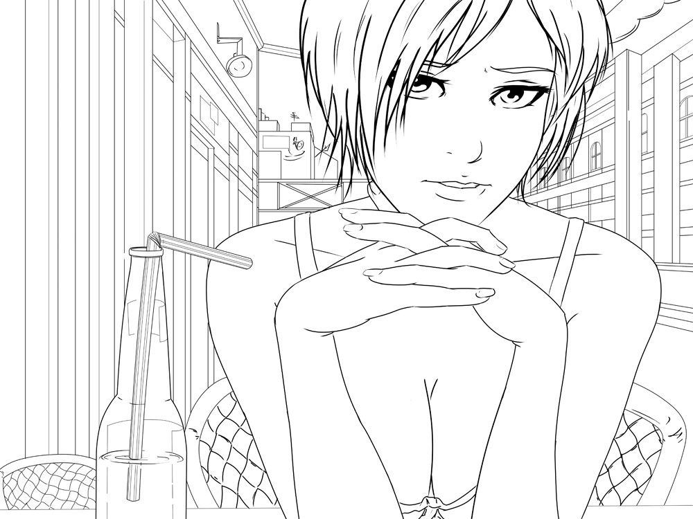
- colouring the lineart might work.
great job totally actually, another great work!
👍: 0 ⏩: 0

Very nice! The colours are soft and calming, and the details are nice, too.
👍: 0 ⏩: 0

This looks awesome owo *praises and bows to its awesomeness*
👍: 0 ⏩: 0
<= Prev |