HOME | DD
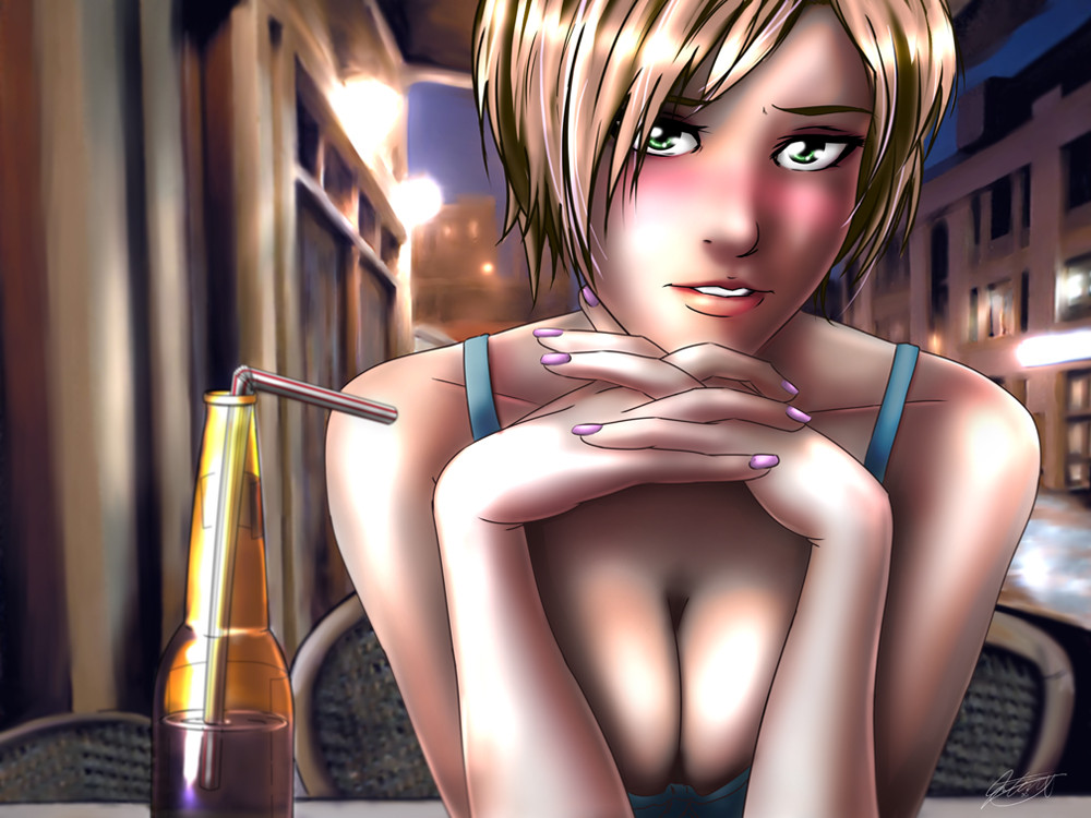
 jadeedge — First Date
by-nc-nd
jadeedge — First Date
by-nc-nd
Published: 2008-08-08 04:59:10 +0000 UTC; Views: 12437; Favourites: 557; Downloads: 416
Redirect to original
Description
Finally finished another piece...After the move, things are finally starting to settle down.
I could use a couple good critiques for this one.
Related content


Comments: 119

wow... those hands... so amanzing... also... nice cleavage... O///o it's just perfect...

👍: 0 ⏩: 0

This is a really fantastic piece 
However, this REALLY is amazing 
9.5/10

👍: 0 ⏩: 0


I think a few others have said what I have to say...it looks like you started with direction, but lost focus in a lot of places. The colors in the picture overall do not only not look too great together, but they don't match according to the brightnesses...the sky looks dark, yet all the buildings are well-lit. And the colors of her skin, while well-blended, just aren't flattering and don't look as good together as I think more carefully selected colors would have. Also, the blush is a little much; it contrasts with the sort of relaxed/interested pose, and it doesn't follow the lines of what a natural blush does. The lineart looks great, except there's something masculine about her face...I think it's the distance between her eyes and her lips, maybe if you brought her eyes down, it would align nicer.
👍: 0 ⏩: 0

Great detail and expression! love the detail on the bottle and her face! really makes the fron stand out well! i also like the painter like style of the background! My only suggest(and this is purely aesthetic not necessary) is maybe toning the background down a bit or washing it out just a tad to excentuate the front even more! great work man!

👍: 0 ⏩: 0


You know I keep saying this, but. If I ever get around to makeing a dating sim, I am SO going to get ahold of you.
👍: 0 ⏩: 0

Stunning background mate...dunno I just really like it...
👍: 0 ⏩: 0

I think with how soft the colouring is, coloured outlines would work very well.
With the solid black you have now, I really think that the shading style doesn't suit it.
It's not that it looks bad, it's a great image.
👍: 0 ⏩: 0


The contrast on the skin doesn't bother me too much, it's night in one direction after all, but the linear levels of softness of the shadows is kind of weird. The places where the skin is closest to each other should be sharper imo. So where the crook of her lower arm is against her upper arm the shadow should be relatively sharp, and as it goes up and the body gets further away from itself I'd make it blurrier.
👍: 0 ⏩: 0

i love the softness of this image, it really adds to the overall feel of it.
👍: 0 ⏩: 0

Love the perspective. It really feels like I'm looking straight into her... lets go with eyes ")
👍: 0 ⏩: 0


I think you were leaning toward a dark theme, so maybe the contrast between the shadows and highlights were too much? tone something down a bit, give it some balance.
I did like how she was kinda shiny though.  (Smile)")
👍: 0 ⏩: 0

Overall nicely composed. My only concern is that some parts of the image seem a bit overexposed and make her skin look too much like plastic particularly on the breasts, and on the right shoulder. Other than that, excellent job and nice use of strong lighting.
👍: 0 ⏩: 0

Didn't think it'd turn out this way with the color. Nice, looks more like a brunette though no?
👍: 0 ⏩: 0

I love the way you coloured her and her soft expression really matches the blush you gave her XD However I don't think the colouring style you chose to use for the hair works with what you used on her skin and clothes (And what little their is of them XD;; ) D: They kinda clash 
👍: 0 ⏩: 0


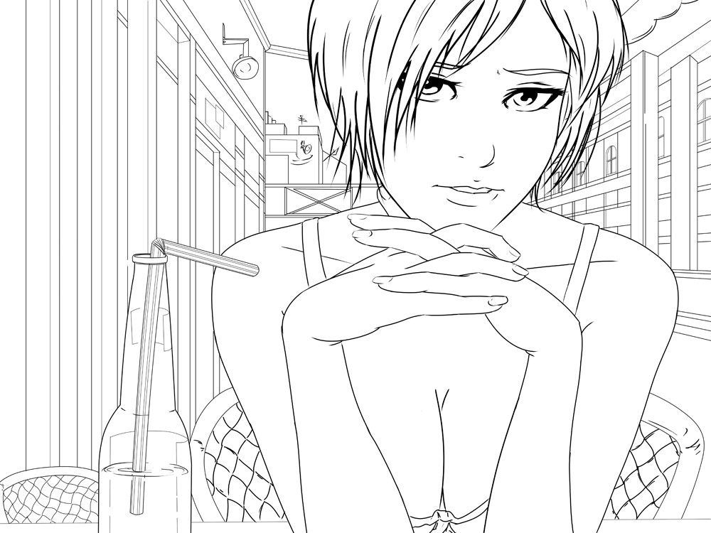
I remember seeing the lineart in progress at this year's Portcon! OwO
Lovely work! I love how detailed you are with coloring! The background is spectacular and the lines are always so smooth
👍: 0 ⏩: 0

I think it looks superb. I especially like the background, it's such a good realistic-looking paint job. The textures on the chair have that blurry photo realistic quality. I can't really criticize, since you're better than me, but if I could say anything, it's that the foreground style and the background style are not that compatible. The foreground objects have that slick digital airbrush quality, and the background has a muddy digital paintbrush quality, and it seems that her body is missing the tones and shadows that the background is benefiting from so she kind of looks out of place. But that could be the intention, in which case it's fine
👍: 0 ⏩: 0


Hmm like I always say you're just great at what you do. Lets see hmm the thing I noticed alot is that people critic you on too strong of a lighting on her, but well I dont know if they payed attention or not but on her right not ours, you see to lights, if you guess the length inbetween each one, the next light would just be right beside her, so I personally would you have the right amount of light.
Now the thing I would agree on is someone mentioned that her right shoulder is wider than her left, that part I have to agree on. Now the other thing I noticed is that you did a good job on the straw, but the thing you did do wrong was, well I dont know if you have ever paid attention or you forgot but when you put a straw in a bottle filled with liquad the part of the straw that is in the liguad is not alligned, with the other part of the straw out side of the liguad, well you know because the liquad moves light so it would make like the straw is split would be the word Im looking for, sorry if this confusing to understand its just this is the only way I guess I can explain, but over all instant Fav from me.
PS: But seriously dude you have to tell me how you got so good I dont know if you ever checked out my profile b ut Im not that good and if I want to be a cartoonist or make mangas I got to be on your level or better.
👍: 0 ⏩: 0


wow, really cute and daring =3 that's SO what I would focus on on a date

👍: 0 ⏩: 0

The only thing i can come up with is that you could try mixing hard and soft shading together.
Like a more defined shade area casted from her hair, and a smoother on her shoulders ect.
👍: 0 ⏩: 0

You did an amazing job with the shading ")
👍: 0 ⏩: 0


I would have to say...I think the drink would warp the straw a bit more, making it look disjointed..and the lineart round the hair is a little too dark..but apart from that, its a good job all round.
👍: 0 ⏩: 0

It's awesome, I love the coloring of the background, gorgeous piece!
👍: 0 ⏩: 0

Very Nice! I love how photo-realistic the background came out!
👍: 0 ⏩: 0


wooow amaizing coloured ^^ how long are you make thic pic?
👍: 0 ⏩: 0

mmmm. I like. <3 fav
Looks like whomever is on the other side of those eyes is gonna get some.
👍: 0 ⏩: 0

This drawing is really beautiful, yet the coloring really bugs me. The same goes for all of your pics actually, I really like your linearts, way more than the finished pieces.
It's so blurry, this kind of soft smooth coloring style doesn't really fit your detailed drawing style. Look at the nose for example. But worse is the abusive use of dodge tool. Her hands and shoulders are so bright it actually hurts the eyes. As for the hair, it looks metallic.
The background is very well done. But since it's lineless and detailed, it doesn't fit the rest. The girl just seems paste on top. If you colored your characters the same way you paint the backgrounds, it would look a lot better I think.
👍: 0 ⏩: 1

Mauguine is right
but She is so sexy with brush and pretty fingers
👍: 0 ⏩: 0

great, thanks. you've just got this [link] stuck in my head
👍: 0 ⏩: 0

Hm... The backround looks a bit off and unfinished, although I qould guess that is at least somewhat intentional because too detailed a backround would take the focus off of her.
Only other thing I have to say is that she looks a bit unreal in relation to the rest of the picure.
👍: 0 ⏩: 1

Unfortunately I have to agree with wastelandsofthemind on this piece. The coloring is not is refined as your other pieces, such as Waiting for You [link]
I remember the line art on this piece and I remember how fresh and airy it looked.
This piece I think needs to be "completed"...better use of lighting on the subject would definitely enhance the effect and tone of this piece.
Otherwise, yes, very nice cleavage! Bmuahaha!
👍: 0 ⏩: 1
The cleavage is indeed awesome.
👍: 0 ⏩: 0

Awesome!! You did just as good of a job as I thought you would!!
👍: 0 ⏩: 0

The bottle is amazing!
I think that she's a little to shiny. When it loaded, I had to squint a little. And I think her chest hangs out a bit too much. Without the arms there, her nipples would probably just peek out.
👍: 0 ⏩: 0
| Next =>