HOME | DD
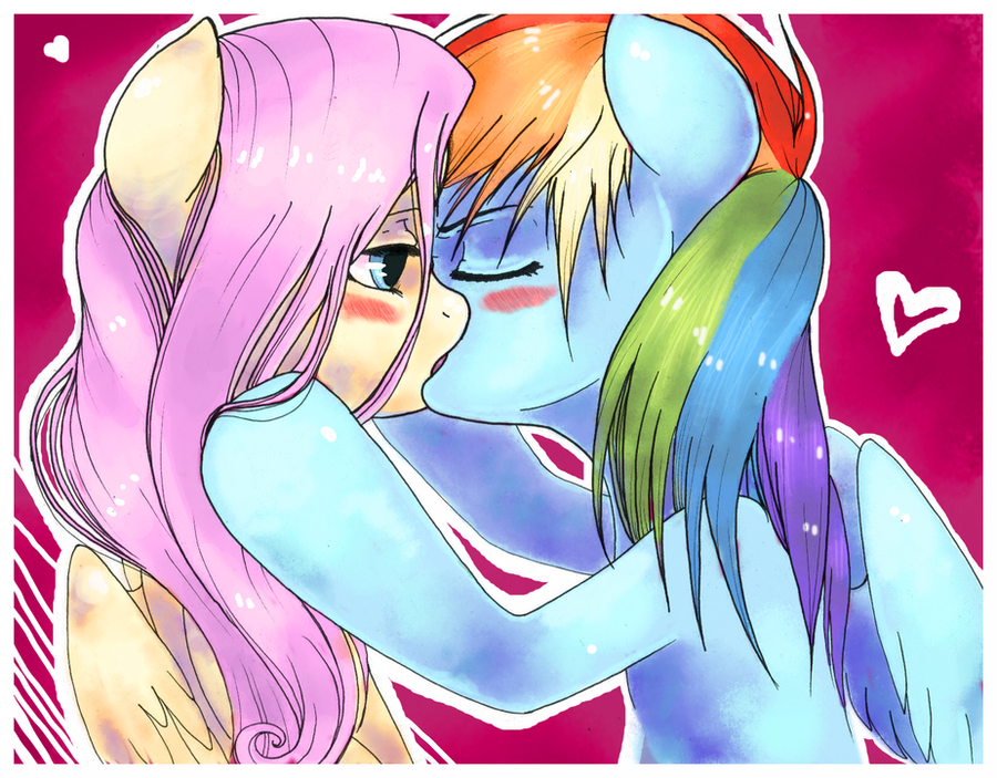
 JamesHalt — FlutterPie is Magic
by-nc-nd
JamesHalt — FlutterPie is Magic
by-nc-nd

Published: 2012-08-08 21:21:58 +0000 UTC; Views: 5271; Favourites: 166; Downloads: 680
Redirect to original
Description
This is an experimental picture where I tried some new ways to do things:--thicker lineart (easier to play with)
--coloured lineart (believe or not, it makes drawing genitals much easier)
--simplier shades & highlights (quicker)
--white lines as highlights for mane (as in my older pics and they're rilly fast)
--brighter eye shades
ANY opinions are MORE than welcome. Say especially if you don't like something because otherwise you'll see more like this in the future. I ain't sure 'bout those white lines, though...
I like the word "FlutterPie". It just fits so well :3
Related content


Comments: 24

How could I ever feel blue,
when I have a friend as awesome as you?
👍: 0 ⏩: 0

So shiny.....
But seriously, adorable! Flutterpie and AppleDash are my favorite ships! Under them is Twixie
👍: 0 ⏩: 0

")


Damn... thanks, gonna fix that soon
👍: 0 ⏩: 1

No prob! Glad to help
Funny thing, I only pay attention to little details like that when an artist ask for opinions like you did (don't ask me why, 'cause I don't know)
 (Wink)")
👍: 0 ⏩: 0

As a Pinkie Pie who loves a Fluttershy, this pleases me. ^u^
👍: 0 ⏩: 1


I love this picture for many reasons, it has Fluttershy, it has Fluttershy, it has a color blend, it's not kissing but it looks like it would be and Pinkie's hair is shiny. Also FlutterPie is fun to say
👍: 0 ⏩: 1

D'awww! This is really adorable! 
👍: 0 ⏩: 1
Now that I look at it, it really looks quite blurry! But good if the other changes please you.
👍: 0 ⏩: 0

I like the highlists on their mane, it gives a feel that it is made of jelly or something
Thicker lineart in my opinion suits these characters better(even though i can't find bigger difference between current and the previous size while looking at your drawings... Maybe because i get used to put a really thick lineart by myself), especially when it's coloured and not black.
Shading seems fine to me ( picture might be too bright and i can't feel it enough to find it wrong).
The only thing that actually bothers me - i think you overdid the blur in Pinkie's eyes a bit, but maybe it's just me.
And... it's all frome me :3 Ponies and peace :3
")
👍: 0 ⏩: 1
Oh, really cool if ya like the liddle changes I tried! The lines are indeed at least twice as thick as usually
Lol now that I look at it, the eye may be a... bit too blurry, yes.
")
👍: 0 ⏩: 0