HOME | DD
 JapanYoshi — How did this twig win out? (8 alternate new logos)

#deviantart #deviantartlogo #deviantartupdate #deviantartlogo2014
Published: 2014-12-06 01:13:12 +0000 UTC; Views: 12594; Favourites: 189; Downloads: 31
Redirect to original
Description
I made all these logos in a whim. I think at least 4 of them are better than the new logo.(BTW, if anyone at dA is looking at this, you can use any of the logos without paying or crediting me (even though a premium membership or just a couple of points would make me very happy)
Reply to the hater Winrry who apparently blocked me after the following rebuttal:
You seem to know nothing about logo design. Here are some of the things you missed:
- Those are a capital D and a lowercase A.
- They form a Venn diagram, signifying inclusion.
- To fit with deviantART's tagline "Turning the Art World Literally Upside Down", it is point-symmetrical.
- It's a sine wave, you uncultured [redacted]
- The wave and the middle line form the letters dA.
- The logo signifies that everyone is welcome, regardless of "wavelength".
- This is a (better) illustration of the logo makers' idea of "chopping the letters off".
- At first glance, it looks like an open sketchbook.
- However, if you put it in a square, you can see the letters "dA" more clearly.
- Congratulations! You got the imagery right for the first time!
- However, your look is way too shallow. When you rotate the logo 45° to the right, it forms a D.
- When you rotate the logo 45° to the left, however, it forms an A.
- It's a bell curve, you uncultured [redacted]
- The bell curve signifies a statistical distribution called "standard deviation". How's that for fitting?
- It also signifies that anyone, regardless of where your skill is on the bell curve, is welcome.
- This logo is a play on "thinking outside the box".
- The square is, obviously, the box. The sequence of circles are ideas, floating outside of the square. You know, like a bubble.
- It also looks like a checkbox or a canvas and pen if you look at it another way.
- Nothing much to say about that. It's a lowercase d overlaid by a lowercase a.
- It looks like a book from the side.
- Best of all, it's still better than the new one.
- That's a redesign of the one good dA logo we all know and love.
- However, instead of making the lines parallel, I made them into a check mark to signify approval.
- Unlike these alternate logos, the new logo looks like:
- Z
- X
- F
- T
- badly drawn cross
- badly drawn swastika
- percentage symbol
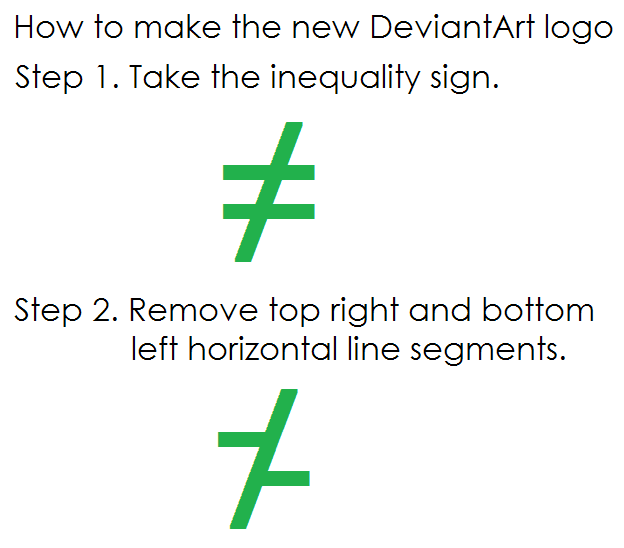
- inequality sign
- backwards dollar sign
- a twig
- a cactus
- a green blob
- a running green blob
- pharmacy symbol
- bamboo stick
- a browser error
- a weird unexplainable thing
- a gun
- a segment of a broken fence
- the result of an age-long art block
- a professional recreation of a crayon doodle of a 3 year old kid who just learned not to eat the green crayon
- the result of a bunch of designers going "f█k it"
- a bad inside joke that takes an entire essay to halfway explain
Whatever your branch of design is, my best guess would have to be clothes design or typography design, because it can't be about logo design.
Related content
Comments: 117

These are actually good, wish we could have voted on the new logo from deviant artist submissions. ;-;
👍: 0 ⏩: 0

What IS the new logo? I can't figure it out......
👍: 0 ⏩: 0

Woah, those are awsome logo designs!
Also, you could put under the description for the "broken stop sign" logo description that it shows the breaking of restrictions and limits of the art world, and there are no rules here on what you're "allowed" to post!
👍: 0 ⏩: 1

Thanks! Good to know that there are more desirable double meanings.
👍: 0 ⏩: 1

These are just amazing logos, and truely any one of them would be more understandable, cooler looking, and generally all-around better than the current one.
I tip my santa-hat to you, my good sir
👍: 0 ⏩: 0

All your logos look literally like made in a whim, politely said.
👍: 0 ⏩: 1

I literally made them all in a whim, so yes, you're right. .-.
👍: 0 ⏩: 0

They copied it from here too
platzkart.ru/
👍: 0 ⏩: 0

When I first seen it I was literally "What is that?" and here are others that i think it looks like:
-Road intersections
- two sevens (one is upside down and the other right side up)
- random strokes of paint
- An abstract object of some kind.
When a logo has multiple interpretations that has nothing to do with what it is representing then the logo is not a good logo and needs to be redone. A logo represents the business like how our signature represents us. Would you randomly change your signature to an alias out of nowhere and accept that your watchers would know who you are? That's the same concenpt of a logo. A logo represents a company to what they do and for their users to identify them by a symbol of some kind. If your users can't figure out who/what you are by your symbol then it's a fail. It's not just a logo, it's a representation.
👍: 0 ⏩: 0

I really like the logo you made that's right above the word "This"
👍: 0 ⏩: 0

Since Winrry apparently blocked me, here's her open reply:
"DA's logo is purely DA combined with sides cut."
See, you have to explain that before anyone goes through at least 10 of the 23 things the new logo looks like.
Also, maybe you could stop using my age as an attack, and also stop attacking 8 logos that I made in about 25 minutes only using the stroke tool. I could make polished logos if I had the time and thoughts to do it.
👍: 0 ⏩: 2

She makes me sad inside. Someone had to point out to me that it's a mirrored upside down A. It's not even "DA". it's.. an A. On its side. With most of hte A out of bounds.
Yours are all better.
👍: 0 ⏩: 0

I wonder if she'll block me too!
👍: 0 ⏩: 0

Everyone ignore this comment. I accidentally posted a reply not on the post.
Logo still sucks.
👍: 0 ⏩: 0

Ok, so let's start from the one that looks like a copy of chanel with two sticks on the sides. How is that DA? No ideas. o.o Then, to the right. The double parabola looks like from a site of mathematicians or people working with statistics. Much artsy ; )) I can't even comment the next one, cause it doesn't even resemble ANYTHING. Oh wait, now I see! It's grass! Great for botanics! The other one to the right looks like sign which says forbidden, just someone cut the circle and the string went down. Maybe it could work as a brand new road sign. The one under it looks like a bell o.o HUGE bell o.o The other one looks like bubble factory : D Then the one to the left looks like another grass. Or maybe a book from a side? For the best it could be for book publishing, but art? o.o And the last one. It looks like a half of the clock with an arrow that's too big for it. Suggest it for people that fix clocks maybe?? So yeah, I even found some meanings in them even though they're pretty terribly done if you look from aesthetic way. And yeah I work with graphic design so I don't need your bs about your courses.
You think I'm being mean? You're being mean to the logo which is well and professionally done. Actually a Z is much less seen there than the things that I mentioned in your logos. So if you dislike what I just said in any way, please rethink what you said about the new logo.
👍: 0 ⏩: 3

So, you're saying that we should all hail ZeviantFart?
Too bad I don't have the patience to read your whole comment. Luckily, I can read the future and predict you will most likely block me. As said, these were done quickly. With the time dA had, they could've made an excellent logo that was not a complete copy of another website, plak-whatever-it's-called.
I wonder if you read that. Probably, I don't write much. I'll just use emotes to explain.
👍: 0 ⏩: 0

I agree with this. It's so easy to say that a logo is awful if you specifically look for ways to misinterpret it. While it's true that this logo isn't the most recognizable out there, it's still better than most of the ones in this post. And I'm absolutely certain that if any of these were picked, that it would get nearly the same amount of backlash as the current one. The fact is, people don't like change. Hell, even I didn't like this one at first, but it's growing on me fast.
JapanYoshi , the stuff Winrry said is the exact sort of stuff you'd hear if one of your logos had been picked. At least half of your logos still mostly have to be explained to be understood, just like the current dA logo.
👍: 0 ⏩: 1

You must love inequality so much.
👍: 0 ⏩: 0

You seem to know nothing about logo design. Here are some of the things you missed:
- Those are a capital D and a lowercase A.
- They form a Venn diagram, signifying inclusion.
- To fit with deviantART's tagline "Turning the Art World Literally Upside Down", it is point-symmetrical.
- It's a sine wave, you uncultured [redacted]
- The wave and the middle line form the letters dA.
- The logo signifies that everyone is welcome, regardless of "wavelength".
- This is a (better) illustration of the logo makers' idea of "chopping the letters off".
- At first glance, it looks like an open sketchbook.
- However, if you put it in a square, you can see the letters "dA" more clearly.
- Congratulations! You got the imagery right for the first time!
- However, your look is way too shallow. When you rotate the logo 45° to the right, it forms a D.
- When you rotate the logo 45° to the left, however, it forms an A.
- It's a bell curve, you uncultured [redacted]
- The bell curve signifies a statistical distribution called "standard deviation". How's that for fitting?
- It also signifies that anyone, regardless of where your skill is on the bell curve, is welcome.
- This logo is a play on "thinking outside the box".
- The square is, obviously, the box. The sequence of circles are ideas, floating outside of the square. You know, like a bubble.
- It also looks like a checkbox or a canvas and pen if you look at it another way.
- Nothing much to say about that. It's a lowercase d overlaid by a lowercase a.
- It looks like a book from the side.
- Best of all, it's still better than the new one.
- That's a redesign of the one good dA logo we all know and love.
- However, instead of making the lines parallel, I made them into a check mark to signify approval.
- Unlike these alternate logos, the new logo looks like:
- Z
- X
- F
- T
- badly drawn cross
- badly drawn swastika
- percentage symbol
- inequality sign
- backwards dollar sign
- a twig
- a cactus
- a green blob
- a running green blob
- pharmacy symbol
- bamboo stick
- a browser error
- a weird unexplainable thing
- a gun
- a segment of a broken fence
- the result of an age-long art block
- a professional recreation of a crayon doodle of a 3 year old kid who just learned not to eat the green crayon
- the result of a bunch of designers going "f█k it"
- a bad inside joke that takes an entire essay to halfway explain
Whatever your branch of design is, my best guess would have to be clothes design or typography design, because it can't be about logo design.
👍: 0 ⏩: 3

I had number 2 in mind without knowing it has been already here.
👍: 0 ⏩: 0

Can you repost this into the main description?
👍: 0 ⏩: 0

I'm not even bothering to read this as I can already see it's not going to explain me anything 


And for your knowledge professional graphic designers don't work in a single branch as 'typography design'. Typography is a way to design, not a work branch. I know typography, I involve it in my projects, but if I only worked with that I owuldn't even be called a designer. Listen, kid. I can see in your profile that you are 15 years old so it's practically impossible that you have as much experience as I do in visual art, so don't try to tell me that you know logo design better than I do, because you were playing with toy cars when I was involved into design processes already 
And try to get to know what is a logo structure, as stroked random lines don't really work as logos
👍: 0 ⏩: 3

You are a horrific example of elitism in art and study. Even if English was your second language, the fact that you're doing nothing but ripping this "kid" apart through all of your posts and then mocking them for not being polite just paints you as a hypocrite and apparently incapable of understanding what the word "polite" means in English. In short, it means don't be a fucking asshole. You have managed to as IMpolite as possible. Again, in short, you behaved as a fucking asshole in your response to this "kid".
Obviously all that schooling you had for visual art didn't include any classes in being a decent person. That's too bad. Maybe your attitude will get you places in your chosen vocation, if so, good for you. But at least this "kid" has enough design ability at his young age to just use some mouse clicks and line tools to design logos that made a hell of a lot more sense to me WITHOUT the detailed explanation that you chose to ignore than dA's current logo.
Or your ranting. I had to reread your huge runon sentences repeatedly to evne understand what kind of crap you were trying (too hard by the way) to spew to sound intelligent. You just sound arrogant and egotistical.
👍: 0 ⏩: 0

Wow, vain much? What has age also got to do with this? Don't act like a dick just because you're older. They had made very fair points and were able to bulletpoint all their reasoning behind their logos which can make sense. The admins had to type up a good couple thousand words and throw a youtube video together before people could understand it; and some people STILL don't understand it. The logo is an obvious flop if the majority of people cannot understand it.
Also, don't insult everyone on this art site- not every deviant is 'immature'. Some people here are professionals who earn their wages from this place and other similar sites. Of varying ages too, of various skills. Some artists were able to pick up a pencil and just whip something up a billion times better than what you can do without the workshops and design classes too, whereas others have to work... does that affect the end result? Depends what perspective you have.
And as for 'low skill and idea(s)/conceptual level' ...All developers need these. For anything. That's where development comes from. An idea that gets worked on after you put it down. Did you not see the bunch of images on the boldly facing the future update? Those were concepts. Whooo what a concept! Hey look a thing is hidden here.
👍: 0 ⏩: 0

LOL, what a fucking huge blowhard and douchebag, I say! And you appear to be even less mature than this "kid" you're talking about. This "kid" doesn't make art his way of life, apparently, since he stated that he's a hobbyist, and you're blinded by your "transcendence" bullshit fine enough not to see that on his profile. This, however, doesn't stop you from mentioning this artist's age! What a terrible mistake. I feel sorry for you right here, frankly - seems that studying this hard and knowing that much leaves a terrible scar on your sense of politeness and ability to percieve random stuff on a daily basis. Gee, I wonder what you'll say when you'll get a chance to see a drawing made by a 3 y/o which has somehow made its way here, blow yourself up? Would be better for the majority of random deviants, that is.
Just letting y'know that you're not the... basically, who in the hell are you to teach anyone... anything? Somehow a mentor? I don't think so!
👍: 0 ⏩: 1

I love your "gaussian" design, though your mathematical approaches may require some insider information to be readable.
👍: 0 ⏩: 0

Because its simplistic. the new style of logos in 2010- is simplicity, 2000-2008 was strong gradients with more detailed logos.
I personally like the new one better because it's readable and easy to place, where as most of the other ones are clustered, confusing, and possibly have an unwanted double meaning.
👍: 0 ⏩: 1

"readable"
What the hell is that new logo, an inequality sign? Z? X? F?
"clustered"
The new logo is like an inside joke that only the hippest of the hipsters are supposed to get, as opposed to the nice, symmetric classic 
"confusing"
I think the new twig is myriads more confusing. Is it a cactus? Is it a roadsign? Ad infinitum. The guess "chopped-off letters d and A" will never show up.
"unwanted double meaning"
The new logo has many more. To list a few, there are: Inequality sign, Currency symbol, and Halfway-a-swastika.
👍: 0 ⏩: 2

I guess. I don't know, I like it.
👍: 0 ⏩: 1

DA is now a beautiful cactus. You just have to accept it.
👍: 0 ⏩: 0

It's also the exact same logo of another site...
👍: 0 ⏩: 0

I agree with you
I have 20 years as graphic design consultor,
We know what we talk about.
👍: 0 ⏩: 1

Thanks! I'm just a design junkie in high school, but I'm glad an experienced graphic designer agrees with me.
👍: 0 ⏩: 0

i love the one that looks like a check in a half circle. It's legible and resembles the old logo. I'm not a big fan of the new logo......also i wish they kept the original color of the green. the bright green is a pretty color, but DA has always stood for dark forest green and a yellow green.
👍: 0 ⏩: 0

👍: 0 ⏩: 0

Given what the DA business pretended to be about, why not just a simple sans serif font, fatten it up, then get a mosaic program and turn the DA into a crazed mosaic of a squillion thrillion pieces of DA users art? They'd all be too small to see individually, it would involve all the members or a mad high proportion of them, and would genuinely represent the community.
They're so quick to nag spam and harass for their advertisers, why on Earth not nag spam and harass for people to send them art to a folder to use in the mosaic?
One folder selection in a mosaic program later and every artwork tagged or in that folder becomes a pixel (or 4 pixels or 16 or whatever) in the mosaic.
Too sensible? Too inclusive? Not what they want for whatever commercialisation scheme they're up to?
👍: 0 ⏩: 0

You don't have to discredit us deviantArtists. Dig deeper and you'll find "better" dA logo proposals. Or see mine if you want.
👍: 0 ⏩: 1

Like I said, imo, not a single one is better.
👍: 0 ⏩: 2

Mine too? (it's in my gallery btw)
👍: 0 ⏩: 1

well... I'm not Paul Rand anyway.
👍: 0 ⏩: 0

This is not hating, thanks for understand and sharing.
I want the old logo back, not a copy!
platzkart.ru/
www.google.com.mx/search?q=log…
Movingbrands is the responsable of this abomination
www.movingbrands.com/
Let us ask together for help to Spyed to recover DA originality!
Also you can join and submit your art here:
praise-old-da-logo.deviantart.…
👍: 0 ⏩: 0

hah! These mongrels could indeed use one.
👍: 0 ⏩: 0
| Next =>


