HOME | DD
 JapanYoshi — How did this twig win out? (8 alternate new logos)

#deviantart #deviantartlogo #deviantartupdate #deviantartlogo2014
Published: 2014-12-06 01:13:12 +0000 UTC; Views: 12594; Favourites: 189; Downloads: 31
Redirect to original
Description
I made all these logos in a whim. I think at least 4 of them are better than the new logo.(BTW, if anyone at dA is looking at this, you can use any of the logos without paying or crediting me (even though a premium membership or just a couple of points would make me very happy)
Reply to the hater Winrry who apparently blocked me after the following rebuttal:
You seem to know nothing about logo design. Here are some of the things you missed:
- Those are a capital D and a lowercase A.
- They form a Venn diagram, signifying inclusion.
- To fit with deviantART's tagline "Turning the Art World Literally Upside Down", it is point-symmetrical.
- It's a sine wave, you uncultured [redacted]
- The wave and the middle line form the letters dA.
- The logo signifies that everyone is welcome, regardless of "wavelength".
- This is a (better) illustration of the logo makers' idea of "chopping the letters off".
- At first glance, it looks like an open sketchbook.
- However, if you put it in a square, you can see the letters "dA" more clearly.
- Congratulations! You got the imagery right for the first time!
- However, your look is way too shallow. When you rotate the logo 45° to the right, it forms a D.
- When you rotate the logo 45° to the left, however, it forms an A.
- It's a bell curve, you uncultured [redacted]
- The bell curve signifies a statistical distribution called "standard deviation". How's that for fitting?
- It also signifies that anyone, regardless of where your skill is on the bell curve, is welcome.
- This logo is a play on "thinking outside the box".
- The square is, obviously, the box. The sequence of circles are ideas, floating outside of the square. You know, like a bubble.
- It also looks like a checkbox or a canvas and pen if you look at it another way.
- Nothing much to say about that. It's a lowercase d overlaid by a lowercase a.
- It looks like a book from the side.
- Best of all, it's still better than the new one.
- That's a redesign of the one good dA logo we all know and love.
- However, instead of making the lines parallel, I made them into a check mark to signify approval.
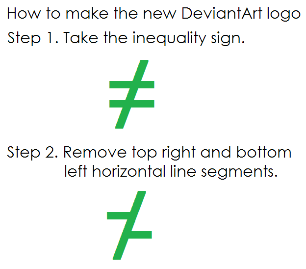
- Unlike these alternate logos, the new logo looks like:
- Z
- X
- F
- T
- badly drawn cross
- badly drawn swastika
- percentage symbol
- inequality sign
- backwards dollar sign
- a twig
- a cactus
- a green blob
- a running green blob
- pharmacy symbol
- bamboo stick
- a browser error
- a weird unexplainable thing
- a gun
- a segment of a broken fence
- the result of an age-long art block
- a professional recreation of a crayon doodle of a 3 year old kid who just learned not to eat the green crayon
- the result of a bunch of designers going "f█k it"
- a bad inside joke that takes an entire essay to halfway explain
Whatever your branch of design is, my best guess would have to be clothes design or typography design, because it can't be about logo design.
Related content
Comments: 117

Perhaps you could take a design class?
👍: 0 ⏩: 0

twig? that's too mildly, i say minimalistic swast*ka
👍: 0 ⏩: 0

I think this is subjective, because I wouldn't pick any of the alternatives as a dA logo.
But the joke itself is still funny.
👍: 0 ⏩: 0

STUPIDEST revision on a logo EVER.
It looks like a Z
or a wonky Z
or some "Not" equal sign
Someone was seriously drunk when they came up with this.
👍: 0 ⏩: 1

WELL WHY DAFUQ COULDN'T THEY HAVE JUST LEFT IT ALONE?!?!?
👍: 0 ⏩: 0

I would have went with the topmost right one, if I had a choice.
👍: 0 ⏩: 1

The Open Book or the Broken Stop Sign?
👍: 0 ⏩: 1

The open book. If you imagined that thing in a square, the letters "dA" are mentally visible.
👍: 0 ⏩: 0

I love the one that looks like a checked box, I think it's very cool and original
👍: 0 ⏩: 1

Thanks! I wanted to do something with the phrase "thinking outside of the box", so I drew a square and a sequence of circles. I think it also kind of looks like a sheet of paper and a pencil, or a tablet and a pen.
👍: 0 ⏩: 1
<= Prev |


