HOME | DD
 JasonTN — Balance

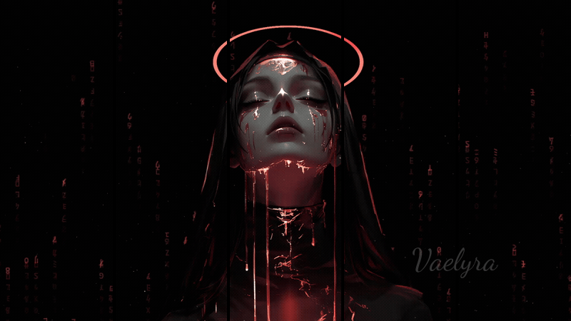
#balance #earthbound #harmony #moon #peace #sun #symbolism
Published: 2014-10-10 20:56:06 +0000 UTC; Views: 30363; Favourites: 1029; Downloads: 566
Redirect to original
Description
Hey guys, here's a painting that isn't of an angel") I'm still working on a few... trying to get the hang of painting clothing folds first before I come back to them, so they will be delayed.
I'm still working on a few... trying to get the hang of painting clothing folds first before I come back to them, so they will be delayed.I tried practising painting cloth and using symbolism.
I hope you all like it
")
Also check out my tumblr for more sketches, processes and more!
jasonarts.tumblr.com/ Draw Crowd : drawcrowd.com/jasonarts
Art Station: www.artstation.com/artist/Jaso…
Related content


Comments: 41

E P I C
May I use this as a desktop background? I'm in love with it!
👍: 0 ⏩: 0


This one is just dazzling and is one of your strongest images! I love her pose and calm expression which contrasts nicely with the strong, thick, quick brush strokes and the colors are mingling so well here! Excellent work!
👍: 0 ⏩: 1

Aw thanks so much  (Smile)")
👍: 0 ⏩: 0

This is beautiful! Some much movement in the piece, but the center is so calm and balanced!
👍: 0 ⏩: 0

Beautiful! I like how the blue sash twists as its cascades down. The loose energy of the brush strokes enhance that wonderful sense of movement.
👍: 0 ⏩: 1
haha thanks a lot
👍: 0 ⏩: 0


It is simultaneously balanced in the girl, but imbalanced in the background. Beautiful.
👍: 0 ⏩: 0


haha complimentary colours are da best
👍: 0 ⏩: 0


Oh it's gorgeous, even the strokes add to the mystical nature. The colours are so vibrant as well.
👍: 0 ⏩: 1
👍: 0 ⏩: 0


Very beautiful.
Though the art does need a little refining here and there but nonetheless it is wonderful.
Keep up the amazing work
👍: 0 ⏩: 1
haha yeah I know, im still working on figuring out how to fully render pieces. Thanks alot
👍: 0 ⏩: 0


 (Wink)")

I really enjoy the looseness of this image and you did a pretty good job with the clothing folds. Keep it up
👍: 0 ⏩: 1

hi That blue color is really beautiful and those small dots at the bottom gives a nice effect.and the face expressions really appropriate
👍: 0 ⏩: 1
heh thanks a lot
👍: 0 ⏩: 1
Continue the good work you are really getting better and I know that because I am not a new person I am that person who was always comment on your work and say strange things about that the time fit in a sword more than a spear if you remember I just changed the avtar
👍: 0 ⏩: 1
Thanks a lot
👍: 0 ⏩: 1
No need to thank me I'm happy you have noticed the name Thank you
👍: 0 ⏩: 0


It's a bit rough, but the visible brushstrokes make it look painterly.
Nice work!
👍: 0 ⏩: 1
haha yeah it was meant to be more of a sketch/study than anything
")
👍: 0 ⏩: 0