HOME | DD
 JasonZigrino — Google Search Material Design
by-nc-nd
JasonZigrino — Google Search Material Design
by-nc-nd

#app #apple #application #browser #dark #icns #ico #icon #icons #internet #light #mac #mack #osx #png #retina #web #windows #windows7 #yosemite #googlesearch #windows8 #windows8_1 #materialdesign #retinadisplay #iphone6 #ios8 #windows10 #osxyosemite #iphone6plus #googlematerialdesign #chrome #macintosh #googlechrome #material_design
Published: 2014-10-30 18:23:37 +0000 UTC; Views: 10383; Favourites: 48; Downloads: 1467
Redirect to original
Description
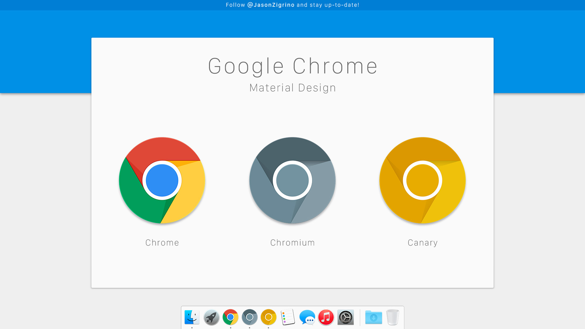
A Material Design Icon for Google Search. Use it to replace Google's Chrome Icon or whatever you like.Also my OS X Yosemite Google Chrome icon replacement.
Related content


Comments: 9

I don't use a Mac but gotta say it looks great.
👍: 0 ⏩: 1

I really like the execution of this icon. It looks just pretty enough to make its way into Yosemite unobtrusively while still stemming from Google's own design concepts.
👍: 0 ⏩: 1

WOW thanks! That's exactly what I was hoping to accomplish.
👍: 0 ⏩: 1
I chose to use that on my desktop Rocketdock as the Chrome App Launcher icon. I posted my screenshots on Windows 10 Custom Desktop Setup DARK THEME and gave viewers a link to your icon in the description
👍: 0 ⏩: 1
Thank you for the link, much appreciated.
👍: 0 ⏩: 1
What do you think of the desktop UI? Any recommendations or criticisms?
👍: 0 ⏩: 1
I thinks it looks great, possibly more space between the icons would aid in readability.
👍: 0 ⏩: 1
Thanx for the feedback! I'll try to find out what it would look if I can figure out how to tweak it to get a bit more space!
👍: 0 ⏩: 0