HOME | DD

jaycee13 β€” A Preview of the Next METRO

Published: 2011-06-04 12:41:33 +0000 UTC; Views: 18646; Favourites: 40; Downloads: 1242
Redirect to original
Description 
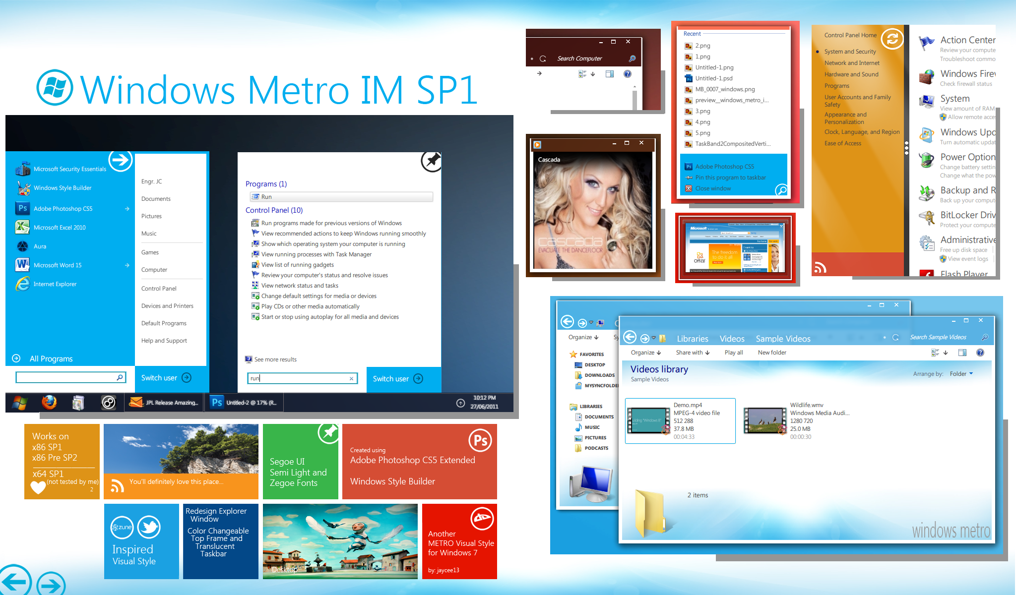
A preview of the next Metro Inspired Theme.. "Windows Metro IM"

The final theme will be release in a couple of days for I was working on some elements.

Stay tuned.

Thanks to the artists who supported me on this one... I will mention your name on the release date.

Enjoy the preview
Related content
Comments: 94

nzljc [2012-10-23 15:26:33 +0000 UTC]

anticipate!

πŸ‘: 0 ⏩: 0

kendly [2011-07-02 02:55:39 +0000 UTC]

amazing.

πŸ‘: 0 ⏩: 1

jaycee13 In reply to kendly [2011-07-02 03:22:51 +0000 UTC]

Thanks!!

πŸ‘: 0 ⏩: 0

CarvalhoDaniilo [2011-06-18 21:09:50 +0000 UTC]

It will be manual installation? or will it be like this: [link]

πŸ‘: 0 ⏩: 1

jaycee13 In reply to CarvalhoDaniilo [2011-06-19 01:18:50 +0000 UTC]

manual installation..

πŸ‘: 0 ⏩: 0

mnyk [2011-06-18 13:41:59 +0000 UTC]

nice i can't wait

πŸ‘: 0 ⏩: 1

jaycee13 In reply to mnyk [2011-06-18 14:50:22 +0000 UTC]

it's already released: [link]

πŸ‘: 0 ⏩: 0

magnus87 [2011-06-13 00:29:35 +0000 UTC]

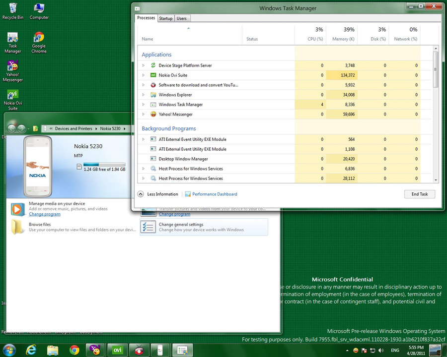
Excelent but I see an eight "8" on Recent Documents :S

πŸ‘: 0 ⏩: 1

jaycee13 In reply to magnus87 [2011-06-13 01:21:43 +0000 UTC]

really? where was that?

πŸ‘: 0 ⏩: 1

magnus87 In reply to jaycee13 [2011-06-13 21:27:38 +0000 UTC]

Normal Aero Start menu


Recent Files Β»


Nextmetro Start Menu

Recent Files 8


ΒΏ8? O.o

πŸ‘: 0 ⏩: 0

markizvonschnitzel [2011-06-11 09:31:42 +0000 UTC]

looks great, i hope it is usable. i just don't like the orange on the left.

πŸ‘: 0 ⏩: 1

jaycee13 In reply to markizvonschnitzel [2011-06-11 14:37:33 +0000 UTC]

Thanks!!

already released: [link]

πŸ‘: 0 ⏩: 0

kuba096 [2011-06-11 08:59:19 +0000 UTC]

Remeber about x64 users...

πŸ‘: 0 ⏩: 1

jaycee13 In reply to kuba096 [2011-06-11 14:31:56 +0000 UTC]

I don't have a x64 architecture..

πŸ‘: 0 ⏩: 0

L1nkysys [2011-06-08 10:57:13 +0000 UTC]

sir pwede mo akong tulongan gusto ko kcing mag develop ng VS para windows 7. ung facebook style at saka rainmeter din at CAD.

πŸ‘: 0 ⏩: 1

jaycee13 In reply to L1nkysys [2011-06-08 12:14:34 +0000 UTC]

sa VS pwede akong makatulong pero sa rainmeter and CAD baka hindi.. di pa kc ako nkakagawa ng themes para dun eh...

πŸ‘: 0 ⏩: 1

L1nkysys In reply to jaycee13 [2011-06-08 12:54:58 +0000 UTC]

salamat sa offer mo sir. kaya lng hndi pa ko expert sa photoshop. lol sa pag eedit lng ng pictures yung kaya ko

πŸ‘: 0 ⏩: 0

pighead3 [2011-06-08 02:47:09 +0000 UTC]

Awesome!~~~Like it!~~

πŸ‘: 0 ⏩: 1

jaycee13 In reply to pighead3 [2011-06-08 04:46:08 +0000 UTC]

thanks...

πŸ‘: 0 ⏩: 0

ShayGTi [2011-06-07 15:46:16 +0000 UTC]

this looks realy great. you do know that W8 will not actually look like this? it's a shame.
it will have metro UI and the standard W7 look a like UI. i think they need to combine it to look like your theme.

looking forward to use it.

πŸ‘: 0 ⏩: 1

jaycee13 In reply to ShayGTi [2011-06-07 15:51:38 +0000 UTC]

yah i know, they will still use the native win7 interface (minus the start menu because of the tile based start page)... but it's too early for us to judge the next OS, i know that what we have seen, was only the first taste of Windows 8...

Thank you...

πŸ‘: 0 ⏩: 0

yukimura12 [2011-06-07 11:55:51 +0000 UTC]

nice man can't wait for the release

πŸ‘: 0 ⏩: 1

jaycee13 In reply to yukimura12 [2011-06-07 11:58:00 +0000 UTC]

thanks... it's almost done.. under beta testing..

πŸ‘: 0 ⏩: 0

sampong8 [2011-06-07 08:26:04 +0000 UTC]

It so great!!!! I cant wait final man~!!!! I suppot you

πŸ‘: 0 ⏩: 1

jaycee13 In reply to sampong8 [2011-06-07 08:35:01 +0000 UTC]

Thanks man!!

πŸ‘: 0 ⏩: 0

L1nkysys [2011-06-07 06:22:02 +0000 UTC]

awesome! are the window frame rounded or squared???

πŸ‘: 0 ⏩: 1

jaycee13 In reply to L1nkysys [2011-06-07 06:23:54 +0000 UTC]

it is squared. to fit with metro..

πŸ‘: 0 ⏩: 1

L1nkysys In reply to jaycee13 [2011-06-07 06:29:44 +0000 UTC]

great. it appears the navigation buttons are far from the border. you could adjust it so it will be closer by following this tut: [link]

πŸ‘: 0 ⏩: 2

jaycee13 In reply to L1nkysys [2011-06-07 06:50:27 +0000 UTC]

fixed [link]

πŸ‘: 0 ⏩: 1

L1nkysys In reply to jaycee13 [2011-06-07 07:03:41 +0000 UTC]

yeah!

πŸ‘: 0 ⏩: 1

L1nkysys In reply to L1nkysys [2011-06-07 07:07:17 +0000 UTC]

i forgot: is the taskbar black by default such as in your ss?? you could remove the extra arrows in the start menu if you want to.

πŸ‘: 0 ⏩: 1

jaycee13 In reply to L1nkysys [2011-06-07 07:50:17 +0000 UTC]

yah.. I made it black same as with win 8..

πŸ‘: 0 ⏩: 0

jaycee13 In reply to L1nkysys [2011-06-07 06:33:10 +0000 UTC]

ok.. i'll try this one.. thanks for your feedback..

πŸ‘: 0 ⏩: 0

Lucas45wem [2011-06-07 02:23:49 +0000 UTC]

P.E.R.F.E.C.T

+Watch U now!

πŸ‘: 0 ⏩: 1

jaycee13 In reply to Lucas45wem [2011-06-07 02:42:41 +0000 UTC]

T.H.A.N.K Y.O.U

Thanks for Watching

Ka-chow!!

πŸ‘: 0 ⏩: 0

magnus87 [2011-06-06 20:59:21 +0000 UTC]

[link]


Excelent Work

πŸ‘: 0 ⏩: 1

jaycee13 In reply to magnus87 [2011-06-06 23:15:56 +0000 UTC]

yeah.. with permission of course... you will appreciate the difference when you see the result..

πŸ‘: 0 ⏩: 0

Shad3man [2011-06-06 18:21:25 +0000 UTC]

magnifico! Γ¨ bellissimo!

πŸ‘: 0 ⏩: 1

jaycee13 In reply to Shad3man [2011-06-06 23:17:59 +0000 UTC]

Grazie a voi .. Contento che vi piaccia

πŸ‘: 0 ⏩: 0

nolan2112 [2011-06-06 15:53:48 +0000 UTC]

[link]

πŸ‘: 0 ⏩: 1

jaycee13 In reply to nolan2112 [2011-06-06 16:09:34 +0000 UTC]

?? you link me to my own page? strange huh...

πŸ‘: 0 ⏩: 0

kaildeath [2011-06-06 10:10:44 +0000 UTC]

It looks nice Keep it up!

πŸ‘: 0 ⏩: 1

jaycee13 In reply to kaildeath [2011-06-06 10:27:40 +0000 UTC]

Thanks kaildeath...

πŸ‘: 0 ⏩: 0

TheMooDude [2011-06-06 02:27:21 +0000 UTC]

this looks great. Can't wait for the release!!! One issue in the screens; the back button seems to be slightly cut off by the titlebar in explorer- but that asside it looks brilliant!

πŸ‘: 0 ⏩: 1

jaycee13 In reply to TheMooDude [2011-06-06 10:27:19 +0000 UTC]

Thanks for the feedback.. the cut was due to the size of the button.. slightly big enough on the frame... but then, it's a style..

πŸ‘: 0 ⏩: 0

picaccino [2011-06-05 20:43:33 +0000 UTC]

amazing work! cant wait to use it real, i will be happy to use it..
love Metro-style..

πŸ‘: 0 ⏩: 1

jaycee13 In reply to picaccino [2011-06-06 12:30:13 +0000 UTC]

Thanks...

πŸ‘: 0 ⏩: 0

martin10018 [2011-06-05 15:07:14 +0000 UTC]

Looks promising!

Why is the font in the Windows Update window caps and bold?

πŸ‘: 0 ⏩: 1

jaycee13 In reply to martin10018 [2011-06-05 15:21:14 +0000 UTC]

Thanks martin.. that's the font style used in Zune's push buttons...

πŸ‘: 0 ⏩: 0

ventiseiad [2011-06-05 08:31:32 +0000 UTC]

epic!

πŸ‘: 0 ⏩: 1


| Next =>