HOME | DD
 JDCalderon — Help again which do you like?

Published: 2009-06-29 08:01:32 +0000 UTC; Views: 939; Favourites: 20; Downloads: 22
Redirect to original
Description
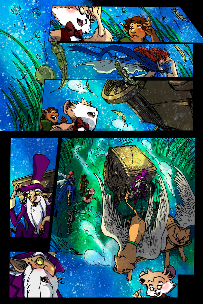
Character created and written by *JDCONEPencils and inks by Jade Gonzalez ~JadeGL
Colors by David Montoya~ryuscape
Here's the cover to 'My first day' and I was just wondering which one of them do you guys like?
Related content


Comments: 50


Hmmm, I'd say the first one is the most fitting as the character in your story was supposed to be different from the rest, wasn't he? Well, the spotlight is trained on him in this pic, which draws the eye more to the center. where he stands.
👍: 0 ⏩: 0

I like the right one. The white makes it pop more.
👍: 0 ⏩: 0


the 1st one is the best because it focus more on the charackter. why dont he use a real ground, it looks somehow boring without snf with he could play more with the lightning.
👍: 0 ⏩: 0

A watcher of mine said that you'll be interested looking at this: [link] ^^"
👍: 0 ⏩: 0

 (Wink)")

The first one, it feels like the mice are actually in a real environment, so it creates a story on it's own.
👍: 0 ⏩: 0


1st one! He's singled in the light, which is what he seems to feel like upon realization >3
👍: 0 ⏩: 0


Oo they're all great!! I like the one on the far left, if you want to go for something more dramatic/dynamic (since it has a lot of contrast). And the one on the far right looks nice as a simple illustration!!!
👍: 0 ⏩: 0

I'd say the first from the left. It has a clear focus, unlike the rest, which seem cluttered.
👍: 0 ⏩: 0

I like the first one, it makes it look more ominous. Like he's singled out and scared on first day of school.
👍: 0 ⏩: 0

I say first one (furthest left), Why: It focuses on the main character better, AND the darker gradiant adds depth to the space and makes the number of "siblings" a little more daunting.
👍: 0 ⏩: 0

I like the one one the right. It's simple easy - Less is more. Only thing Oswald should be the only one with a drop shadow.
👍: 0 ⏩: 0

No. 3. At first glance, the pic looks like an assortment of mice, but it doesn't that take long for the viewer to notice that mouse with a bowtie with a distressed expression.
👍: 0 ⏩: 0


The first one/ the very left one - I also really like the spotlight~
👍: 0 ⏩: 0


The middle one, but desaturate the colors more, on everyone but the central figure.
👍: 0 ⏩: 0

I like the first one to the left, the gradation really helps the viewer which mouse to pay attention to. Almost like a spot light. The middle can work too if you don't want gradation too dominate.
👍: 0 ⏩: 0

 (Smile)")

The furthest left. It give more dramatic feel with that hint of gray/blue on the floor.
👍: 0 ⏩: 0


The one with the white floor, JD.
It´s easier to read it.
👍: 0 ⏩: 0


hmm...I can't choose between the first and the middle onese.
👍: 0 ⏩: 0

Somewhere in between the first two. The first one is too dark and the second one is too light. @_@
👍: 0 ⏩: 0


I like cover "A" better. The protaganist seems to pop out a lot more in that picture.
👍: 0 ⏩: 0

First on the left...it brings out Oswald...yay he's so cute there
👍: 0 ⏩: 0

the one with the dark shading,(or the left one). the Bow tie is kind of hard to see.
👍: 0 ⏩: 0


first one on the left is better. because it gives a better focus on the main character. it is also more interesting because there are more colour changes, which makes it easier to distinguish the main focus point too.
👍: 0 ⏩: 0


")


I like the left one it has more depth to it and on the others the mice towards the back look a bit as if they are floating.
👍: 0 ⏩: 0


since the mouse with the red ribbon seems to be the main character who's pondering while all the other rats are just.. minding their own business, i say the first one
👍: 0 ⏩: 0


Hey, that's a really cool cover. I love all the detail.
I def. vote for the middle one. The gradient's more subtle than the one on the left, while still drawing in to emphasize the guy with the red bowtie (bowtie? it's kinda small), whereas the plain white background doesn't really let the eye focus anywhere in particular. Also, the middle grey fits in nicely with the value range on the mice. The white looks too stark; the mice toward the top of the page start getting lost on the really dark bg.
just some thoughts. hope it helps.
👍: 0 ⏩: 1

I agree, the middle one does have a good gradient that don't get the background guys lost.
👍: 0 ⏩: 0
