HOME | DD
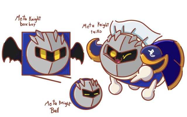
 Jdoesstuff — Meta Knight Design Analysis

#characterdesign #kirby #metaknight
Published: 2018-12-06 20:13:27 +0000 UTC; Views: 11711; Favourites: 222; Downloads: 20
Redirect to original
Description
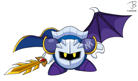
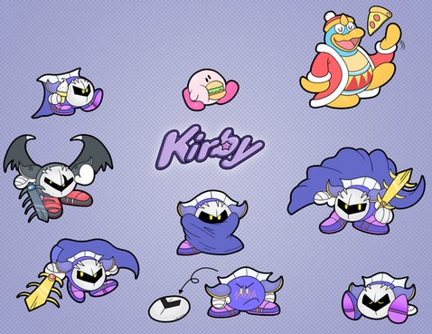
It's been over 3000 years.... Finally finished up my design analysis on the big 3 Kirby characters! Here, we look at Meta Knight. There's a few key differences between each era. I would've included his wings and his sword, Galaxia. But I felt it would be better to keep it strictly Meta Knight himself!
What's your favorite design for Meta Knight? Personally, I'd have to say snes/gba era.
Oh, and I will smack the next person who tells me that Meta Knight doesn't wear boots and that his feet are naturally purple.
Kirby characters © Nintendo/HAL laboratory
Related content
Comments: 12

👍: 0 ⏩: 0

👍: 0 ⏩: 0

👍: 1 ⏩: 0

👍: 0 ⏩: 0

👍: 0 ⏩: 0

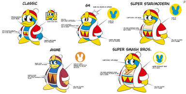
Now if they could only make up their minds on Dedede's eyeballs...
👍: 1 ⏩: 0

Modern looks are my faves. Interesting to see what the anime changes were.
👍: 2 ⏩: 0

I can hear the Spanish accent radiating off the anime one! That one is my child.
👍: 0 ⏩: 0

Snes/GBA era is also my favorite.
Also, it seems that Meta Knight's color scheme tends to change a lot. One moment he's darker and the next he's lighter.
👍: 0 ⏩: 0

