HOME | DD
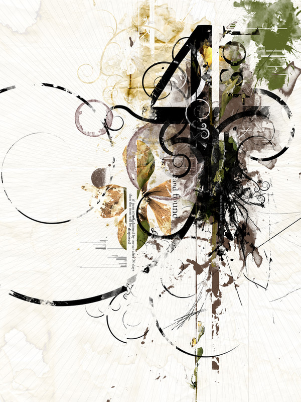
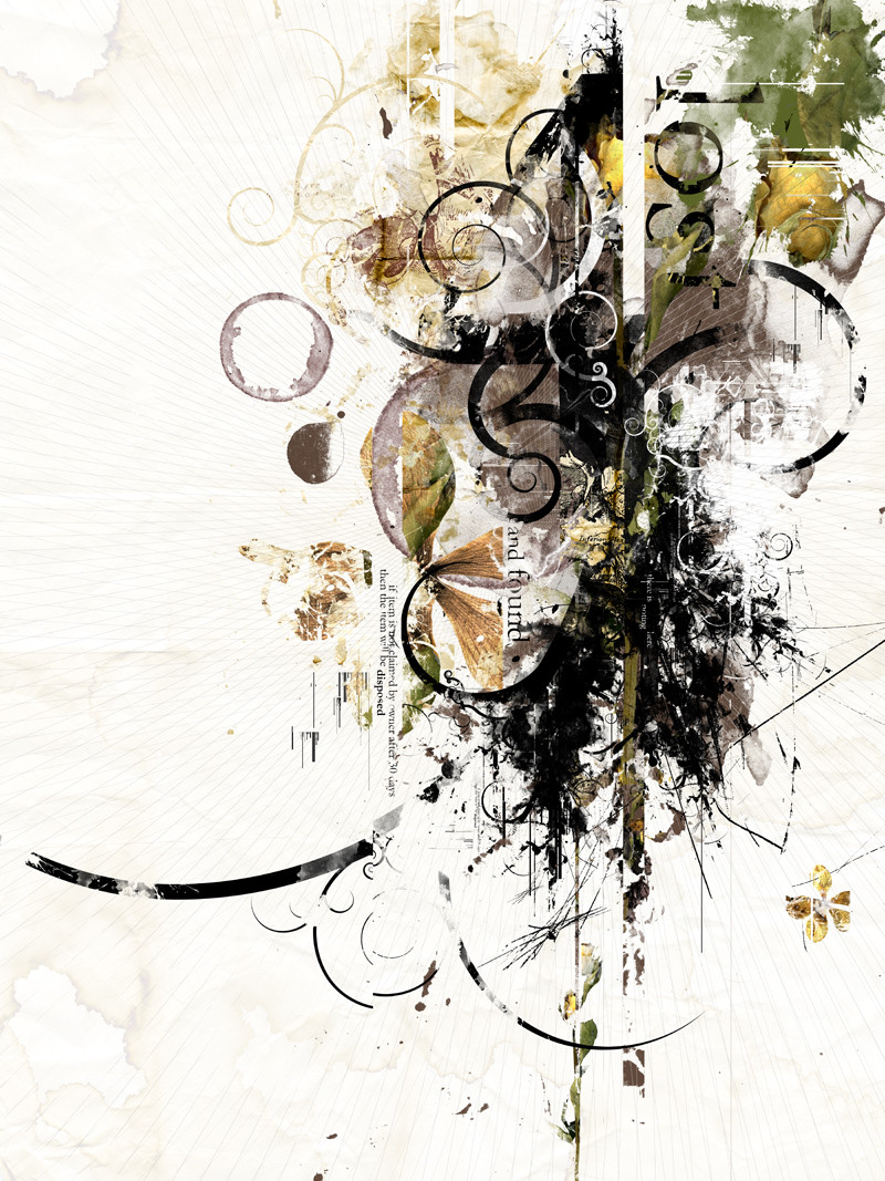
 jedeye459 — Lost and Found
Published: 2007-03-22 02:47:24 +0000 UTC; Views: 1112; Favourites: 7; Downloads: 40
Redirect to original
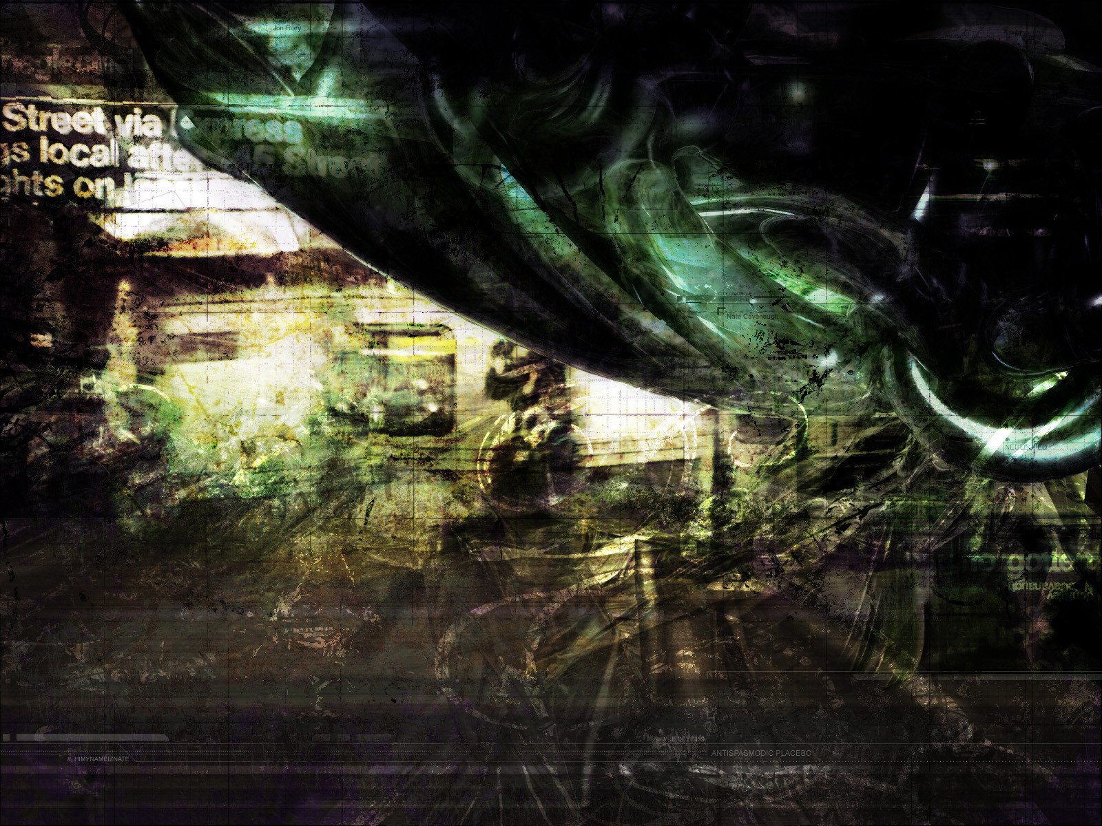
Description
I'm happy with how this piece has been progressing but it's not quite there. Any suggestions, questions or comments are welcome. Thanks!Related content


Comments: 27

oh i love it.
if you don't mind me asking.
what program(s) did you use to make this?
👍: 0 ⏩: 1

I'm glad you enjoy it  (Smile)")
👍: 0 ⏩: 1
oh wow.
thats all?
impressive iv never really tried to do anything like that.
but it looks hard
👍: 0 ⏩: 1
Yup... Photoshop and a scanner can go a long way
 (Wink)")
👍: 0 ⏩: 1
for sure. so then did you design some of that stuff yourself on paper and just kinda put it all together in photoshop?
👍: 0 ⏩: 1
The elements that I scanned in were pretty raw. There was not much planning involved, I pretty much just threw globs of paint at paper, poured coffee on stuff, and even used some dried flowers. After I had a decent collection I started looking at individual scans, and how they would interact with one another. I'm not sure if you have seen it but the final result is here [link] there were a few small changes, but I feel the impact was great.
👍: 0 ⏩: 1
seriously?!?! WOW it looks so much for difficult then that.
👍: 0 ⏩: 0

love love loooooooove the colors and layout. it's awesome!!!! great job

👍: 0 ⏩: 1


very cool!
I only have one suggestion, if i may:
I personally would have used a more saturated colour for the yellow and green areas (splashes). I think it would give the whole image more contrast. Maybe a Magenta and a Blue or someting. but thats REALLY a matter of taste.
great design!
👍: 0 ⏩: 1
Good call! some magenta could add some energy!
👍: 0 ⏩: 0

I agree with ~evilfutsin
I think you might need one more earthy element.
I'm not quite sure about the lone swirl on the left. Seems out of place and not really connected well.
👍: 0 ⏩: 1
Thanks! Taking another look at the swirl I agree with you. I will play with it... I think taking the top part of it off, and just leaving the bottom part would look nice, but I will have to try it.
👍: 0 ⏩: 0

Like it! The one thing I do feel is missing, though, is something that makes it feel a bit...organic. The touches of the flowers and mud-like splatters are working nicely, but they seem like the tie-in from the inky/shape forms and the flowery stuff. Maybe something a bit more earthy?
I dunno, just a thought.

👍: 0 ⏩: 1
Thanks, I appreciate it! I will play around with that.
👍: 0 ⏩: 0


"not quite there"? Whoa, if you don't think it's done yet, then I wonder how great the finished one is!
Heh, sorry for the outburt... forgot the part where I was supposed to comment: Great job! I love the combination of those colors!
👍: 0 ⏩: 1
Thanks... you go to far
Glad you enjoy it!
👍: 0 ⏩: 0
