HOME | DD
 jeffwamester — Compositional Constititional #3

Published: 2012-08-24 20:22:46 +0000 UTC; Views: 11263; Favourites: 258; Downloads: 303
Redirect to original
Description
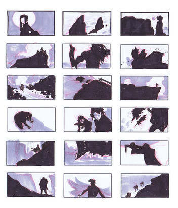
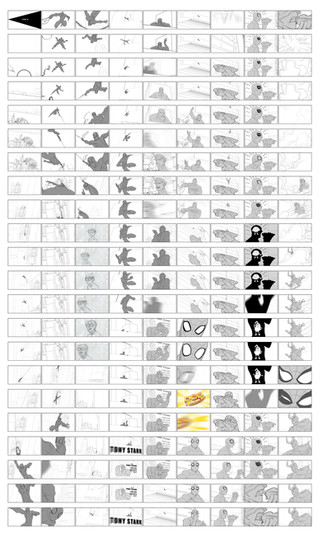
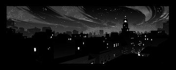
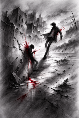
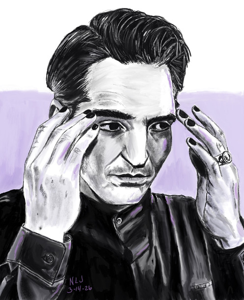
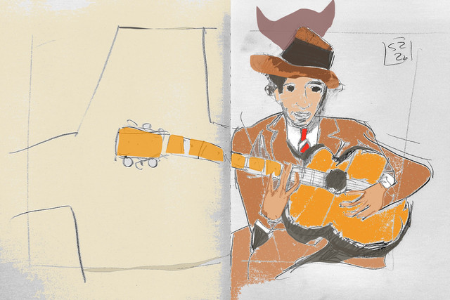
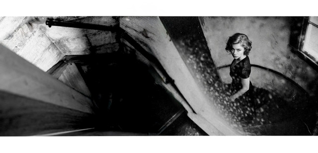
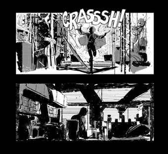
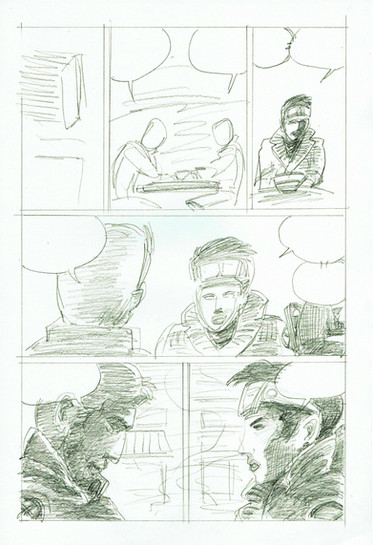
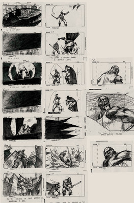
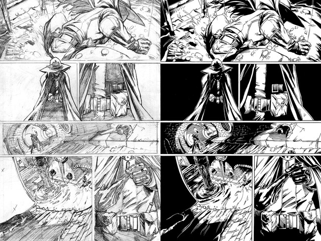
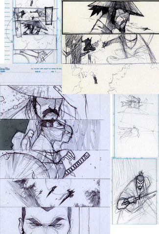
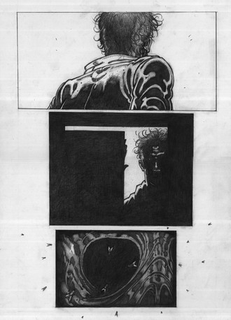
More focus on how grey plays a part in the composition... also included a few more things I have learned in this process...If you wanna join in on the fun:
PS: Comments, questions etc. encouraged... I am trying to learn more and learn from you guys what you guys do to work on this skill.
PPS: What would you guys think if I posted a tutorial on the process I am experimenting with?
PPPS: Yes, I think of myself as a rogue art scientist. wanna fight da'bout it?!
Related content
Comments: 28

Heya, I really enjoy these!
You really go at all the ideas and possible compositions/moods, and it's SO good.
I realize this is a couple of years old, but have you ever pursued the idea of making a tutorial of the process?
👍: 0 ⏩: 0

i got one for ya. this looks a lot like what richard schmid calls 'pattern' - the strongest principle of design. his book 'alla prima' talks about it more in depth, but basically it has to do with the shapes created by connecting the darks in a composition.
i like finding connections between different applications of art. *ding
👍: 0 ⏩: 0

i'm not this far along. i'm definitely interested in it.
good on you for leading the charge.
👍: 0 ⏩: 0

Oh, one more thing... A lot of your compositions have the point of interest in the dead center... Not necessarily negative, just something to be aware of (if someone hasn't already mentioned it)
👍: 0 ⏩: 0

nice! the shades of grey are especially remarkable on the second on the first row giving an impression of distance in between the people (relative to the viewer), and on the seventh in the same row as the person goes in the tunnel!!
an amazing series of composition so far!!
if you would be so kind could you please do the tutorial thing?
👍: 0 ⏩: 0

anouuu...I dont understand the flow of the story unlike the previous ones... But mabe I justcant figure which parts to look at first >.>'' sorry... But I do wanna see a tutorial
👍: 0 ⏩: 0

a lot of these are really awesome. My two favorites are the one with the rings and the second to last one with the river. Do you use reference for that? or are you just boss like that
👍: 0 ⏩: 0

These continue to be awesome. So glad you're posting them!
👍: 0 ⏩: 0

These are really awesome!
One suggestion though, fade objects that are further away to help create depth, this would especially help for the 5th, 6th and 7th thumb for the top row. The technical term for it is "Atmospheric Perspective" if you care to look up a more detailed explanation.
Seriously though, these are really good compositions.
👍: 0 ⏩: 0

Ooh, I really like the one where the person is walking through a tunnel 
👍: 0 ⏩: 0

TUTORIAL: DO WANT!
Thanks for the template! A lot of the time I find myself being really bad at "stepping" back and looking at the big picture and paying attention to the composition. This is just the kind of exercise I need to practice with.
👍: 0 ⏩: 0

Are you making these compositions off of a story or anything? Or just making up cool comps from your head for nothing in particular?
👍: 0 ⏩: 1

Comps from my head, no story...
👍: 0 ⏩: 1

I'm even more impressed then
👍: 0 ⏩: 0

Yes, please, bring on the tutorial!
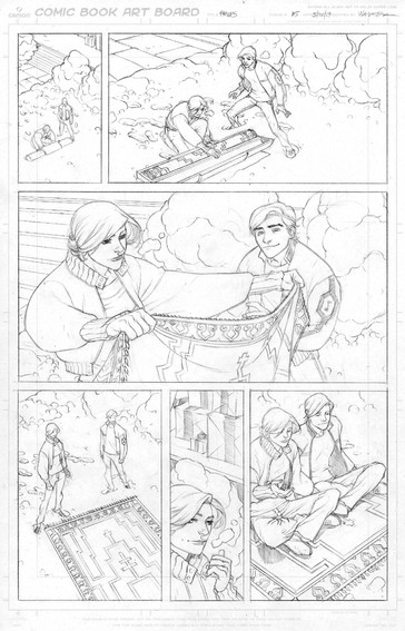
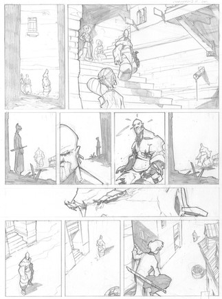
Also, what about thumbnailing a comic-page like this? These work great for illustration/covers/... but, you among those who know best, know that a comic page works differently than a pin-up. Yes, the typical thumbnails look similar, but its a bit unusual to see comic page thumbnails with spotblacks, or even with greys. You got the skills, we need the thrills
Thanks in advance.
👍: 0 ⏩: 1

No difference actually, you just have to add in another layer of consideration ( i.e. that a narrative has to connect and build between each composition. ) and in some circles people believe you need to consider the page as a whole versus individual panels ( although I believe that just ends up interfering with the story for the sake of a "pretty page" ).
👍: 0 ⏩: 1

Hm, yeah, the comic page works as a whole but as you said, narration is more important than a pretty page. Looking forward to the next deviation.
👍: 0 ⏩: 0

Wouldn't you want to try other canvas sizes? Like squares and A4?
👍: 0 ⏩: 2

Yes, and no... the theory is the same really. Design is about proportion and intention. Canvas size/shape is just the vessel you are confined to....
👍: 0 ⏩: 1

agreed the theory is the same, but in real life you don't only get to work on banners is all I'm saying 
👍: 0 ⏩: 0

p.s. really diggin' all of these so far
👍: 0 ⏩: 0

