HOME | DD
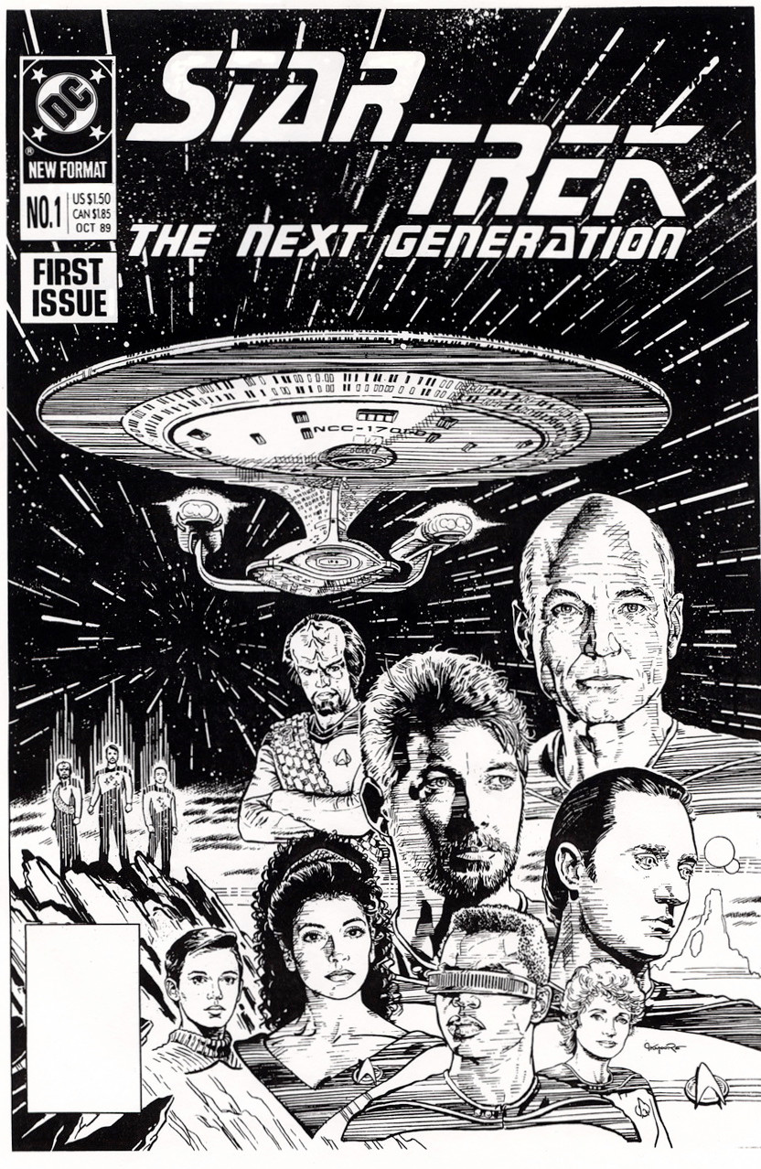
 Jerome-K-Moore — STAR TREK: The Next Generation #1 Return To Raimon

Published: 2007-04-01 04:57:45 +0000 UTC; Views: 10507; Favourites: 144; Downloads: 223
Redirect to original
Description
Comic Book Cover, DC Comics' STAR TREK: THE NEXT GENERATION. Pencil, Ink, Opaque gouache.I dug up this old photocopy of my illustration for the first issue of DC's regular series of the Enterprise D crew. Sorry for the grime. lol But that's "old school," as you "kids" here at DA keep reminding me.
Related content
Comments: 53

Old School is the best school.
👍: 0 ⏩: 0

I especially love the way you did the starlines here.
👍: 0 ⏩: 0

Jerome K Moore...you don't know how excited I am to see you on Deviant Art. I was a big fan of your's back in the day. Hell, one of the main reasons I bought all of the "Star Trek" Comics back then was mainly to own a piece of your work. Then all of a sudden it seemed like you disappeared. Over the years I'd do Google searches from time to time, but not much would come up about your current whereabouts. I just wanna say that I love your work and happy to see you still producing.
👍: 0 ⏩: 1

Thank you, Mr. Troy Grzych. I do appreciate your kind words.
Yeah, comics is a difficult way to make a living, and I took a staff job at Warner Bros for a time.
But I'm back freelancing now, so we'll see what damage I can manage now.
👍: 0 ⏩: 1

Thanks for responding and I can't wait to see what you come up with next.
By the way, recently I was unceremonially laid off from my graphic design/illustration job after 10 years. So I now find myself in the position of trying to decide what my next move is. I've always had a desire to maybe pursue something in the comic book field ever since I was a kid. What particularly is difficult about the comic book industry, just incase I ever think about trying to dive in? I could definitely use a piece of advice from someone who's been part of that industry.
👍: 0 ⏩: 1

Umm... I don't think this is appropriate to discuss openly here.
👍: 0 ⏩: 1

Understood...nuff said. Keep up the great work! Thanks for all the great images you've created in the past and I look forward to all the new ones you're gonna give us in the future!
👍: 0 ⏩: 1

Thanks!
I'll try to answer your questions in a private note.
👍: 0 ⏩: 1

That would be great, I'd appreciate it. Thanks.
👍: 0 ⏩: 0

STNG
You ARE really good at this..
Envious
'Got to fav...
👍: 0 ⏩: 0

I don´t know anything if is it is old or new school.
This is Great and I have this issue with Sulo/Takei signature.
Whish I could do liknesses like that.
👍: 0 ⏩: 1

Well, it certainly isn't 'new school.' LOL! And that's fine.
What the heck is Takei doing signing a Next Gen comic?
👍: 0 ⏩: 1

Hey .I have a next generation signed by Takey.
He can sign anything...is Takei we talking about.
👍: 0 ⏩: 0

Honestly, I prefer your work in B&W, most colorists do not do your work justice, I like to see every line you put down. - mh
👍: 0 ⏩: 0

Out of this world.
(OHHH, you see what I did there? With the punning? 
👍: 0 ⏩: 1

I loved this cover when it came out. I remember really wishing the insides where done in the same style (though I guess that would have taken forever! ) you always nailed teh likenesses on the people AND the ships which seemed to be a rarity back then....
👍: 0 ⏩: 1

Thank you, Vince! I appreciate your generous praise. I guess it helped that I was such a big Trek fan. Trek fans are usually very attentive to details, so it worked out pretty well. Looking back on the older Trek comics, it would seem that some of the artists, and even the writers, didn't genuinely care about the nuances as much.
My bane was, and continues to be, my innate laziness. Making a monthly comic book schedule seems like an insane undertaking to me. In spite of my annoying need to pay the rent, it remains my desire to finesse a story's art, deadlines be damned. LOL! But I would also want the story I illustrate to be one that is resonant, uniquely compelling, and as faithful to the show as I endeavor to be with my art. Unfortunately, I never found an inspiring story scheduled far enough in advance for me to work on.
Must've been a Romulan conspiracy.
👍: 0 ⏩: 0

Nice very nice, makes a trekkie like me remember TNG again
👍: 0 ⏩: 0

Oh really? That's not ink in the illustration. That's my dyed blood! LOL!!!
Never easy. But loving what you do, and the subject matter makes it funner-- er-- FUN. LOL!
Thanks!
👍: 0 ⏩: 0

The line technique looks good, it's not too heavy--not too delicate; especially considering you have to factor in very saturated colour. The likeness are spot one (even the small ones) and very dimensional.
I don't recall the colour version of this work but like much of your stuff, Jerome: I find it hard to believe I wouldn't have noticed it unless it just had some dreadful (or at best unflattering) colour job that just diminished the strength of the black and white art.
tony
👍: 0 ⏩: 0

have 2 copies of this comic cover....Magic!!!(also photocopied for my major artwork assessment!)
👍: 0 ⏩: 0

Old School is still awesome and this is a great pic. I'm going to assume it's based in season two because they're still wearing the collarless uniforms, but Riker has a beard.
👍: 0 ⏩: 1

Sharp! SHARRRRP!
You are hereby being put in for a commendation. There MAY be a promotion for you in this.
Just gotta finish all the paperwork.
Thanks for the nice words, Jenna!
👍: 0 ⏩: 1

XD alright! promotion time.
And, as always, I'm just saying the truth. i love your work, my friend.
👍: 0 ⏩: 2

No problem, I guess. XD
I do mean it though.
👍: 0 ⏩: 0

Are all those broken lines in the piece Morse Code ...._.._ _..._
Trek talk? A cry for help? The real meaning to Da Vinci's Code?
I MUST KNOW!!!!
TELL ME!!!!!
👍: 0 ⏩: 1

No. It was just my brand-new experimentation with a texture technique I hoped would effectively translate the half-tones from the photo reference. I wanted to develop something different in style from what I had seen done already in comics. I was influenced by some illustrations I saw in a telephone book.
As I said, this was the beginning, and I feel I got steadily better, refining the technique. But I realize it's not everyone's "cup of tea." Sorry if it's not to your liking, sir.
Thank you for your comments.
👍: 0 ⏩: 1

Are you crazy?
I love that technique fool!
Im abouts 2 bite it...like Travis did.
I just keep looking at it thinking you got another hidden message in
it.
Serve up another "cup of tea" mang.
👍: 0 ⏩: 1

Oh. Well, that's different.
👍: 0 ⏩: 1

Ain't nuttin' wrong with old school mah friend Jerome. Looks great as usual.
👍: 0 ⏩: 0

That is "radical"
I love the details you put in...it's so...."tubular"
👍: 0 ⏩: 0

Thats very cool! TNG is my favourite!
It looks like Wesley Crusher is part of the rock!
👍: 0 ⏩: 1

Superb...man...these are soo cool!
Still, Picard looks a bit skinny.
👍: 0 ⏩: 1

He gained weight with his success. lol
Seriously, though, that's how he appeared in the photo reference. Uh-huh. Yup. Yup.
👍: 0 ⏩: 1

heh,
then poor him. not healthy, to be skinny like that...
👍: 0 ⏩: 0

Wow... I remember seeing this in print. My dad's fiancee was reading the series.
Those old color methods were not so kind to your work. I much prefer the inks.
👍: 0 ⏩: 1

Why, thank you. I tend to agree about the inferior color job. But even with today's improved methods, it still takes a talented color artist to make things look good.
👍: 0 ⏩: 0
| Next =>


