HOME | DD
 JesseAllshouse — Elektra

Published: 2013-10-11 05:17:23 +0000 UTC; Views: 2171; Favourites: 60; Downloads: 0
Redirect to original
Description
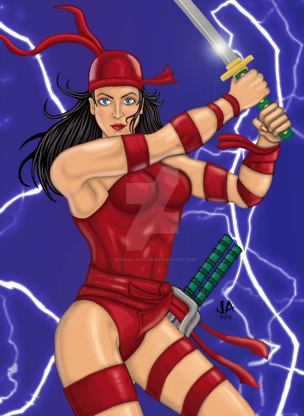
Photoshop 2013. Digitally inked in Photoshop 2013.
This was drawn from looking at a Marvel Annual Flair '94 Trading Card .
Originally sketched with pencil in 1997.
Related content


Comments: 43

You put a lot of work in this! Very well done. Your proportions are good and I like how you coloured this piece.
👍: 0 ⏩: 1

Thanks glad you like it. There are still a couple of things that I want to add or change but for the most part I'm pretty happy with it.
👍: 0 ⏩: 0

Awesome coloring and shading! The pose/anatomy are looking pretty solid too.
👍: 0 ⏩: 1

At first I thought there were some issues with anatomy but looking carefully there aren't!
Very nice job! Really like the outfit! ^^
👍: 0 ⏩: 1
Glad you like it.
👍: 0 ⏩: 0

You've captured an awkward pose really well and I really like the colour choice, good work!
👍: 0 ⏩: 1

If you like the pose check out the reference I used. There's a link in the description if you are interested.
👍: 0 ⏩: 0

Her outfit really is gorgeous - I love the pirate theme!
👍: 0 ⏩: 1
Glad you like it!
👍: 0 ⏩: 1

That is really awesome. I love the pose and the colours that you chose. It's hard to stay close to one colour and make it work with different tones only
👍: 0 ⏩: 1
Thanks! The pose is from a trading card that I used as reference. Check out the link in the description if you are interested.
👍: 0 ⏩: 0


👍: 0 ⏩: 0

Excellent work on her arms, legs, and stomach! I also like how her hair's flying out. ^^
If I may say a minor critique that's probably just something to notice for the next picture? It looks like you have the hilt of the sword positioned in a way that the blade itself ought to be pointing back to a degree, instead of straight over her head. But the sword and handle looks correct in the position you have it.
Do I make sense in what I'm trying to say? My apologies if not!
The way her ribbons are flying do a good job in showing the motion in this piece--hope I get to see the finished version!
👍: 0 ⏩: 1
Thank you. I think I know what you mean about the katana. The top of the blade should appear like it's further back because of the angle of the hilt. I should be able to adjust the foreshortening in Photoshop.
👍: 0 ⏩: 1
Okay! And that's great that it should be simple enough for you to deal with. ^^
👍: 0 ⏩: 0

To start of great piece!
My critique:
Right now she looks strong, but just strong...
And what I'm assuming is that you wanted to portray her to look powerful.
Right now her pose is fine but it kind of has a bland moment.
I would recommend that you bend her back more and make sure you make her arms bend more as though she is going to give a powerful hit.
The top half of her arm should be angled at about 180 degrees and make the lines seem as they will intersect it gives the visual as though she is going for a powerful hit.
Also, separate her legs more. Make her front leg seem more forward than the back leg (make the back leg look diagonal from her front leg). So it shows that her body is twisting.
Also when her arms are raising keep in thought that the breasts also raise up.
If your going for a comic approach remember to show more visual in her cheek bones.
Also I would recommend you change her facial expression into more of anger. Her facial expression is alright right now but it just makes her seem too happy. And if your going for a powerful look making her seem happy kinda makes her lose that image.
I recommend that you look into tutorials that has to do with expressions and facial features. Also remember eyes are usually shaped like an almond form.
sta.sh/01icwxqf1v8n <--- Here I put some of my critique in visual form just to make it clearer
It will show what I mean of how she can hold her arms up to give more expression of a powerful being
I shaded blue in part of her body to show where exactly you have freedom to bend her body.
And also just some tips.
Its a great picture!!
Just remember how you want your image to be approached.
Look at tutorials for dynamics and you'll surely pull of outstanding pieces.
Your really good so keep practicing because you'll become amazing!! ^W^/
👍: 0 ⏩: 1
Wow great critique. Thanks a lot for taking the time to do that! You brought up one of the things I was already concerned about the facial expression and others I hadn't thought of like the pose dynamics and the cheek bones. That's really helpful.
👍: 0 ⏩: 1
Your welcome!! >7< I'm glad it helped hehe
👍: 0 ⏩: 0


👍: 0 ⏩: 0

Oooh. I really like this one.. The outfit itself seems like it would be something from mortal kombat. Haha ")
Keep up the good work.
👍: 0 ⏩: 1
Thanks. Now that you mention it, she does remind me of Mileena from Mortal Kombat. They look similar and both use sai. Kitana and Jade also have similar looks.
👍: 0 ⏩: 1

I like this character's build and pose. You did a really nice job with the shading and coloring, it's very believable and adds a lot to her personality.
👍: 0 ⏩: 1

I love her pose, The anatomy, and the colors.  (Smile)")
👍: 0 ⏩: 1

Good job filling out the rest of the pose. I can see where ya had problems accurately refering from it. Maybe because this piece isn't as compositional (either by lack of having a background or lack of cropping to create sense of environment).
👍: 0 ⏩: 1
Thanks. I'm still not sure what to do with the background yet. I could try to replicate the reference but I'd rather think of something original.
👍: 0 ⏩: 1
Comic characters all have classic poses they are known for that it isn't frown upon to repeat like so many others but doing your own background to put the character in is what changes things up.
I used a few old Marvel cards as refs before.
These old gaia avi art pieces come to mind...
seraph6283.deviantart.com/art/…
seraph6283.deviantart.com/art/…
Of which the cards I ref were these...
i.ebayimg.com/t/1994-Fleer-Ult…
images.comiccollectorlive.com/…
👍: 0 ⏩: 1
I remember those 94 Fleer Ultra cards. There are some brilliant paintings in that set.
👍: 0 ⏩: 1

I like the drawing just give her face more of an expression. The pose is great so I would think a more drastic like mad or maybe focus expression for the face
👍: 0 ⏩: 1
Thanks I was going for a facial expression similar to that in the reference I linked in the description. Check it out if you haven't already. I definitely see what you mean though. Right now I think the lips pucker too much, maybe I should go with more of a smile/smirk.
👍: 0 ⏩: 1
Her face was more covered in the original piece which in turn made her eyes more piercing.
👍: 0 ⏩: 1
That's an interesting observation. When I decided to show more of the face I hadn't thought of what I wanted to do with the facial expression. I could have her mouth open like she's yelling. I'll have to try out a few different ones in Photoshop and see which looks best.
👍: 0 ⏩: 1
eyes tend to be more piercing and lips more sexual in comparison to each other even if they aren't really doing anything.
👍: 0 ⏩: 0