HOME | DD
 Jeysie — Customizable Icon Border CSS
by-sa

Published: 2009-05-05 20:09:06 +0000 UTC; Views: 3880; Favourites: 30; Downloads: 218
Redirect to original
Description
(See my DeviantID on my profile for details!)
Description
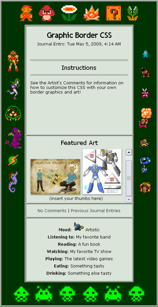
Many of us like to put collections of the avatars of our friends and clubs in our journals. But why keep them in a little box when you can put them to use as decoration instead? They'll even still be clickable! You can even add small thumbs or PLZ accounts as well.
Please note this is really meant to be customized: the example above (and in the skin) is simply a demo, rather than a final design. (You can view a live fully-customized version on my journal .) Notes for customizing can be found below.
I've tested this in IE7, FF3, and Opera 9 for WinXP, and it seems to work OK in all three, but let me know if you encounter any major bugs.
Note: the .dummy entry in the CSS is just because the silly uploader won't let me upload without referencing an image file, even though the CSS doesn't actually use any (other than the DA avatars). You can just ignore/delete it.


Header Notes
The icons in the code should be changed to your own avatars, thumbs, or PLZ accounts. You can have up to six icons on the top or bottom borders with the default spacing. How many icons can fit in the left and right borders depends on how long the journal is. Leave some "fudge space" rather than trying to cram in too many.
Footer Notes
These boxes can be used for whatever you want. You can have as many or as few as you want by copy and pasting. You also leave out the footer code altogether.
Please note that if you put a list (<UL> or <OL> ) in one of these boxes, it may cause odd gaps. Adding "margin-top:-.5em;" to the CSS for the box in question should fix the problem.
Journal Text Notes
<div class="heading"></div> should go around any headings. There should be an empty line before the heading but not after it.
CSS Notes
Background colors (background:# ; ): div.journalbox provides the color for the "outside border", while div, div.journalbottom, and ul.f provide the background color for the content.
Text Colors (color:# ; ): Should be changed on div, h2, a:link (normal links) and a:visited (visited links) to keep the text readable on your background.
Inside Borders (border: ; ): Changed to your desired width, style and color. div and ul.f should ideally match. The border style in div.heading can be whatever you like.
Outside Borders: The spacing in-between the icons can be tweaked by changing margin: in the div.border-x img sections. The order for the numbers is: top, right, bottom, left.
Box Heights: The height: setting for the box-# divs and div.entry can be tweaked. Don't remove the overflow:auto, or any content too tall or wide will get cut off.
Box Text Alignment: The box-# divs can be un-centered by adding text-align:left, text-align:right, or text-align:justify to that div's CSS section.
Headings: The font-size: on div.heading can tweaked, either in % for percentage of the regular font size, or in px for size in pixels.
There's certainly other possibilities for customizing for those willing to experiment, but these are the bare minimum attributes that would need to be changed.
Behind The Scenes
This actually started out as an experiment - I was busy planning a different journal CSS idea but realized that the whole "section of icons" part of my journal was going to be difficult to work into the design. So I started trying to think of alternate places on a journal where I could place icons.
Along the way this particular idea popped into my head, and I liked the test case result so much that I decided to go ahead and try to build a whole journal around the concept. And I liked the end result of that so much that I decided I might as well upload it as a deviation, too. I mean, why not?


Related content
Comments: 19


I'm gonna critique this... oh wait... I think you know that by now. um... I like the whole concept of this. With the using icons and plz accounts and stuff to customize it, and your own pictures? Or someone else's if you want to or whatever... I found this on a.deviantart.net/avatars/l/i/l… " alt=" " title="littlerin2"/>'s page and got here from it, and I like how you can scroll it down, 'cause I can't do that with any of the skins I make. The icons and art you put on the demo version are really cute, and I think you just did well on this overall. I'm sorry, my critiquing sucks, but I did really like it.
👍: 0 ⏩: 1

Thanks for the critique, and I'm glad you liked it. 
As for how to scroll boxes, setting a height, width, or both (something like height:200px; or width:300px;) and overflow:auto; as part of the CSS for the section in question will do it. The latter is what produces the scrollbar.
👍: 0 ⏩: 1

Okay. That makes sense. I'll try it...
👍: 0 ⏩: 0

I love this! I am so going to use it in my journal
I like how I can customize it so easily. Thanks for making it!
👍: 0 ⏩: 1

You're welcome, I'm glad you like it!
👍: 0 ⏩: 0

Sure! If you need any help beyond the notes I've provided, just let me know, and I'll try to assist.
👍: 0 ⏩: 1

Thanks. 
👍: 0 ⏩: 0

Thanks so much! I always wanted a skin like this, and I don't know any CSS! -coughsomecough-
👍: 0 ⏩: 1

You're welcome! 

👍: 0 ⏩: 1

No problem! I followed your codes quite easily. You should go see my journal, tell me how I did. x3
👍: 0 ⏩: 1

Looks good, and made me giggle. 
👍: 0 ⏩: 1

Thanks! x3 I'll make sure I look the close tags over when I modify it again with a different plz.
👍: 0 ⏩: 0

This is really nice.c: I hope to use it someday if I ever get a subscription~.
👍: 0 ⏩: 1

This looks like a very well thought out skin.
Great job.
👍: 0 ⏩: 1

Thanks.
Ironically it originally came from trying to think of where to put my club icons in another skin idea I was going for, but I liked the effect so much I built my skin around that instead.
👍: 0 ⏩: 0


