HOME | DD

jleoc — Typographic Tempest II

Published: 2007-09-05 23:00:43 +0000 UTC; Views: 6165; Favourites: 52; Downloads: 346
Redirect to original
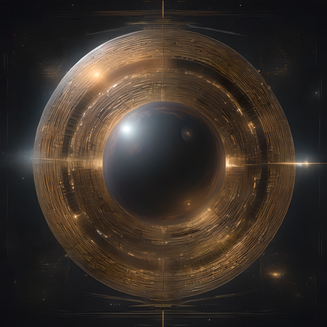
Description Inspired by a comment by on Garamond Leaves 01 .
Related content
Comments: 16

Lepelebom [2009-01-05 19:01:19 +0000 UTC]

It's a show!

👍: 0 ⏩: 1

jleoc In reply to Lepelebom [2009-01-05 21:39:13 +0000 UTC]

Thanks

👍: 0 ⏩: 0

gerxrdo [2008-10-09 16:37:52 +0000 UTC]

great job! thanks for sharing

👍: 0 ⏩: 0

gerxrdo [2008-10-09 16:36:13 +0000 UTC]

thanks for the reply! after seeing the original I said "gee! this sux" I prefer this one

👍: 0 ⏩: 0

gerxrdo [2008-09-23 12:24:11 +0000 UTC]

do you have this picture without the letters

👍: 0 ⏩: 2

jleoc In reply to gerxrdo [2008-09-28 20:05:21 +0000 UTC]

Or this: [link]

👍: 0 ⏩: 0

jleoc In reply to gerxrdo [2008-09-28 18:32:20 +0000 UTC]

How's this: [link] ?

👍: 0 ⏩: 0

H--ester [2008-07-01 20:35:13 +0000 UTC]

Nice, love the idea!

👍: 0 ⏩: 1

jleoc In reply to H--ester [2008-07-01 21:03:29 +0000 UTC]

Thanks

👍: 0 ⏩: 0

artstarter [2007-09-14 21:55:09 +0000 UTC]

This is so creative...I love it.

👍: 0 ⏩: 1

jleoc In reply to artstarter [2007-09-15 16:04:15 +0000 UTC]

Thanks so much

👍: 0 ⏩: 0

rith3d [2007-09-12 02:25:28 +0000 UTC]

it look like a letters rebellion!nice idea!i like it!

👍: 0 ⏩: 1

jleoc In reply to rith3d [2007-09-13 16:41:30 +0000 UTC]

Thanks so much

👍: 0 ⏩: 1

rith3d In reply to jleoc [2007-09-13 21:07:44 +0000 UTC]

you welcome

👍: 0 ⏩: 0

jleoc [2007-09-11 21:44:09 +0000 UTC]

They're all translucent though some show it more. The long shadows are from piers just out of the frame on the right that I put in to highlight the steps. I tried to keep most of the letters out of these shadows.

👍: 0 ⏩: 0

lexflint [2007-09-11 02:47:59 +0000 UTC]

some of the letters appear to have a translucent, gel-like quality-- neat. though it appears brighter than Tempest I, the shadows are still long (?)

👍: 0 ⏩: 0