HOME | DD
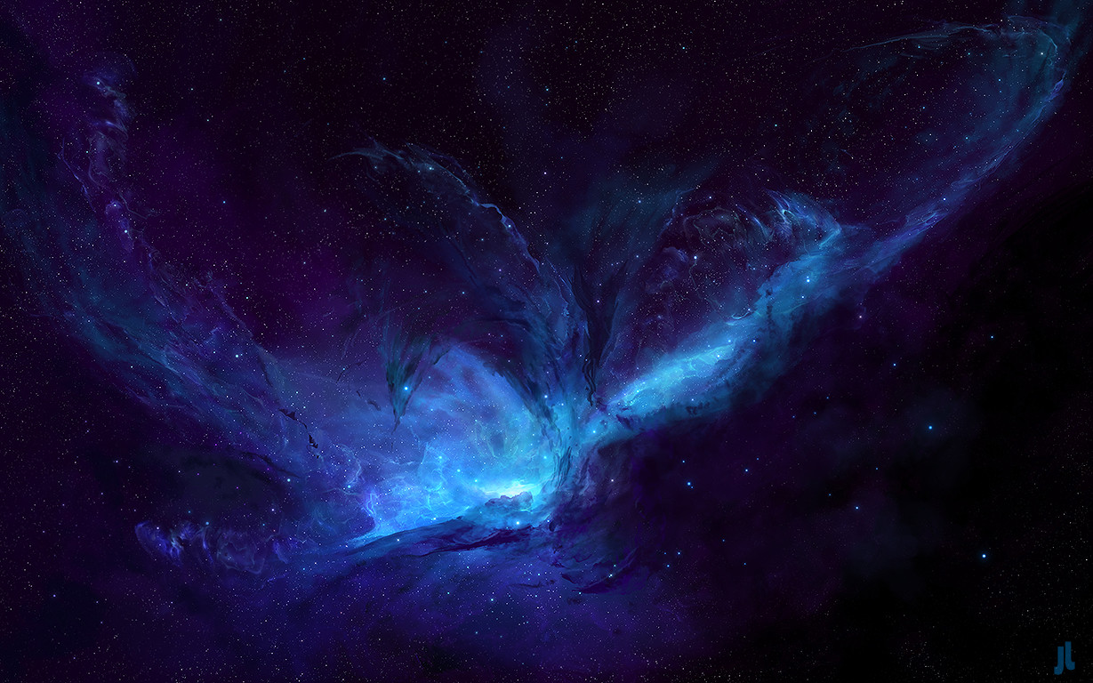
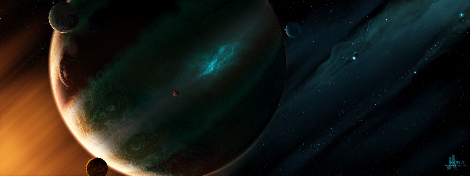
 JoeyJazz — Showtime

Published: 2007-10-22 16:15:53 +0000 UTC; Views: 16089; Favourites: 242; Downloads: 1042
Redirect to original
Description
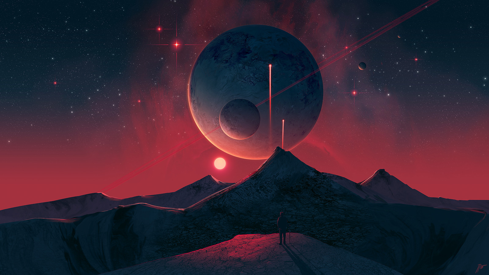
Just a small piece...5 hours...
You may use it even as a wallpaper
 (Wink)")
Oh, and thx for his "close up planet" tutorial
EDIT1: (1 hour)
Added a few details.
Made a several additions to the nebulae.
Completely changed the closest planet surface.
EDIT2: (10 minutes)
Added one blue star
")
De-sharpened the moon in the middle.
Sharpened some other parts
Changed the upper-right part of nebula.
Added on contrast (just a bit)
Removed the name typo...
Related content


Comments: 40

Ah, I just wanted you to know that I misclicked the Print Request thing there. I guess I was just admiring your work so much that I had a seizure due to awesome or something. ")
👍: 0 ⏩: 1

No problem - I wouldn't upload it anyway
👍: 0 ⏩: 0

Just so you know, Ive seen this ripped and used as a background for a forum skin. I dont remember where but you should check around on template sites for "space" themes and see if more of your stuff has been ripped off.
You do amazing work and unfortunately its popular enough that people want to steal/rip it.
Keep up the good work!
👍: 0 ⏩: 1
Well - I remember that I gave a permission to preview my artworks on simplegfx but they didn't use showtime... ...I'll look around a bit. Thx for info.
👍: 0 ⏩: 0


very nice job
I totally dig the texture on the right and the nebula
however, the texture of the middle planet seems kinda low-quality, but its a great piece of art nonetheless

👍: 0 ⏩: 0

Je to takovy pekne cisty, mistama to muze pusobit trochu nedodelany, protoze celkove je to fakt hodne cisty a dalo by se rict prazdny (oproti jinym spaceartum). Ale to se mi na tom libi, ze to neni tak preplacany
Jen podle me mas hodne nevhodnej popis. Typo se mi k tomu nak nehodi, prijde mi to proste takovy humpolacky k tem jemnejm barvam jaky si pouzil. A taky nechapu to podivny zarovnani jesus vzhledem k showtime. Ale je to jen muj nazor...jeden z mnoha
👍: 0 ⏩: 1
No, až to bude hotový, tak to ještě upravim.
👍: 0 ⏩: 1
Aha no ja myslel, ze uz to hotovy je
Ta to se budu tesit teda.
👍: 0 ⏩: 1
To sem si původně taky myslel... ..ale několikanásobný edit není u SA ničím zvláštním
👍: 0 ⏩: 0


Another nice submission! You make nice scenes and compositions, but I notice that you could work a bit on the intricacies a bit more to truly make your art outstanding (from my perspective, anyway). See, I like the smudgework (such as to the left, reminds me of Greg Martin's sort of style), however, elsewhere around the nebulae the smudging seems quick, and just a bit sloppy. Using a smaller brush to work on the detailing of that smudgework would greatly improve it. I think I preferred the crispiness of the older close planet, but the new one is still great, just softer, and I'm not wearing my glasses. 
👍: 0 ⏩: 1
Thank you for your critique - I'll take it to heart! (in fact 'maybe' I'll edit this deviation a little bit more).
👍: 0 ⏩: 1
You're welcome, and awesome.
👍: 0 ⏩: 0

Awesome work, I like this version better, but there seems to be inconsistency in the detail of the nebula in different places... I guess that could just be the way it is though, so its no biggie.
👍: 0 ⏩: 1
thx - yes, I used blur tool somewhere to create better depth - this way the nebula don't seem so flat
👍: 0 ⏩: 0

Krása.
Hele, napadlo tě někdy, že něco takového může ve vesmíru opravdu být? Já myslim, že určitě ano.
Tak to teda máš ve š

👍: 0 ⏩: 1
No, pozor - sci-fi není fantasy - sci-fi je něco, co by dle vědeckých poznatků čistě teoreticky mohlo existovat... ...takže jsem tu správně
👍: 0 ⏩: 1

Cool nebula, It reminds of this beautiful peice by samODJ [link] The aqua/orange combination looks great on nebula's in space art.
👍: 0 ⏩: 1
Well, I took inspiration here: [link]
But Showtime is not completed.. ..edit will come soon
👍: 0 ⏩: 1
Yeah, there is more resemblance to that one than the one I showed you. The edited version looks better, though the planet near the middle still seems a bit over-sharpened ( someone said that under another "Golden Gate" ) It seems a bit too harsh compared to the smudgy nebula but still nice overall !
👍: 0 ⏩: 1
Another "Golden Gate"?
If it is a structure, painting process, coloring or mood comparison... ...well, then there is something wierd with me 'cause in THIS way these are two completely different pieces
But I still feel there is much more power in this one that I must bring to light... ...with another edit
👍: 0 ⏩: 1
I must have said it wrong, this and Golden Gate are very different. Their only similarities is that the planets have details that are too sharp in comparison to the soft-flowing nebula's in each...It would be different if you were the sharp-nebula type, like =Burning-Liquid but it seems you are the smudgy-nebula type like ~Andr-Sar ( which is a hard find among space artists ) Softer, Smudgier nebula's would benifit by having less detailed planets in them.
But thats only my opinion, it seems a lot like it. And the artist of this peice [link] Managed to have a sharp planet against a soft nebula looks good with each other...I'm probably just being my picky self lol !
👍: 0 ⏩: 1
When talking about Burning-Liquid - his Geminorum is one of my most favourited nebulae/galaxy paintings [link] . I like this style a lot.
👍: 0 ⏩: 1
Yeah, it seems he has evolved to be the kind that makes sharp nebulae, others make softer ones. Toning down the sharpness of the planet in this in your second edit made the whole thing flow nicer.
👍: 0 ⏩: 0

Tebe by měli zakázat za schazování sebevědomí mladých grafiků
👍: 0 ⏩: 0


YOU tell me (Smile)")
👍: 0 ⏩: 0

Joe, ted mam trochu smíšený pocity. než sem hodil full size naběhl na mě wow dojem, ale pak nějak popadl i když š
Ostatně, vemuli v potaz, žes to dal za 5 hodin, tak musím naznat, další povedená práce
👍: 0 ⏩: 1
moc tam toho neni... ...ale zase když si to člověk zmenší na plochu, tak to je takový příjemný pozadí. ( i když je to maximálně na 1024x768
👍: 0 ⏩: 1
jna na ploše to vypadá moc pěkně
👍: 0 ⏩: 0

no za 5hodín je to pekné ale pre takého skúseného grafika ako ty by si spravil za 1hodinu to čo ja za rok
👍: 0 ⏩: 0

5 hodin jo ?
")
👍: 0 ⏩: 1
ano 5 hodin... ..něco zvláštního? o.O
👍: 0 ⏩: 1
ne nic ... tak kazdy ma sve tempo ze ...
👍: 0 ⏩: 0

no omg wtf toto je pecka tak toto si dam urcite ne plochu a gratz ked toto vytvorim za 5 hodin tak si zatlieskam ako fakt GW mas odomna fav
👍: 0 ⏩: 0