HOME | DD
 joeyv7 — Blue Muse

Published: 2008-09-20 23:01:41 +0000 UTC; Views: 4492; Favourites: 47; Downloads: 0
Redirect to original
Description
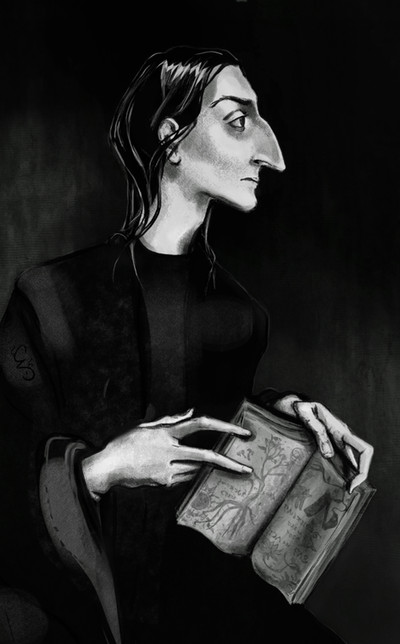
after Der Blaue Reiter /Fauves[link]
[link]
[link]
Related content


Comments: 73


👍: 0 ⏩: 0


I love the feel of Expressionism, one of my favorite styles of art. How lucky are you to get such good responses and critique. Well earned!
👍: 0 ⏩: 1


I have the distinct impression I know how he feels. reeks of dread and desperation, well done
👍: 0 ⏩: 1

 (Wink)")
👍: 0 ⏩: 0
Thanks - this reminds me of stained glass, for some reason. I think it's the dodge tool on the red.
👍: 0 ⏩: 1

ur blocked? This is beauteous! I do love some fauvism I does. You really make such great use of the muse as not just himself here, but in the composition of the piece! It's really tragic how it seems as if the dark redness is crushing him down and surrounding hiim! Really, great job! u are gettin better and better at ps!
👍: 0 ⏩: 2
Thanks! 'Blocked' pretty much refers to Blaaaaaaarrrrrg. I can live w/ this one.
It's worth it, though, just to be able to say 'Blaaaaaaaaaaarrrrrrrrrrg' again
👍: 0 ⏩: 1
lol
BLAAAAAAAAAAAAAAAAAAAAAAAAAAAAAAAAAAAAAAAAAAAAAAAAAAAAAAAAAAAAAAAAAAAAAAAAAAAAAAAAAAAARG
that felt good
👍: 0 ⏩: 0
the red is the wings I promised not to put on him, and I hope he flies to you and cheers you up. I've had a few 
👍: 0 ⏩: 0

I like the bright bold colors...the posture is awesome, like he's supporting some awful weigh or in pain...(and I like the nose , of course)...are those wings?
👍: 0 ⏩: 1


Such pain and expression... the bright contrasting colours are very interesting....
👍: 0 ⏩: 1
I almost want to make this a stained glass piece. It was supposed to be like a speed paint, but it still took hours . . .
👍: 0 ⏩: 1
Oh dear, you are right!!! It`s a lovely design for a stained glass motive!!
I am sure it took a long time...
👍: 0 ⏩: 1
comparatively short, though - I didn't worry about the hands being perfect fo once
👍: 0 ⏩: 1
Hands are always the hardest part for me... I keep trying to change them... so I go to study Loomis now...
👍: 0 ⏩: 0

As always, your choice of colors is magnificent and perfect! I feel like I'm looking at the art of a Picasso or something.
👍: 0 ⏩: 1
wow, thanks very much, Jodie!
👍: 0 ⏩: 1
No problem! Keep up the good work!
👍: 0 ⏩: 0

brilliant colors, so you used a digital media in this
very intriguing. do you paint with the mouse or
with a tablet?
👍: 0 ⏩: 1
👍: 0 ⏩: 0

Nice! I like the bright, bold, flat background colours alot.
👍: 0 ⏩: 1
Thanks - that's basically what I like best too
👍: 0 ⏩: 0

Weeeh, Cathy, I'm back! xD Now I can see all your beautiful deviations! ")
Love the colors here, though maybe you could make the lineart a bit clearer; it looks blurry
👍: 0 ⏩: 1
HAI welcome back!! Yeah, I likes the colors too . . I want it a bit primitive like this. So how ya been? Tendinitis all better??
👍: 0 ⏩: 1
Yeah, my foot's really well ")
And you, how you been?
👍: 0 ⏩: 1
fine, I can't get away from work lately because of the overtime, I seem to be having a block artistically. So many people would kill for my problems though, I can't complain 

👍: 0 ⏩: 1
Ah, yeah, when things are bad I always think that there are ppl in worse situations, so I stop complaining x) Everybody's having artblock! O.O Hope you can rest a bit from work. And read sth, lol
👍: 0 ⏩: 1


Wonderful work, really love the pose you have painted her in and the colours are gorgeous

👍: 0 ⏩: 1


Oi! I like it, but I think you've done better. If I may be cruel enough to give some critique: I think the yellow needs more structure, perhaps. Look at the both links you provided, (gorgeous, btw. Franz Marc 
On the blue and red, and the upper left part of the purple, you do very well.. but the yellow. I think two shades of yellow are just a bit at the low side.
Well.. sorry 
👍: 0 ⏩: 2
*sputter* I'M LEAVING dA & NEVER COMING BACK AGAIN!!! *stomps off*
ok, I'm back - being a diva is so tedious

👍: 0 ⏩: 1

ow my, now I feel SO INSULTED by this ABSOLUTE REJECTION of my critiques now that I'm LEAVING too! Oh, wait.. you did that already, so why should I do the same and with that show that I do think that was a good action of yours? Seems illogical. So, I'm staying! Just to be irritating. NAnanaNAna!
Noes, you're back.. ^^ What to do now..
More serious 
👍: 0 ⏩: 1
yeah, it's like a trend. People are too sensitive, I think the good outweighs the bad by a mile here

👍: 0 ⏩: 1
It's weird, people don't seem to be able to be a bit more in balance. No one ever thinks it's good to be a bit critical about feelings. Ah well...

👍: 0 ⏩: 0
Oh naww, I appreciate the critique. I wanted the figure primitive, this was a speed paint for me. I'll take another look @ this when I get more awake; that is a *big* field of yellow. One thing I started to like was the stained - glass effect of the red; I think I started to shy away from more work, thinking it would draw attention away from the figure. By structure, the yellow could perhaps use a black line somewhere too . . .
:
👍: 0 ⏩: 1
^^ ok, sometimes people can be so quick frustrated that I feel I should add at least twice a 'sorry, but...' and an 'I do however think that your art is great!' thing in my rep
Well, if you wanted it to be primitive, I think you've succeeded quite well  (Smile)")
You could also - I guess you've thought about that too - copy the file and work on the copy instead of the first one.. to prevent from any mistake, you know
Wait.. as I look a little longer at it, I think it's the hanging locks of hair that disturb me the most. Maybe just a bit blurring around the outlines would make me satisfied. Remains, however, the question if it's good to work on a thing just to make mé satisfied
👍: 0 ⏩: 1
See, that downward hair is my fave part, it makes it look like Asian calligraphy (?)(along with the flat colors) I haven't had time to dink with the yellow, but I will . . . .
👍: 0 ⏩: 1
Ah! Yes, that's true.. Hmm.. you know what? It actually doesn't disturb me anymore.. Weird. ^^
👍: 0 ⏩: 0
Thanks Bea 
👍: 0 ⏩: 0

you have the talent to use contrasting colours in a way that it looks fantastic together and what is amazing that the emotions expressed here would be effective even in b/w. I wonder if you have this brave kind of colour pairing in your dresses or pillows at home?
(I hope you don't mind that I put this painting to my Snape collections... 


👍: 0 ⏩: 1
| Next =>