HOME | DD
 JonathanWyke — A man without fear 02
by-nc-nd
JonathanWyke — A man without fear 02
by-nc-nd

Published: 2013-04-19 16:33:17 +0000 UTC; Views: 1701; Favourites: 36; Downloads: 10
Redirect to original
Description
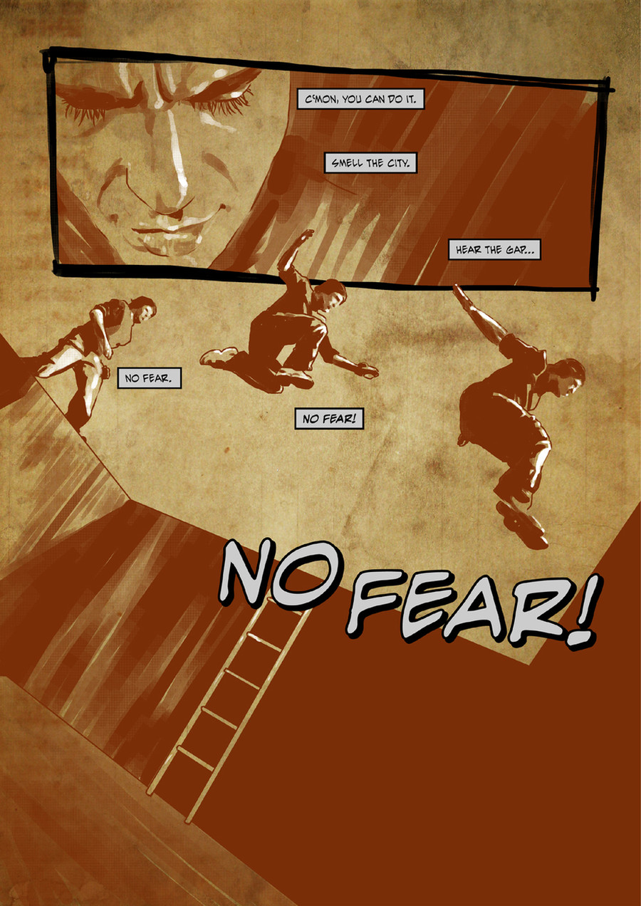
Second (and final) page of this experiment.The point is to see if this style will work in a sequential way, and whether the loose style holds things together well enough.
Comments and crits are very welcome!
Page 1 is here
Related content


Comments: 25

Wonderful gallery. You are extremely talented. I dig the new style too. It's pretty slick.
👍: 0 ⏩: 1

Thanks very much. This new style is very much a work in progress. I'm still not convinced that it can be used over a full range of action / feelings.
👍: 0 ⏩: 0


Looks prety cool. The only thing I'd do is go in with the darks a bit darker
👍: 0 ⏩: 1
Cheers. You're right about the darks - throughout my little experiment with this style, having more solid darks on the background image has come across as vital. It holds the rest together.
👍: 0 ⏩: 0

I absolutely love this.
In a culture where color is king this is something to truly be proud of. The monochromatic setting really establishes a brilliant environment and feel to this page. I really enjoy how "minimal" it all feels. Its kept simple but delivers the information it needs to.
You were quite brilliant in not putting a frame around him in the jump. You can totally feel how free he is right there given the space to breathe and being unbound by a frame.
Awesome work. I would purchase this.
👍: 0 ⏩: 1
Cheers mate!
I think that it does work - I was worried it would look too unstructured and messy, but I think it pretty much holds together. The amount of 'black' in the background image is key to the style working I think. I'm using the style in a short pitch that should be done soon, that's more real-life rather than superheroy, and it's interesting to see how the style holds together with that sort of pressure on it.
👍: 0 ⏩: 1
I absolutely love it. Its iconic in a sense. I may be coming to you in the future.
 (Wink)")
👍: 0 ⏩: 0

Awesome, I love this style! Maybe I would try to find a way to make the man in the foreground stand a little bit more out from the buildings in the background. Maybe coloring him with a slightly lighter shade of brown? Still, I love it, I think it definitely works with sequential art!
 (Smile)")
👍: 0 ⏩: 1
Thanks! I know what you mean about the figure, but I'm torn over it. On one hand, adding an extra colour would mean it could be made to stand out, on the other however, I do think I quite like the way he's not having your attention drawn to him. Makes the reader work a bit.
👍: 0 ⏩: 0


I would agree that it is working, but there are some things you might want to consider. First, everything is really warm. Combined with the types of strokes and marks you're using, there's a lot of visual tension. While it works great for an action scene with a lot of movement, I think it's going to break down in many other circumstances. So you send your character into a courtroom for extended dialogue. In this style you've moved from intense action to a kind of neo-surrealism. It's going to be hard to stay away from creepy (especially if you cool down the palette, too.)
If you switch over to more organic marks and cool down the palette, you're really going to have to codify the way you use grunge texture and throw down highlights in order to make if feel cohesive. Even then, it'll be a challenge.
With that said, there are some great things going on here. The way you've highlighted your character is dynamic, and really ties it to the background. There are also some great textures sort of buried in there, like the ventilation unit on the building. And I keep seeing little cross shapes repeat in the buildings, which is just delightful.
👍: 0 ⏩: 1
I think that's really interesting. When I decided to do these two pages it was because I was convinced it would work for quiet scenes, and wasn't sure at all on how it would look with action going on. You've highlighted something else for me to consider. Curses!
The backgrounds I've been using for these are just some old stock textures. Going further I'd make my own, but that seemed pointless for this little experiment. At present I think I'd keep with one simple palette through the whole story, perhaps with the addition of a single colour (strong red or yellow here for example). I kind of like how the colours remind me of life drawing with a conte crayon.
👍: 0 ⏩: 0

Just a short comment: according to my test is the best thing I've seen from you so far. IT works really well, both storytelling and style. thumb up
👍: 0 ⏩: 1
Cheers mate! I think bits of it work, but there's a lot to work out still. I'm expecting to hate it by next week
👍: 0 ⏩: 0

Can't go wrong with a poke in the eye with a sharp stick, but I think this works very well, page 1 does too. Good work, I hope you keep going with it, I'd pick up a copy of this in my local comic book store.
")
👍: 0 ⏩: 1
Thanks! I'm going to keep prodding away at it. I think the problem is to balance the loosenes, as I think it could get awfully sloppy looking.
👍: 0 ⏩: 1

Thanks mate! What does worry me about it is I think the wobblyness of it may be about as commercial as a poke in the eye with a sharp stick...
👍: 0 ⏩: 0
