HOME | DD
 JoshSummana — Snippet

Published: 2013-11-22 19:49:33 +0000 UTC; Views: 7115; Favourites: 223; Downloads: 71
Redirect to original
Description
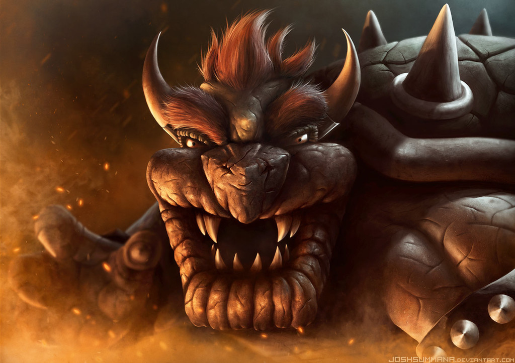
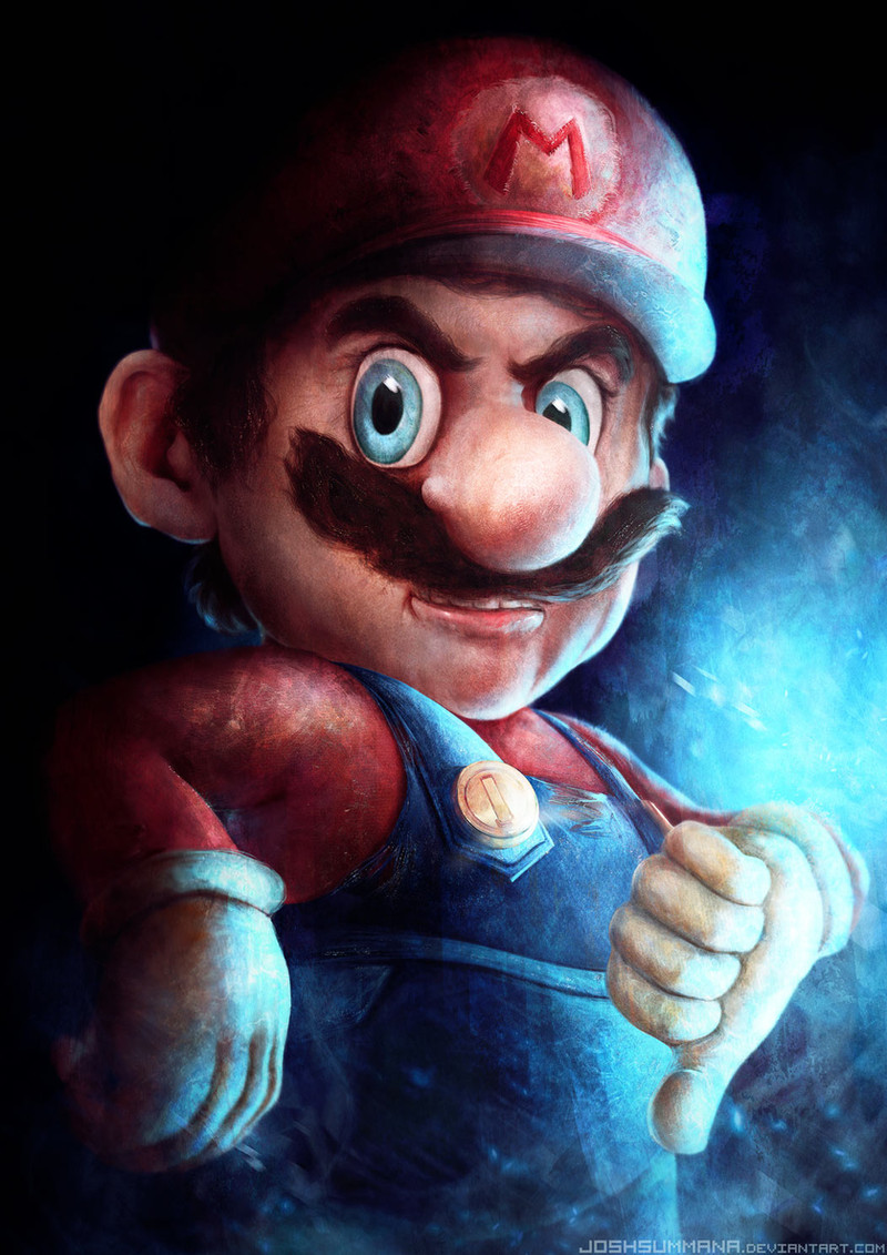
On the right is a snippet from a recent commission I had to do. On the left is an old piece I did that the client was inspired by. I would like to think I have improved slightly since last time round ^_^Related content


Comments: 29

The 2013 would have been better if there wasn't any blur on it. The blur doesn't make any sense.
👍: 0 ⏩: 0


 (Smile)")
 (Wink)")

For sure you have better shadding, best way is compare green part of those arts.
👍: 0 ⏩: 0


I like the use of colors a d the palette used in the 2011 one the best, but your technique of lighting has definitely improved in 2013. If you had used the first one's palette and the second one's coloring style it would've been the most beautiful drawing of the Mario nomnom plant ever <3
👍: 0 ⏩: 0

they're both good but i like the one on the right better, there's a noticeable improvement with light and realism.
👍: 0 ⏩: 0


That's what I was thinking too.
👍: 0 ⏩: 0


I see the differences deeply... In 2011 you used to draw with really tiny size especially in the green thing i dont know what they called lool
and your way of showing light is much much better in 2013 and leave also much better ^^ but the 2011 pic is much better when you are away from screen lool
👍: 0 ⏩: 0


I like the leaves, stem and pot from the 2013 one, but i like the head better in 2011. They both are equally amazing and I do see the improvement with the realism you are going for though! Good Job!!
👍: 0 ⏩: 0


The one from 2011 looks rough and very nice but if you look at it for long enough you can notice that it has its faults, and since then, you seem to have been able to correct them so I'd say that you have improved. (Especially with leaves and stem)
")
👍: 0 ⏩: 0

An awesome improvement. It definitely looks more realistic in the new one to me. 'v'
👍: 0 ⏩: 0


I can see a definite improvement in your technique, there are less lines and better textures. Yet I still like the one you did in 2011 better.
👍: 0 ⏩: 0

I think they're equally cool, but in different ways.
👍: 0 ⏩: 0


👍: 0 ⏩: 1

the one on the right isn't the main focus in this image... where as it was in 2011. So I had to lose a lot of the detail/edges. It will make sense when I post the full image
👍: 0 ⏩: 1
👍: 0 ⏩: 0


