HOME | DD
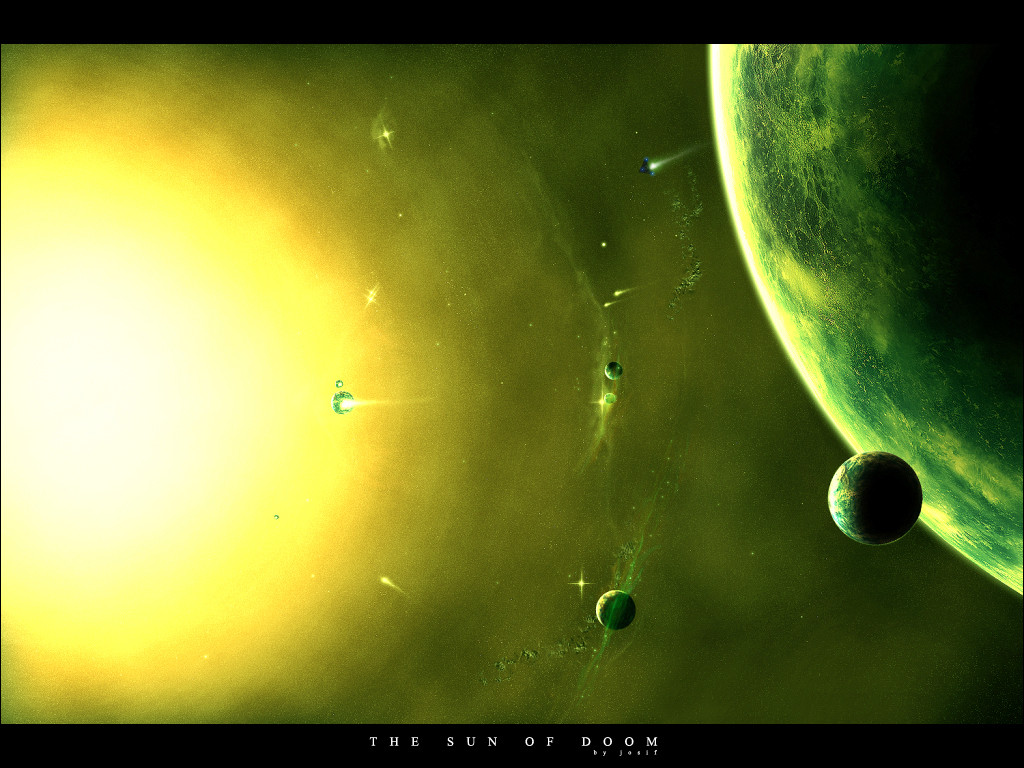
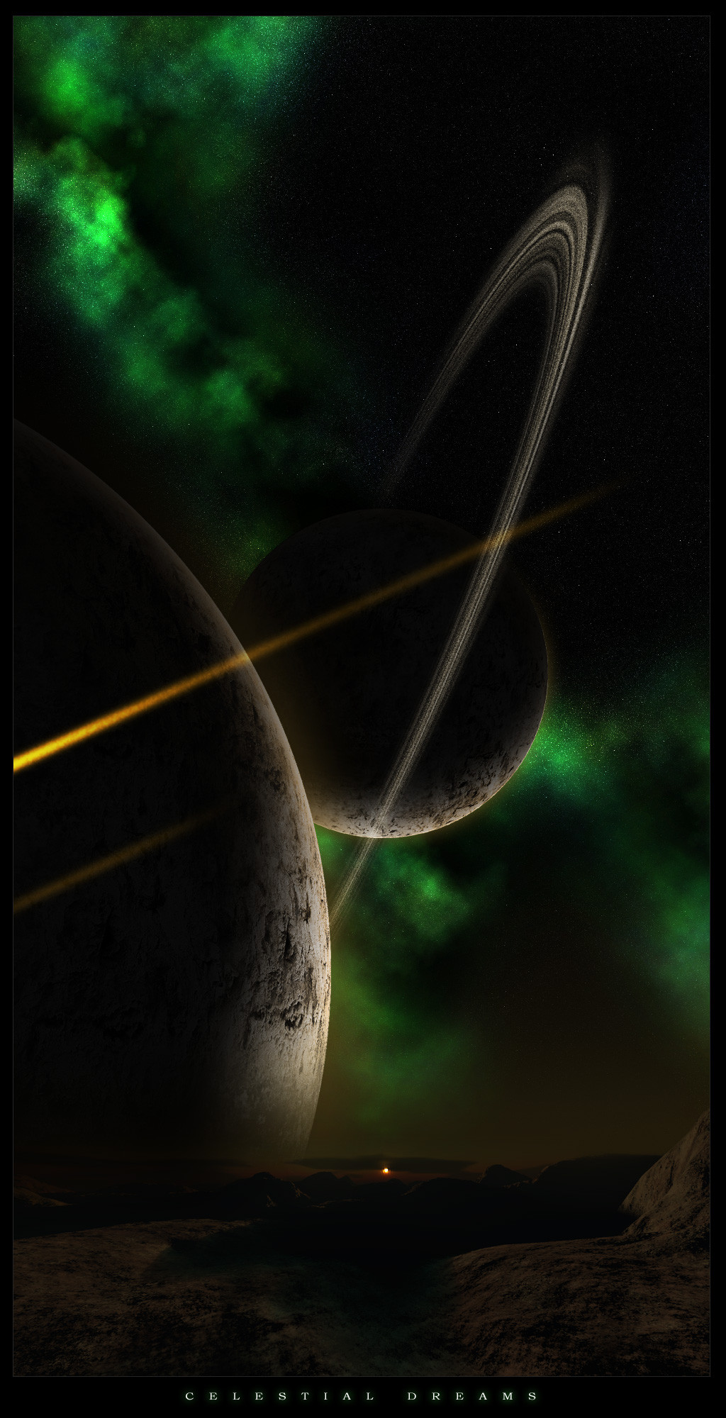
 Josif — Space unsolved mysteries

Published: 2007-05-20 04:25:17 +0000 UTC; Views: 6811; Favourites: 109; Downloads: 438
Redirect to original
Description
Well i havent made anything in a while so i decided to work on a new piece, really happy how it came out, all done with defaults in PSCS2, no stocks used.thanks to for suggestions like what to change or improve while doing the piece
 (Smile)")
took a long time to make around 8 hours maybe.
comments and fav's are much appreciated.
Related content


Comments: 38

oh my god, this is just..... amazing.
i love your work. please, keep it up! (:
👍: 0 ⏩: 0

Absolutely lovely. I love the work on the Nebula. I can never get my nebula to work right. ")
👍: 0 ⏩: 0


Very awesome. My only (small) gripe is that one of the rings ends before it goes behind the planet. Everything else is top-notch. I especially like the planet texture, it has a very painterly feel to it.
👍: 0 ⏩: 0


The textures you used in this are awesooome... like, the planet's rings look all grainy, and the upper right corner resembles a water-color effect... Amazing detail
I also like the colors used in the planet.
👍: 0 ⏩: 0


i like this one very very much
especially the artistic unique effects


👍: 0 ⏩: 0

That's amazing, man. You've definitely got a 
👍: 0 ⏩: 0

That's cool. How do you get that effect on the nebula?
👍: 0 ⏩: 0


nice planets, colors and that shit on the upper right is awesome. only thing I don't like is the text.
👍: 0 ⏩: 1

Wow this image is beautiful..
The nebula is so amazingly strong ands works wonders with the soft blue, dreamy feel.
Awesome work!
👍: 0 ⏩: 1


really good work here.. I think you managed to accomplish a very good sence of depth to the nebula.. really awesome its all painted. Only thing I see that needs improvement are the rings. But awesome work! I think I'll return the watch
👍: 0 ⏩: 1

thanks, and thanks for the watch too, its my first attempt at rings, ill work on them
👍: 0 ⏩: 0


looks great and i have only 1 comment, dont reuse planets in the same piece, makes u look noob. anyway i luuuuuuuuuuvvvv the nebula u painted...im guessing u have a wacom but correct me if im wrong
👍: 0 ⏩: 1
thanks, yea i got lazy =/ next time ill make a different one for each, tho i tryed to make them as different as possible by changing colors nd stuff, and no, i used my mouse heh, i dont have a wacom.
👍: 0 ⏩: 0

Impressive depth/detail/scene! ")
As not to be completely useless, a few suggestion - those few stars in the centre of the planet rings look as if they are in front of the ring .. seems a little unrealistic spacially? And the only other critique, the atmospheres of the smaller planets looks a little odd - as if they are not a part of the planet, but an outline (and a thick outline at that).
Those are very minor 'problems' though  (Wink)")
👍: 0 ⏩: 1
thanks a lot, what do u suggest on how not to make the stars look infront of the ring?
and yea i noticed the stroke on the planets as well, i dont know how i got it, it was suppose to be an outer glow but it seems when i resized it ended up looking like that =/
👍: 0 ⏩: 1
perhaps remove those stars completely if you can't make them look behind the rings, or downsize them till they look like backdrop stars.
As for the stroke, well, you could always try resizing, and if that doesn't work, rework it at full res.
👍: 0 ⏩: 0


thanks, and thanks for the fav as well
👍: 0 ⏩: 0