HOME | DD
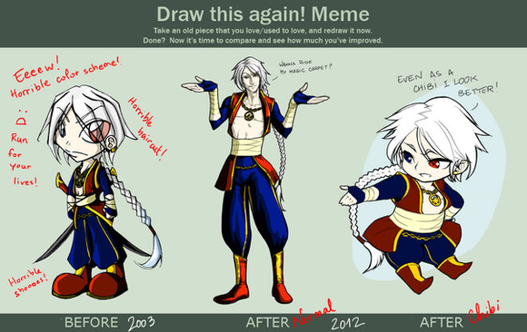
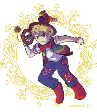
 Joyfool — Draw this again...

#after #again #before #draw #jack #meme #joyfool #jesterday
Published: 2015-05-31 16:03:15 +0000 UTC; Views: 6509; Favourites: 430; Downloads: 0
Redirect to original
Description
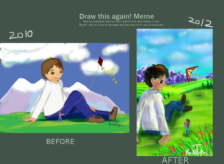
Hmmm...definitely improved something but still no style for me.Critique, please? ^^
Related content
Comments: 91

Aah gee thank you so much for your insights, you've helped me find my strengths! :'D
👍: 0 ⏩: 1


I Don't give a bleep about what anyone else says
cuz in my opinion
Vision: very cute bright. happy.
originality : that pose is hard as shit to do . so this is PRO status yo. maybe it would be even better if you made this into a SCENE. like hes doing a handstand being goofy. otherwise I can see how the pose into a white background can be a little distracting.
technique. you used a fade off into the background technique on his legs and feet.
your perspective is pretty damn good.
impact. A plus biatch A plus youve improved insanely a lot in 5 years.
👍: 0 ⏩: 3

AAAAAAAASHHHH ;________;
What am I supposed to say here ajfahdksjasfkad thank you so much adorable, you made this so motivating yet funny to read
BTW NO WONDER THIS WAS GETTING A LOT OF COMMENTS AND VIEWS TODAY XD LMAO
👍: 0 ⏩: 0

I FORGOT MY WATCHERS COULD SEE THIS LLMAAOOO
XDDD
👍: 0 ⏩: 1

HAHAHAHAHA x'D
<3
Im such a stalker lol
👍: 0 ⏩: 1

I was just being a frieennddd hahah
so I sound so dumb in this critique omg
I didnt think others would be seeing it hahah
👍: 0 ⏩: 1

nooooooooo
I love the plus biatch A x'D
its true thooo ~
and dont wurry I'll keep it a secret hahaah c;
👍: 0 ⏩: 1

rofl XDDDD
*clings to you*
keep my secreett~
👍: 0 ⏩: 1

haha
I promisseeeeeee
pinky promise ~<3
👍: 0 ⏩: 0


Ok i am not the best artist/critic,also i am not sure how to critic a before and after stuff.But i will give my best shot.
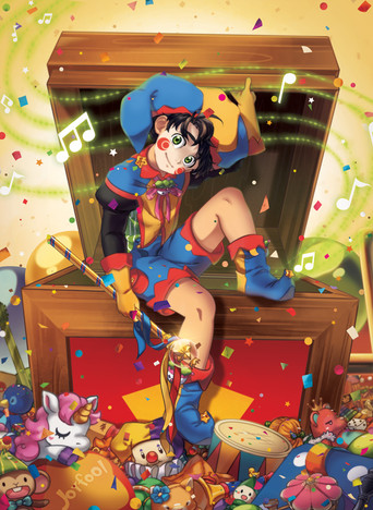
Well lets start with the most obviouse-the style.Now i am not sure how right i would be in saing this,but it seem that both of them are anime/easter inspired,however while the 2010 version looks like could be found in a old manga.and that has it charm,the 2015 looks like a screen shot/promo art of a anime(polished with well made effecs)
Now the other obviouse diffrence is the coloring.2010-a charming paint brush look 2015-polished digital coloring whit artificialy made shading and blurs.Honestly i found both charming,but...lets face it the 2015 version is way better and plaesing to the sences
Other thatn that..well the is not much to say.Character desiing are good it both years(however the eyes of 2015 are a bit better in my opinion ).
Overall both are awesome pieces are great,but the inmproven is stelar,no two way to thing about it.
PS.Sorry for my bad englsih e.deviantart.net/emoticons/s/s… " width="15" height="15" alt="


👍: 0 ⏩: 1

Thank you for your critique!!
👍: 0 ⏩: 1

And thank you for accempting my badly writen critique!
👍: 0 ⏩: 0

He looks like he got older XD. I really love the hat you drew!
👍: 0 ⏩: 0

This so beautiful! Oddly enough, even though the second is technically better, the first one has such a blatant and exciting energy to it actually like it better! >.<
👍: 0 ⏩: 0

So much Improvement, well done! O: The style in the 2015 one looks very anime-like or cartoony. Really good work : D
👍: 0 ⏩: 1

i love both 5 years ago and what it look like now though im wondering why you cutt off the hand in the secant one lol
ur oc really adorable and cute i originally found you by someone i was watching and they feature you
but ur art amazing
👍: 0 ⏩: 1

Wow thank you so much! :'D
I cut the hand because it felt fair for balance to that pose
👍: 0 ⏩: 0

It is not just a style change, there are countless visible improvements in terms of quality. The folds, shading, perspective, shadows, colouring, anatomy, everything! Sure it's traditional to digital, but you still improved tons! You have come so far in five years! Congrats!!
👍: 0 ⏩: 1

Gee thank you so much, I appreciate your insight on this! :'D
👍: 0 ⏩: 0

holy moley
dammit 400 people read my embarrassing critique ahaha
👍: 0 ⏩: 1

LOL is this your first time writing a critique?
👍: 0 ⏩: 1

YES PRETTY MUCH.
well writing a stupid-a$$ one like this yeah hahah
I was cheering you on maaann
👍: 0 ⏩: 1

LMAO
Youuuuuuu yeah I can't agree with half of what you wrote there LOL but your intentions are too sweet to not embrace //////////
👍: 0 ⏩: 1

wait wut!??
why would u not agree with half of what I wrote D:
i wasnt bsing anything I said lol
I meant it
👍: 0 ⏩: 0

despite others saying "it just looks like a different style direction" I'd have to disagree, there are improvements to be seen despite them being two different looking styles.
There's improvements upon flow and dynamics, as the pose looks less stiff and more natural. The perspective looks more pleasing and realistic, the folds in the clothes look more natural, the face is an absolute ton more expressive and he looks more like an appealing character because of the increase in a more lively looking expression, and lastly the hair looks more dynamic and more full/flowy like hair is supposed to be, opposed to the more flat and kinda stiff hair of the 2010 version! Your colour theory looks like it's improved abit aswell, as well as your shading being abit more prominent and contrasting than the 2010 version. It looks like you've tweaked your shading style abit to fit in more with an actual light source, too, whereas before there were places that could've done with shading that didn't have any.
Without even nitpicking into specific styles (such as the 2010 looking more chibi and the 2015 looking more 'anime', one being traditional the other digital etc) you can see a lot of improvement. The way you've actually constructed each drawing shows a difference, the 2015 just looks overall better executed than the 2010 due to obvious gained knowledge of how to draw and lay out certain things. I like the 2015 one because it just looks so much livelier to me. You shouldn't feel bummed out about your art, I'd have to disagree with you thinking your art has gone rather sideways instead of up, the improvements are definitely there.
👍: 0 ⏩: 1

Oh wow, thank you so, soo much for writing me such a thoroughly observation!!
I'll try and be nicer to my efforts, thank you! :')
👍: 0 ⏩: 0

Gasp
So.. much improvement!!!!! This is amazing!!!! Your oc is so cute!!!!!!!
👍: 0 ⏩: 1

lemme tell you: you improved in art, perspective dimentions, and character design, but still its impossible to bite a tongue like that.
👍: 0 ⏩: 1

Thanks! 
👍: 0 ⏩: 1

*Applause*
(Is so proud of you) Omg awesome job :'D
👍: 0 ⏩: 1

Ahh this is so amazing! You are definitely improving
👍: 0 ⏩: 0

I feel as though these take on different art directions as they're made from both differing styles (Chibi to anime) and mediums (traditional to digital).
From there, they root off into specialties each medium has to offer. With traditional, thicker outlines but control over shading. And with digital, clean, thin lining and simplified cell shading.
Still, I'd say, overall they're both colourful and overtime, has shown the development design tweaks in 5 years.
👍: 0 ⏩: 0

Funny thing, both of the drawings are really charming in their own way. They seem more like two different art directions, than levels of quality. It's also amazing to see how much you've changed in five years
👍: 0 ⏩: 1

The way you describe it its exactly what makes me feel so bummed of my art XD Instead of going up it goes sideways in terms of style/quality
👍: 0 ⏩: 0
| Next =>

