HOME | DD
 K-Johnson —
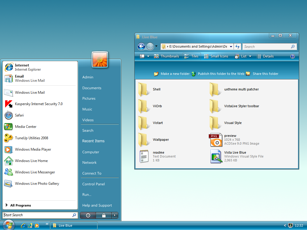
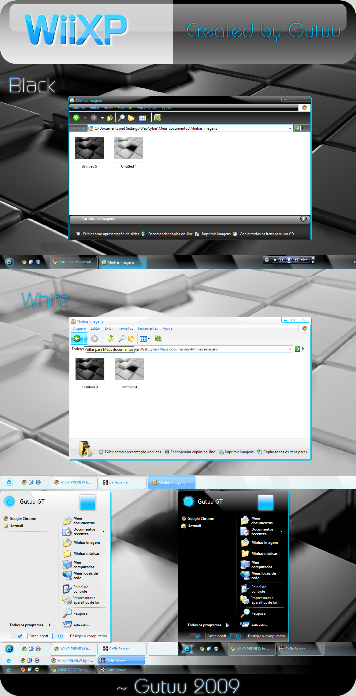
Clearscreen Sharp for Windows7
by-nc-nd
K-Johnson —
Clearscreen Sharp for Windows7
by-nc-nd
Published: 2009-10-25 01:51:16 +0000 UTC; Views: 941918; Favourites: 1946; Downloads: 218439
Redirect to original
Description
THANKS fediaFedia FOR THE DAILY DEVIATION and I'm glad that people out there still enjoy using this theme! (Smile)") )
)--
Note: For current news regarding Clearscreen Sharp for Windows 7, please view: [link]
--
Hi all,
Here is the Clearscreen port for Windows 7. Much has been polished and much had to be redone, thus some things have been changed -- some compromises here as Windows 7 shares even more resources between different parts of the theme. So expect some details to be lost (like the etched look on the group sorting headers -- Windows 7 ignores the property and only allows a 1px height for the seperator), or the unique "New Application" button state for the Start Menu (that image is shared and grossly distorted in another area), amongst other things.
You may be wondering where the navigation buttons and other resources are -- I am having trouble replacing my resources in System32. Replacing Explorer.exe works fine, but as soon as I replace a .dll file, things go to crap. I had to repair my OS 8 times yesterday and don't feel like having another go for a while. I'm taking the same steps as I had on Vista x64, and I had no problem on Vista, so this is very strange. Any help is appreciated
I am working on Clearscreen Round, which shouldn't take as long, as the base that these two themes share is now complete. Won't give an ETA; it'll be done when it's done.
Known Bugs / Limitations:
- Because of the nonstandard frame and padding size (both set to 1) of this theme, you may see the frames distort in some areas... unfortunately, there's not much I can do there as Vista's default Aero also has problems when scaling it down to this size; fidelity of the edges and corners are lost. [limitation]
- Aero Wizard dialog uses the bodytext color property (which is set to black in my theme) for the titlebar text for whatever reason (coding laziness?) -- basically, black text on black shadow == difficult to read... [limitation]
Volume mixer line goes a few pixels too far -- this is because the padding size is low, which allows for more vertical and horizontal space, allowing the vertical seperator to come into view and cross the horizontal volume mixer line. [limitation]- Resource Monitor accordion text color is white and sits on a light gray background. [limitation]
- Start Menu may show up blurless near the top when you first open it, but it fixes afterwards. This is because DWM assumes that there is a solid graphic there like in the default Aero, so it doesn't blur it. Unfortunately, there is an intentional gap up there to fit the style, and I don't want to change it. It's not a big problem, but a minor annoyance for some.
Updates
- Fixed x86 white/blank graphic bug (Systray, IE8 Search)...again.
v3.2 (November 1, 2009):
- Fixed Start Menu's Userpic in Top Superbar orientation.
- Revisted the Superbar Thumbnails section, still not sure about it, but I think it looks better than it did.
- Improved Start Menu blurless area limitation (seen when you first open it, DWM fixes it afterwards) by expanding the white area (Programslist) horizontally to cover it. I can't fix the top part, unfortunately, or that would mean that there will be no gap up there, and I like the gap
- Removed Fading Animation in Explorer Documents section/template. It was an experimentation that I forgot to remove.
- Fixed Vertical taskbar graphics to stretch proportionately
v3.1 (October 31, 2009): Bug fixes & Polishing
")
- Fixed x86 white/blank graphic bug (Systray, IE8 Search)
- Fixed SIZINGMARGIN property for progress bar left and right edge -- edge retains fidelity when progress bar is stretched or shrunken.
v3 (October 30, 2009):
- Fixed Treeview bug (Seen in CCleaner, Regedit)
- Fixed Start Menu panels from distorting in Large Icons mode
- Fixed Shadowless frames (left and right) to match top and bottom frames
- Optimized frames for current padding/sizing border (1)
- Added a bit more contrast to highlighted text (highlighted text now set to #000000; highlight fill = #CDCDCD)
- Fixed Disabled SplitButton Dropdown graphic
- Updated Explorer.exe to current version [6.1.7600.16404] (x86 & x64) -- thanks to ~drake04 !
- Fixed Large Icons view in Start Menu from distorting the menu panels.
v2.5 (October 26, 2009):
v2 (October 25, 2009):
FAQ
- Q: Where can I get the green wallpaper in the preview?
A: Sorry, that isn't a wallpaper. It is a background made for presentation purposes. Maybe when I have the time I can create a wallpaper like it. - Q: What about the ones in Explorer? Where can I get those wallpapers?
A: I do not remember where I got them from, so out of respect to the authors I won't share them.
I think the ones in the preview came from Flickr. You may be able to find them in some of my favorite photographers galleries and shrink them down to your resolution yourself:
[link]
[link]
[link]
[link]
[link]
[link]
Q: Are you going to make a large triangular Start button?
A: Sure, when I get the time. The reason for its current absence is because the triangular Start button is shared in all four Superbar orientations.
Q: Help! I can't make out the text in X program!
A: Programs that rely on their own graphics or font colors along with resources from the theme (colors, font, images) for their GUI will often have usability issues (black font on black background, for example). This is unfortunately out of my hands. Programmers design their program around the default Aero theme as that's what the overwhelming majority would use.
Related content


Comments: 708

i did it with Universal theme patcher
👍: 0 ⏩: 0
i want this theme
when i apply it becomes window classic theme please help me
")
👍: 0 ⏩: 0


Hi, Great theme!
Is there any way I could apply JUST the taskbar style? Thanks in advance.
👍: 0 ⏩: 0

You deserve to be the original UI designer for Microsoft, it's people like you who make great changes!
👍: 0 ⏩: 0

This is how windows 7 should have looked when it shipped. Gread job!!
👍: 0 ⏩: 0

great, but how i can change that, active window:
[link]
i want everything black like inactive window, anyone?
👍: 0 ⏩: 0

Best Style ive tried! Keeping it for all my computers!
 (Wink)")
👍: 0 ⏩: 0


how to install ? plz anyone tell me
👍: 0 ⏩: 0

This is my favourite win.7 vis.style. Im with it on my PC and Laptop, it is great, thank you.
👍: 0 ⏩: 0


my favourite style just changed to Glass onion ! but i will always remember this awesome style ! i hope it will be there with cool modification for windows 8
👍: 0 ⏩: 0

What's the difference if I use the normal explorer.exe instead of the one included?
👍: 0 ⏩: 0

2 full years on and this is still my favourite Windows 7 visual style.
👍: 0 ⏩: 1

is that a pic of the late Chuck Schuldiner?
👍: 0 ⏩: 0

Glow air + office 2010 + leo's revenge = this.
Nice combi.
👍: 0 ⏩: 0

hi i was jst wondering if i could use ur theme
c i love ur theme very much
i have used both vista and wen i upgrade i use w7 but i also love office 2010 vs
so want to b able to use both at the same time
so i would like to seek ur permission to combine ur theme
i promise to acknowledge u wen i am done
pliz this wil b m first theme
i will b waitin for ur reply
👍: 0 ⏩: 0

Hi, congratulations this theme is the best and is better of the original Windows 7 theme even without transparency ^^ , but too bad with transparency it looks too much transparent and by changing colors there is not much difference. If you can fix that for Se7en 32 bit it would be very very appreciated!
👍: 0 ⏩: 0

Big thank you man! I always use this theme on my PC and now I'm downloading it on my laptop.Perfect style , great job! KIU
👍: 0 ⏩: 0

very great.. but please change the scollbars.. they are nearly invisible :/
👍: 0 ⏩: 0

Hey, I've installed your theme and it looks great! Been using it for a while but then I installed another theme. However, I just applied the .theme file and it looks just like Windows 7 Aero.. So I decided to change back to Clearscreen sharp but when i do, everything looks like a basic theme(like in Win95)... Reinstalled and restarted but nothingchanged. help?
👍: 0 ⏩: 0


Hi, I'm using this visual syle now for the past 5 months. I'm still loving it, but there is one thing that really annoys me.
The color of the scroll bar does not stand out good enough. I wonder why this has not been fixed yet?
I would appreciate an answer on this issue. Thanks
👍: 0 ⏩: 1

No problems with my scrollbar, bro. Maybe check the gamma of your monitor?
👍: 0 ⏩: 1
Hi, thanks for your reply.
The seetings of my monitor seem fine.
I'm using this theme for about 1 year now and still don't get tired of it - it's perfectlt designed.
I can see my scroll bar but the smaller it gets, the harder it is to find.
You have to admit, the differences of the light grey shades are rather small, aren't they?
I'm sure it's possible to make the scroll bar dark grey, but I guess that'd be rocket science, lol.
👍: 0 ⏩: 1
Sorry for late reply, but hardly on. I guess it could use a little darkening. I've been waiting forever for him to release Clearscreen Round, but hasn't done anything for a while so I don't think anything will get updated.
👍: 0 ⏩: 0

The left hand field in the control panel items is black and so is the text... any help on this?
👍: 0 ⏩: 0

Great looking theme. One of the few ones that don't look all screwed up with the shadows under windows turned off.
👍: 0 ⏩: 0


awesome theme sir...but u might wanna use "theme resource changer which automatically changes explorer buttons if installed and dosent need patching system files!
👍: 0 ⏩: 0


This is an AWESOME theme, that does not come with the downside of having to manually adjust all your icons, loginscreen,...
Great work!
👍: 0 ⏩: 0

I can't get it to work, I just get some winXP lookalike theme :/
Any idea what I'm doing wrong?
👍: 0 ⏩: 0

Dude you need to finish this style and add suport for SP1
👍: 0 ⏩: 0


Hey, where did you get your wallpapers from? xo.
👍: 0 ⏩: 0


oh God! I loved it!!!
I had some trouble while patching the themes dlls, but I used system recovery and tried again with Universal Patcher and it worked
LOVED the theme! Very, very clean, simple and BEAUTIFUL!
👍: 0 ⏩: 0
Hi K.Johnson,
I've tried out different themes and finally decided for your Clear Screen Sharp because I like it the most.
If I could change two things on your theme, then I would highlight the active tab within a browser more, to better distinguishe it from all the passive tabs.
On Internet Explorer I find it very heard to identify the active tab. On FireFox it's kind of ok, but it could be better.
The other thing is the color of the scroll bar in Windows and Internet Explorer as well as in FireFox. If you can scroll, you have to look close to see the scroll bar at all.
Why is that, I wonder ? It should stand out but as far as I can see, there is almost no difference between the scrollbar color and the background where the bar scrolls in.
Besides this, I would change the reflexion of the top part on windows. Looking closer, it looks like blury glass with a very faint pattern of diagonal stripes. I'd prefer the blur effect to be even - just a personal taste. Don't get me wrong, most of the effect is beautiful like the horizontal, even reflexion line going from the very left to the very right.
I do love the design of the top right hand side: the collapse, the re-open and the close button. (this for example is by far too small at the Dusk and Nude2 Theme)
The sharp corners of any windows, the glow when moving the mouse pointer either on the right hand side of the start menu or on the tabs of the taskbar, the clean way the mouse highlights the options within a drop down box of a menu (although it's not strong enough, same problem as with the scroll bar).
👍: 0 ⏩: 0


I just tried your theme as it looks exactly like what I'm looking for...the problem is that I don't get any transparency. The theme comes out as a Windows Classic style and not the beautiful aero glassy theme in the photos...is there something I must do first? I have my computer patched to accept 3rd party themes.
👍: 0 ⏩: 0


i really like this theme, the only thing i want to change is the black colored taskbar to a transparent one
can anyone help me on this?
👍: 0 ⏩: 0
| Next =>