HOME | DD
 K-Johnson —
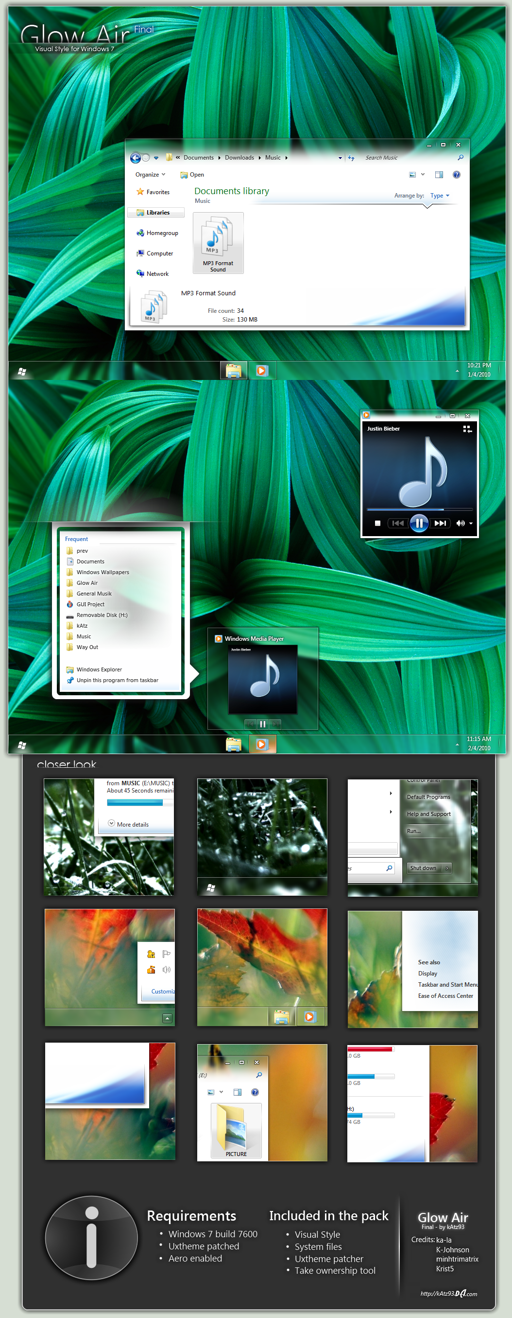
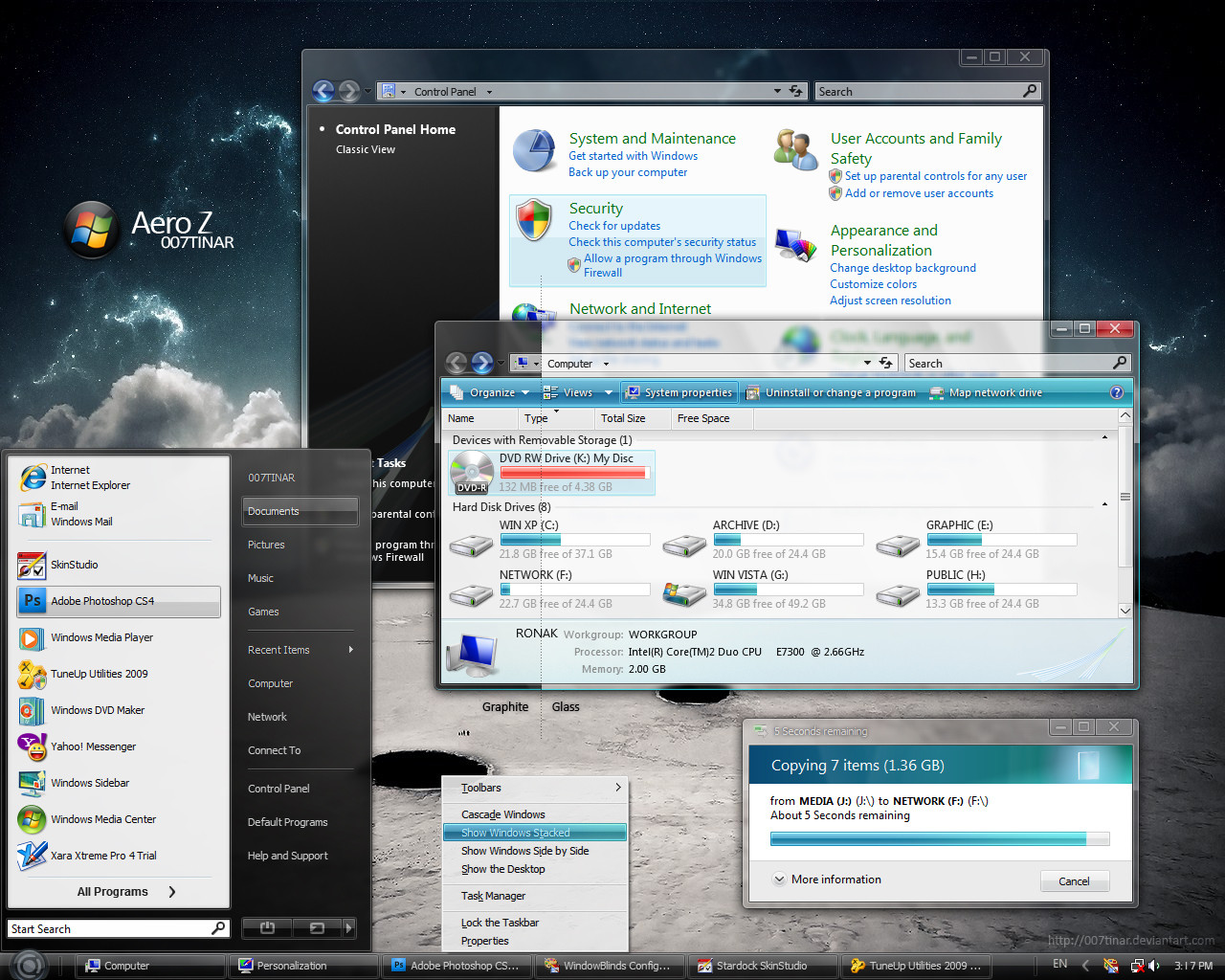
Clearscreen Sharp for Windows7
by-nc-nd
K-Johnson —
Clearscreen Sharp for Windows7
by-nc-nd
Published: 2009-10-25 01:51:16 +0000 UTC; Views: 941925; Favourites: 1946; Downloads: 218439
Redirect to original
Description
THANKS fediaFedia FOR THE DAILY DEVIATION and I'm glad that people out there still enjoy using this theme! (Smile)") )
)--
Note: For current news regarding Clearscreen Sharp for Windows 7, please view: [link]
--
Hi all,
Here is the Clearscreen port for Windows 7. Much has been polished and much had to be redone, thus some things have been changed -- some compromises here as Windows 7 shares even more resources between different parts of the theme. So expect some details to be lost (like the etched look on the group sorting headers -- Windows 7 ignores the property and only allows a 1px height for the seperator), or the unique "New Application" button state for the Start Menu (that image is shared and grossly distorted in another area), amongst other things.
You may be wondering where the navigation buttons and other resources are -- I am having trouble replacing my resources in System32. Replacing Explorer.exe works fine, but as soon as I replace a .dll file, things go to crap. I had to repair my OS 8 times yesterday and don't feel like having another go for a while. I'm taking the same steps as I had on Vista x64, and I had no problem on Vista, so this is very strange. Any help is appreciated
I am working on Clearscreen Round, which shouldn't take as long, as the base that these two themes share is now complete. Won't give an ETA; it'll be done when it's done.
Known Bugs / Limitations:
- Because of the nonstandard frame and padding size (both set to 1) of this theme, you may see the frames distort in some areas... unfortunately, there's not much I can do there as Vista's default Aero also has problems when scaling it down to this size; fidelity of the edges and corners are lost. [limitation]
- Aero Wizard dialog uses the bodytext color property (which is set to black in my theme) for the titlebar text for whatever reason (coding laziness?) -- basically, black text on black shadow == difficult to read... [limitation]
Volume mixer line goes a few pixels too far -- this is because the padding size is low, which allows for more vertical and horizontal space, allowing the vertical seperator to come into view and cross the horizontal volume mixer line. [limitation]- Resource Monitor accordion text color is white and sits on a light gray background. [limitation]
- Start Menu may show up blurless near the top when you first open it, but it fixes afterwards. This is because DWM assumes that there is a solid graphic there like in the default Aero, so it doesn't blur it. Unfortunately, there is an intentional gap up there to fit the style, and I don't want to change it. It's not a big problem, but a minor annoyance for some.
Updates
- Fixed x86 white/blank graphic bug (Systray, IE8 Search)...again.
v3.2 (November 1, 2009):
- Fixed Start Menu's Userpic in Top Superbar orientation.
- Revisted the Superbar Thumbnails section, still not sure about it, but I think it looks better than it did.
- Improved Start Menu blurless area limitation (seen when you first open it, DWM fixes it afterwards) by expanding the white area (Programslist) horizontally to cover it. I can't fix the top part, unfortunately, or that would mean that there will be no gap up there, and I like the gap
- Removed Fading Animation in Explorer Documents section/template. It was an experimentation that I forgot to remove.
- Fixed Vertical taskbar graphics to stretch proportionately
v3.1 (October 31, 2009): Bug fixes & Polishing
")
- Fixed x86 white/blank graphic bug (Systray, IE8 Search)
- Fixed SIZINGMARGIN property for progress bar left and right edge -- edge retains fidelity when progress bar is stretched or shrunken.
v3 (October 30, 2009):
- Fixed Treeview bug (Seen in CCleaner, Regedit)
- Fixed Start Menu panels from distorting in Large Icons mode
- Fixed Shadowless frames (left and right) to match top and bottom frames
- Optimized frames for current padding/sizing border (1)
- Added a bit more contrast to highlighted text (highlighted text now set to #000000; highlight fill = #CDCDCD)
- Fixed Disabled SplitButton Dropdown graphic
- Updated Explorer.exe to current version [6.1.7600.16404] (x86 & x64) -- thanks to ~drake04 !
- Fixed Large Icons view in Start Menu from distorting the menu panels.
v2.5 (October 26, 2009):
v2 (October 25, 2009):
FAQ
- Q: Where can I get the green wallpaper in the preview?
A: Sorry, that isn't a wallpaper. It is a background made for presentation purposes. Maybe when I have the time I can create a wallpaper like it. - Q: What about the ones in Explorer? Where can I get those wallpapers?
A: I do not remember where I got them from, so out of respect to the authors I won't share them.
I think the ones in the preview came from Flickr. You may be able to find them in some of my favorite photographers galleries and shrink them down to your resolution yourself:
[link]
[link]
[link]
[link]
[link]
[link]
Q: Are you going to make a large triangular Start button?
A: Sure, when I get the time. The reason for its current absence is because the triangular Start button is shared in all four Superbar orientations.
Q: Help! I can't make out the text in X program!
A: Programs that rely on their own graphics or font colors along with resources from the theme (colors, font, images) for their GUI will often have usability issues (black font on black background, for example). This is unfortunately out of my hands. Programmers design their program around the default Aero theme as that's what the overwhelming majority would use.
Related content


Comments: 708

They were less hard in Vista, but people said it was harder to see in lighter backgrounds, especially overlaying windows, so I tried addressing those issues by making the shadow more opaque and setting the titlebar text to Semibold styling. It's a compromise. I'm not terribly happy with it, but I tried designing this VS so that anyone can use it.
I wish Microsoft would just render the text glow in regular apps like they do in MSPaint and Word. Notice how the glows look much better there? It's because conforms to the shape of each letter, instead of stretching an image to imitate a glow.
")
👍: 0 ⏩: 0


ok I need help, I can't seem to find a good Uxtheme patch. I'm using Windows 7 build 7600. Do you know which is the best site to download the patch? thanks
👍: 0 ⏩: 1

try this one, works nicely
[link]
👍: 0 ⏩: 0

when connecting to a wireless network with a passkey on my netbook (x86) the graphics look wrong, hard to explain, ill upload a screenshot if you want
👍: 0 ⏩: 0

Finally managed to get it to work. Thank you ")
Birger
👍: 0 ⏩: 0

I was somewhat dreading upgrading to Windows 7, as I hated the fact that every single thing was blue. Disgusting. I went ahead and checked out Clearscreen Round for Vista, and I wish I had been using it for the past three months. Needless to say, I am excited to check out this theme when I get 7 in the mail this week. Keep this up! Maybe Microsoft will realize that color is obnoxious.
👍: 0 ⏩: 0


Incredible Work! +.+ One of the best VS for Win 7 at this moment! Congratulations.
👍: 0 ⏩: 0

is there an option to reduce the transparency of the start menu/taskbar even further or does it involve more complex tweaking?
if I knew how to do it myself I would..
excellent theme though..a 'must have'
👍: 0 ⏩: 0

Thanks for your great work . This is definitely the best win7 theme currently in the world.
But since it's clearscreen "sharp" ,why not sharp a little more , square more elements ? I think square buttons will be more impressive.
👍: 0 ⏩: 0

Nice
Tell me one thing... where did you get those images in that folder?
👍: 0 ⏩: 0

@ alghawas: you could try to delete the .theme and the style folder associated. If you cannot see anything in your explorer you could give a try to the old command prompt. Even if the start menu is ruined, you could at least do something like: WIN key and type COMMAND, press enter. Have a look at the command prompt, if it looks fine then type:
CD\
CD WIND (windows...use tab to get to word completed)
CD RESO (resources...)
CD TH (themes)
dir
delete the related folder
reboot and you'll get the defaul style working again
👍: 0 ⏩: 1

Thanks for your reply, appreciate you trying to help. However, I've already tried that
That just defeats the whole purpose of your very helpful post. In the mean time, can you tell me how to 'really' install the theme?
I'm planning to format and I don't want to do the same mistake
👍: 0 ⏩: 1
Not sure to understand what you mean by 'delete is del'... I guess you refer here to the del command key, but that would be too newbie, then I don't think you meant that.
Anyway, to install the theme you first need to path the uxtheme. There are some tools around, currently I don't remember what I've used (I've back up it somewhere on my external drive...): perhaps this [link] or this [link]
but google it to be sure you get the last working tool.
Once you get the uxtheme patched, you've to reboot and copy the clsSharp.theme and clsSharp folder into the windows/resources/themes folder.
That's all.
👍: 0 ⏩: 1
Thanks for reply, again. I was actually referring to the command, how would you know I'm not a big newbie ")
I've actually done the steps you've said, but not before i did some other things lol. So thanks again for everything bro  (Wink)")
👍: 0 ⏩: 0
Firstly, thank you for all your hard work. I'm sure everyone, really, appreciates it
Secondly, I've ruined my operating system ")
To clarify, look at this screenshot ([link] ). I can no longer open any folder on my PC.
I got to this stage by playing around, a lot, because I had no transparency and it was simply, blue.
👍: 0 ⏩: 0

nice, tray icons are ok now, good job...
i noticed, and i don't know if it's bug or intention, that icons in quick launch area (which must be enabled via New toolbar...) are much more apart from each other than in aero theme
👍: 0 ⏩: 1
It's intentional. Since I can't shrink the padding between each Taskbar icon, I made the Quick Launch conform with it in looks so it feels more 'integrated' I guess, lol.
👍: 0 ⏩: 0

Amazing theme!
The only thing that got me down was the Close, Minimize & Maximize buttons..

👍: 0 ⏩: 1
Yeah, not much us skinners can do there as it's very restrictive. Didn't want to go for orbs nor the regular caption buttons as I didn't want to pass this theme off as just another 'Aero mod' which was a problem around here around this time last year
But anyway, I am making an Aero framed variation
👍: 0 ⏩: 1
lol Maybe you could just modify the shape of the Aero buttons so they look kinda different? And that they match your amazing theme
I can`t wait to see it!
👍: 0 ⏩: 0

Hey just wanna know how come you are having a folder icon in the taskbar on the right side???
👍: 0 ⏩: 1
I like having one click access to my favorite folders. Sure I can pin it, well not really... it will just show up under Explorer jumplist.
I also usually have my power icons there.
Or are you asking me how to enable it?
👍: 0 ⏩: 1
ohh yeah I am asking how to enable it

👍: 0 ⏩: 1
Check this guide out
I skinned the Quick Launch area to match the look of the taskbar pinned icons
Maybe a few will appreciate this touch, haha.
👍: 0 ⏩: 1
7forums is the ultimate answer to each and every question
Ohh that's really awesome
👍: 0 ⏩: 0

Thanks for fixing the systray. Great theme but I don't really like the thickness of titlebar's shadow. Window borders look so dirty (in the text area)
👍: 0 ⏩: 1
Hehe, the Microsoft guys are kinda dumb because they rely on an image there whereas with Microsoft Word and other programs, they rely on a text glow property so that the glow actually conforms to the shape and size of the text.
Anyway, I will release a default Aero-framed version and maybe my own spin on the caption frame/buttons in the future.
👍: 0 ⏩: 1


hey man iLike so much, but how I'm install?
👍: 0 ⏩: 0

It's cool~~~
But chinese text looks bad, Can you fix it?
Tanks a lot!
👍: 0 ⏩: 1
Can you show me image of where it looks bad?
👍: 0 ⏩: 1
Here
Before
[link]
After
[link]
And other dialog box, menus.....
English text looks perfect, Chinese text not good.
I expect you fix it. Thanks
👍: 0 ⏩: 1
Ok, I can fix it I think. I will make Chinese version and maybe some English users will like it (no Semibold).
👍: 0 ⏩: 1


great theme m8! really appreciate your work
👍: 0 ⏩: 1
Thanks, hey I registered at HollywoodGUI... are you an admin? How do I activate my account?
👍: 0 ⏩: 0
I've got a buggy white area in Systray. Using latest version (v3.1) on win7 X86
👍: 0 ⏩: 2

try to apply classic Aero style and then apply Clearscreen again, that helps me
👍: 0 ⏩: 0


i downloaded from the download link, but still have "white/blank graphic bug (Systray, IE8 Search)" which suppose to be solved in v3.0.
BTW: It's a really nice theme.
👍: 0 ⏩: 1


Issue with latest update (October 31) with x64:
Applying the visual style causes Windows Classic style instead.
👍: 0 ⏩: 1
<= Prev | | Next =>