HOME | DD
 kaber13 — The Rising Storm

Published: 2011-04-12 00:44:49 +0000 UTC; Views: 2192; Favourites: 78; Downloads: 83
Redirect to original
Description
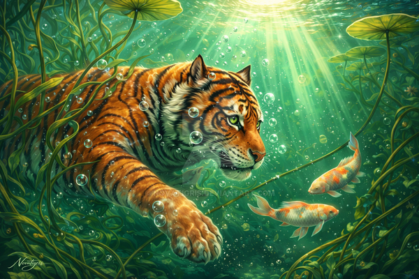
What fantasy artist dosen't have at least one Dragon in their mix. Well here it is. Took some time to figure out how I wanted it but I wrather like the beastie. I even have plans for a few other, cute little dragons. Snow dragonette and a little Royal Crown Dragonette. We'll see.I hope you enjoy him. I uploaded this almost original size so I could have some nice prints available for all you dragon lovers. If you find my work flawed in anyway or have some suggestions to make this one better let me know. This is my first True European dragon.
Related content


Comments: 15


When I look at your artwork, I feel kinda scared. I think your work is about a bad omen.
From a technical view, I think you were very correct. I cannot actually spot any mistakes. I really think your technique is very good (Or I'm sorry that I can't help you improve there e.deviantart.net/emoticons/w/w… " width="15" height="15" alt="
 (Wink)")
Artistically viewed, I cannot say otherwise, either. I can hardly give you any constructive critique, because I think it's almost perfect. you were able to keep a great balance between foreground and background. You were also able to put a lot of feelings in the picture.
Overall, I believe that this is a great artwork e.deviantart.net/emoticons/s/s… " width="15" height="15" alt="
 (Smile)")
👍: 0 ⏩: 1

Thank you so much. Your critique was excellent and I appreciate it very much. I wanted to create that feeling of fear. The bad omen, rising. I wanted it to have that impact and it appears as if I have succeded. Thank you.
👍: 0 ⏩: 1

This is fantastic! the lightning in the background really makes this piece pop! I love it. even the detail of the raindrops hitting the scales looks really really good. Keep up the amazing work!
👍: 0 ⏩: 1
")

Ahh I love how dramatic this piece is, my favorite part is the water dripping down the dragon's scales *o* <3
👍: 0 ⏩: 0


Stunning and breathtaking, i could definitely see this as a scene in a movie or comic with a protagonist fighting this horridly and magestic beast. The coloring and atmosphere are shockingly great and too good for words. You are definitely getting my watch. FAV
👍: 0 ⏩: 0

Great piece
👍: 0 ⏩: 1
Oh thank you very much. It is kind of you to say. I was concerned the eyes would not turn out quite as I had hoped but it appears they have and you noticed. Thank You.
👍: 0 ⏩: 1
Your welcome the glow drawn me to them most but they also look realistic with the shading around the eyelids and such!
👍: 0 ⏩: 1
Thank you. I still think I could have made them a touch more realistic but at this point I am not sure how. The next dragon will hopefully be better.
👍: 0 ⏩: 0

Critique want, critique get. Let me start by saying I think the overall rendering quality here is excellent, and it does look good. You've obviously spent time on this piece, and that shows well. There are, however, quite a few things I think you could improve upon, so let me try and point those out to you!
First and foremost: The lightning arcing with the same curve as the webbing/collar is really rather confusing. It doesn't read very well, and initially almost looks like you forgot part of the head, but left in the highlight. If it's supposed to be very thin webbing (which, judging by the overall anatomy, it is), then I think it would've also helped to leave some light shining through it, and enhance the 'thin' look.
Another issue is with the base of the horns. Since the base area isn't defined very well (you'd expect a highlight near the base of them), it actually looks like they're curving forward with a bit of a fisheye perspective, especially with the horns not being clearly angled backwards. Finally, I'd like to note the facial symmetry. Since he's looking at the camera almost dead-on, it's easy to see. The nostrils, eyes, tip of his lip and teeth are all at a different plane; they're not following the same line. This leads to a slightly distorted look on his face, putting him out of perspective.
That's all I've got for this one, though. It's got lovely textures and a very menacing concept, those few flaws aside, it's a solid piece.
👍: 0 ⏩: 1
Ahh, excellent. I was worried about the facial features sitting right but I didn't want to "copy and past" the other half of the face. I had envisioned it slightly turned away thus the odd perspective of the face but I can see I need to work on that. Overall excellent critiquing and it is most appreciated. Thank you!
👍: 0 ⏩: 0