HOME | DD
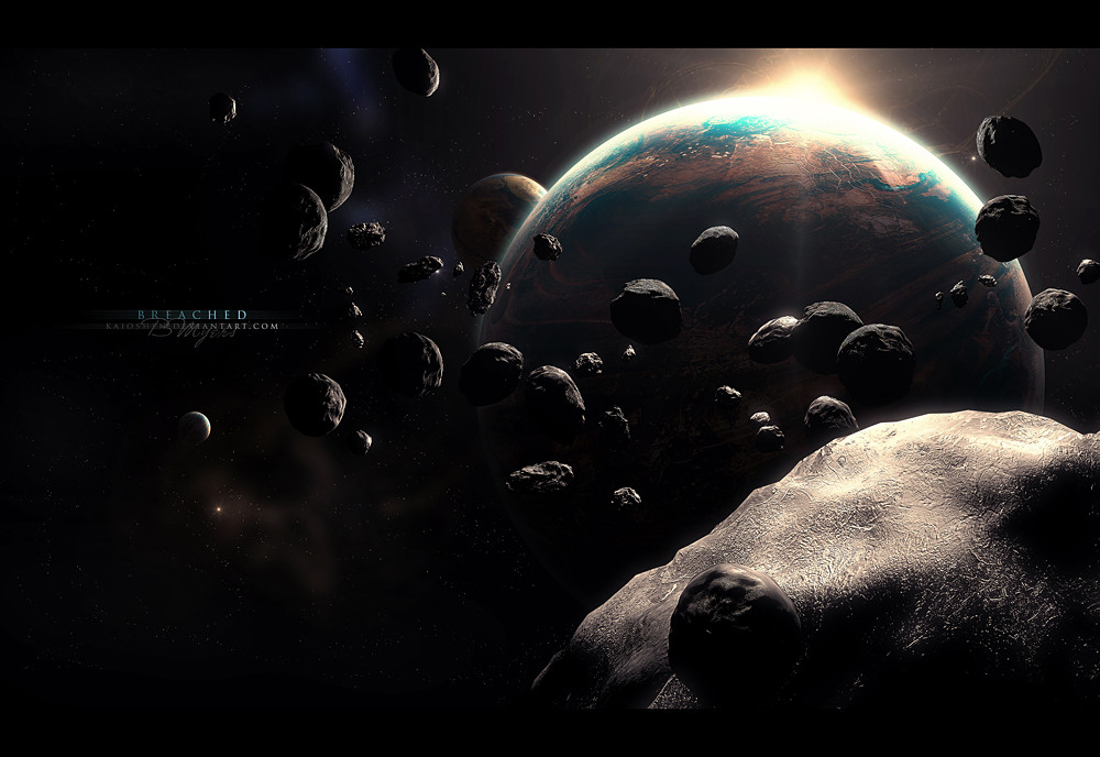
 Kaioshen — Breached
by-nc-nd
Kaioshen — Breached
by-nc-nd
Published: 2007-10-02 18:55:34 +0000 UTC; Views: 2783; Favourites: 47; Downloads: 0
Redirect to original
Description
BreachedTook a small break from this piece over the weekend and now I finished it. I usually don't like to pack my pieces with a lot of stuff, but this one is alright. My inspiration was the Halo 3 main menu music (I don't have the soundtrack yet!
") ). Sorry for the short description this time, don't feel like writing anything real long. :/
). Sorry for the short description this time, don't feel like writing anything real long. :/Enjoy.
")
Edit: I made the asteroids sharper, added another planet, and added a new star field - i'm going for a new look.
 (Wink)")
Related content


Comments: 27

I love the lighting and texturing/colours on the main planet...It looks almost metallic, and the swirls running through it, along with the colours reminds me of that cool effect when oil and rain gather and create shiny effects in puddles.
👍: 0 ⏩: 1

Great one, has a nice lucid yet dreamlike appearance; ethereal sort of lighting, especially with the resplendant interaction of light on the close up asteroid. Lighting and texture are definitely key points of success to this one.
👍: 0 ⏩: 1

hmm this didnt do with the pic that it should have.. its a great piece but there are some issues that can be fixed. I quote: 'the smaller planet behind it has more contrast.. that is weird because he is further away so he should be less saturated and more blend in'. I think you really should do this.. and maybe the astroid is better now but you can paint or use a different texture to add detail and more believability.. now its too soft and smooth (the big astroid in front, the ones further away are good). I still give you props for this piece though
👍: 0 ⏩: 1

I gave the smaller planet less contrast, I guess I should of done it some more :/. As for the smaller asteroid in the foreground, I understand what you mean but that one is apart of the same layer that has the bigger asteroid in it, but i'll try some more.
Thanks for the comment, man
👍: 0 ⏩: 0


Love the near grey-scale of the image and then there's the unexpected bright teal tones where the light hits the planets' oceans.
👍: 0 ⏩: 1


yeah, the lack of sharpness in the asteroids bothers me too. but the planet's are amazing! i love the colors there.
👍: 0 ⏩: 1

Great use of perspective and focus! Nice to see a busier piece of space art, rather than the empty, barron landscapes we usually see.

👍: 0 ⏩: 1

Completely agree with Akajork. Try some texture overlays on your asteroids. That'll make them look wicked cool  (Smile)")
👍: 0 ⏩: 1
I actually toned down the texture, guess now I know to do the opposite... thanks for the comment
👍: 0 ⏩: 0
WOW.. great work dude
👍: 0 ⏩: 1
Thanks for the advice man, i'll edit it some more soon
👍: 0 ⏩: 0