HOME | DD
 kameleon84 — Project Rooftop Invincible Redesign

Published: 2011-11-26 10:11:01 +0000 UTC; Views: 20259; Favourites: 254; Downloads: 0
Redirect to original
Description
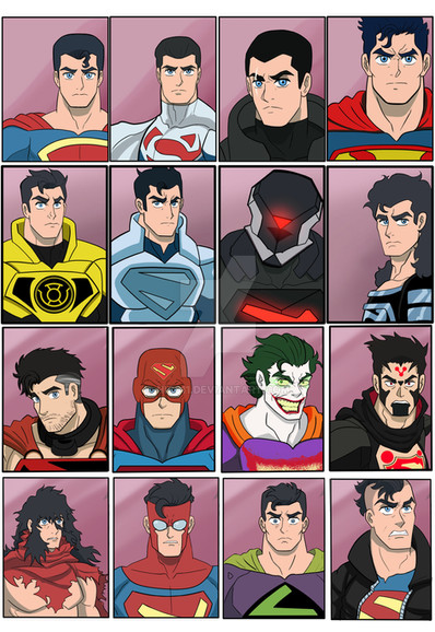
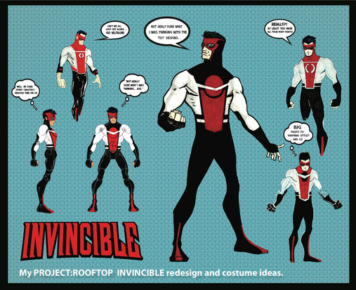
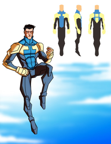
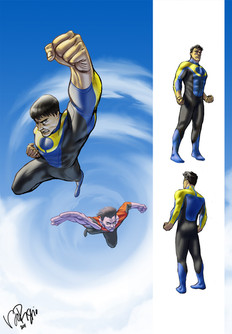
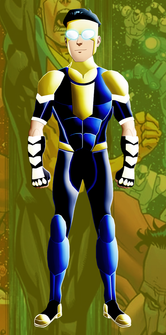
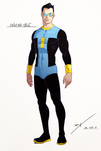
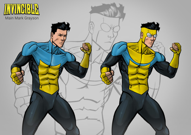
I like redesigns. I always have. I've found a few wesbites that are dedicated to nothing but them. I think redesigns of popular characters helps whenever I'm tryign to design say my own character. Like say Kameleon, Kameleon is very similar to Spider-Man (there I admitted it) so I'll google "Spider-Man redesign" and it always helps.Project Rooftop not only displays redesigns but you win prizes for the best design. What you're looking at here is my attempt at a redesign of Invincible.
[link]
There's not a lot more to say that I haven't said on the piece anyway but I'm looking forward to the results whenever they get announced. And best of all, the judges are Cory Walker and which should be awesome.
Invincible and related characters copyrighted to Robert Kirkman.
Like Ottley, I done a Issue One homage and drew my own redesign over the initial pose. Not really neccessary for the competition but fun to do.
Related content
Comments: 32

👍: 0 ⏩: 0

Dude the owners of invincible need to either hire you or at least but these costumes from you.! I mean wow.
Very ultimate universe feel. They don't even have to doa reboot like dc, they should just write up a reason and switch to these.
👍: 0 ⏩: 1

As much as I'd love that, these designs work for me because it ties into the origin of the suit, i.e. it's a Viltrumite suit which has been coloured to suit a costume look. In the comics, it's pretty much just a costume. A man can dream though...
👍: 0 ⏩: 0

Thanks very much. Shame Project Rooftop didn't think so. Didn't even get a mention on there
👍: 0 ⏩: 0

You should email this to the Invincible comic writters.
👍: 0 ⏩: 0

Looks pretty cool! I like the idea of the similarities in the suits.
👍: 0 ⏩: 0

Great continuity across the costumes, and the variations really sell each character as his own different superhero. It's a little 90s, but that certainly isn't a bad thing for me.
I do have a couple of concerns regarding the actual contest, though: first off, I think it's actually in the rules to not include the character's name in the illustration, but it's not clear if they sometimes choose to overlook it. Second, we have no indication of what the back of the costume looks like, and third, in my experience the judges tend to shy away from costumes that seem a little "busy" visually.
But for the last, quite frankly, I think the style points clearly outweigh the busy-ness. Great job!
👍: 0 ⏩: 1

I was going for a more..."ultimate" design I suppose. I was thinking about practicality and neccessity. It seemed to tie in a little with DC's reboot with Superman as well. I thought about giving Omni-Man a spacesuit which I imagined which be made of extreme durable Viltrumite material thus doesn't damage as easily. I even had it in my head that Art would study the material and manage to replicate it to create the other versions of the suit. So initially I started just trying to create a spacesuit looking costume nthat resumebled the original in some way. I have heard alot of people saying DC's rebooted costumes come off very 90's so I guess it'd make sense mine's does to.
I re-read the rules about the name. There have been others who have included the name somewhere on their piece. I THINK it's a suggestion rather than a rule but I've meailed them this morning just incase. If the name is a problem I can just crop the image so just focus on the central four figures. Likewise, having more than one viewpoint of the suit is a suggestion but I do kind of wish I'd put at least one in now. Maybe I'll do that just for the folks at Deviant
👍: 0 ⏩: 1

Hey, so much the better if it's not a problem with the P:R crew, right?
👍: 0 ⏩: 1

Exactly. The only issue id the lack of reply. They do so they won't reply to acknowledge your entry so who knows if/when they'll say about the question
👍: 0 ⏩: 0

Awesome! Great lines in all costumes. Good luck in the contest!
👍: 0 ⏩: 1

Thanks very much, buddy. There's some stuff competition from what I've saw so I'm not putting my hopes up this time
👍: 0 ⏩: 0

Same to you, buddy. Just checked yours out there. I wanted to add a hood to mine for awhile as well but it went against the theme I had with everyone wearing the same suit.
👍: 0 ⏩: 1

I feel ya on the hood, I think you made the right choice though, because it's looks pro with em all wearing the similar suits.
👍: 0 ⏩: 1

Thanks for the kind words amigo.
👍: 0 ⏩: 0

The centre circle is the dot and the stomach area is the line.
Sweet. Good luck amigo.
👍: 0 ⏩: 0

Is it coming across black? Bugger. Was aiming for the sane colouring the Viltrumites have already. They're basically all the sane suit whichs what I like about them. The boots and the circle on the chest are basically all that make them different. And the colouring of course
👍: 0 ⏩: 1

Really? The Viltrumites are dressed in white and grey. They almost look like futuristic dentists.
👍: 0 ⏩: 1

I think my use of shadowing even before colour that makes it look darker. But I did use white and grey
👍: 0 ⏩: 0
