HOME | DD
 kasai — Floating Metropolis - enviro 6
Published: 2009-04-04 04:26:26 +0000 UTC; Views: 34353; Favourites: 1529; Downloads: 1525
Redirect to original
Description
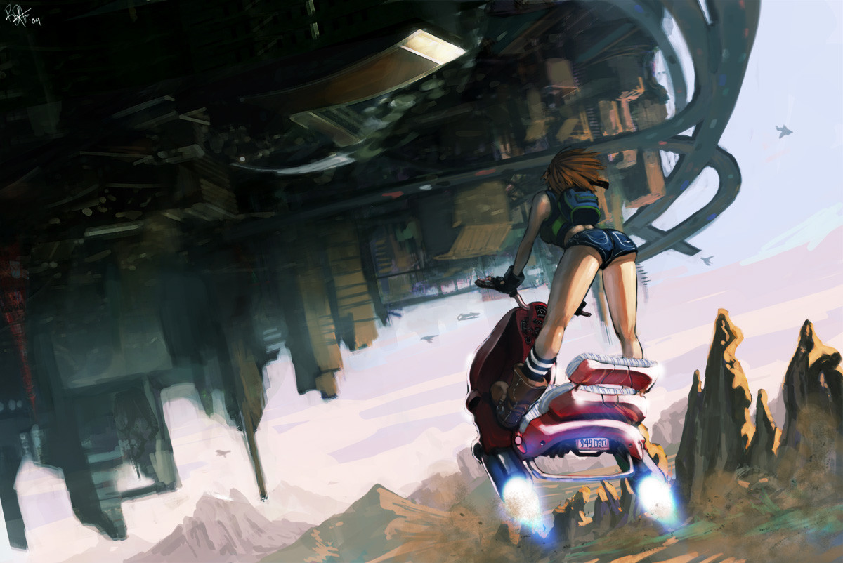
Finished. I'm not entirely satisfied with this piece but what Im satisfied with is that I finished it. I sometimes leave too many unfinished drawings and/or cg paintings around. Its a really bad habit I need to kick. Once you finish something you are able to reflect on what was done and I think that's very important.Things have gotten quite busy so this might be the last weekly enviro.
Related content


Comments: 82


 (Smile)")


hey its brown haired equaled yoko from gurren lagann, sorry i
couldn't resist thid reference...
👍: 0 ⏩: 0

loving this so much! your are an amazing artist!
👍: 0 ⏩: 0


Even if you weren't totally satisfied with this, it's turned out amazing and I'm glad we get the chance to see it.
Stunning picture, theres an almost cinematic feel about it, great concept and amazing work!
👍: 0 ⏩: 0

I must have missed you uploading this piece.
Like what you did with this, cool hover bike and the angle its shot from is real cool depicting such a floating fortress city. would like to see a piece from when she actually reaches up there.
nice stuff man.
👍: 0 ⏩: 0

I understand how you feel. I have so many sketches I scraped mid way through I just couldn't do it. Keep drawing, you have a really great gallery ")
👍: 0 ⏩: 0


It still has great detail anyways I really like it its like seeing a clip of hit movie.^o^
👍: 0 ⏩: 0


Ok I see something I something small. Just her right arm would seem to be lower to where the steering handle is. So maybe the right arm is a bit longer even know you can't really see it. but Fam this is really awesome man! sick yo!
👍: 0 ⏩: 0
Dude this is what I'm talking about love the concept! I got to look at it more for some critiquing but this is sweet!
👍: 0 ⏩: 0


Well I think it came out great. Looks like a painting.
👍: 0 ⏩: 0


looks nice. great color. girl's pose is great. i enjoy it.
👍: 0 ⏩: 0


another sick piece, love the perspective on this one. great job
👍: 0 ⏩: 0

I can't believe how amazing this is. The idea is pretty awesome, but this is honestly the most impressive drawing anyone could ever make of this concept.
👍: 0 ⏩: 0

gorgeous. It could stand for a little more polishing but if it was left like this, I could never complain!
👍: 0 ⏩: 0

First off I would like to say that it's certainly not a rushed piece and I would definitely consider this better anything I've ever done.
The composition is very effective, it seems clear enough that the girl on hover-bike is main focus of this painting. I know it was the first thing MY eye was drawn too. But I was also drawn to the tiny little details as well. The cars on the highway, which appear as mere dots, really gives the viewer an idea of how huge this thing really is.
The only problem that I think I had with this, and it's not a major problem, are the the far away objects in the sky which I'm assuming are supposed to be airships. Given the setting it wouldn't be unusual to consider those objects airships, but I found it was easy to mistake some of them for birds or something. What I'm saying is, if you want to give people the idea that there are airships floating around out there, there is more you can do to suggest to us that those are definitely what we think they are.
But again it is such a minor issue, I almost wasn't going to mention it because it seemed a lot like knit-picking to me. Don't get me wrong though, those details don't take away from the effect of the image, but they also seem so small that you could have done without them.
Besides this painting seems to be mostly about the character on the hover-bike. Otherwise I think this brilliant, the idea is clear, and I really can't find any real faults within it. I'm curious as to why you aren't satisfied with it, but at the same time I realize it's probably natural for any artist to never fully be satisfied and to want to improve their work.
Again this is a brilliant piece, I admire your style.
👍: 0 ⏩: 0

Excellent! Wonderful re-imagining of the tried-and-true floating city concept. Gives me tons of ideas. Two thumbs up!
👍: 0 ⏩: 0


Thanks man!
Keep spreading the inspiration dude. I keep getting power from your work
👍: 0 ⏩: 1


I like the character and the hover-jet thing she's riding. Nice details on this, too. Keep it up.
👍: 0 ⏩: 0


That is some creative stuff right there. Awesome job!
👍: 0 ⏩: 0


I like the concept and the overall painting. It's hot, I could tell from the thumbnail already, hehe. Two major things are bugging me though. First, it seems as though her right leg/foot would land a bit far away from the scooter in comparison to the left. Or the front of the scooter isn't on the same midpoint as the back. Or the high point of the pelvic-box thing is on the right while the knee is higher on the left and the right arm seems hard to land on the handle. I'm not really sure, just know that the perspective of the figure doesn't match the bike. Second, the shiny thing disturbs the visual hierarchy for me. I think the composition/light dark pattern of the picture is strong enough on its own to not need an obvious "let me put the viewer's eye here" object. Besides, its so close to the top of the page. (I'm thinking rule of 3rds.) One minor thing is the tangent on the left foot to the back of the bike. =/
I feel ya on not finishing things. It really is difficult to find that motivation unless you got a deadline and someone's paying you, and it really is like taking the hard road. Usually for me its because its painfully obvious where my mistakes are coming from and every brush stroke seems like a putting a bandaid on a surgery. Sorry I must sound like a pessimist. Anyway I hope you find satisfaction in your future paintings, and for sure keep having fun doing them.
Nice work.
👍: 0 ⏩: 1
I see what you mean about the leg. Needs to be brought in to the left more. I totally eyeballed the perspective with the bike and the girl which was a horrible choice on my part. And Arrrggh! the tangents! Thanks Tre, I appreciate the time spent for this crit. I'll have to keep these points in mind for the next.
I feel you on that one, every stroke becoming like a bandaid. Lately I find keeping positive outlook even when its seems to go downhill helps me get through it. When I hit a roadblock, I'll check refs or other artist works to hopefully pull back on track. May not come out great, but at least I will have learned something...I hope.
👍: 0 ⏩: 0
| Next =>