HOME | DD
 Katt1989 — .Test.Shot.
Published: 2007-01-15 10:23:36 +0000 UTC; Views: 328; Favourites: 11; Downloads: 4
Redirect to original
Description
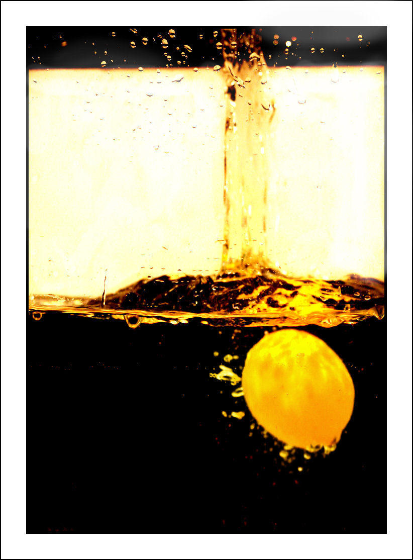
This is one of the many test shots ive done for my new photography college project... I dont think it is anywhere near a final piece - So i am adding it to deviantart just for advanced critique to help me improve this... any technical help would be appreciated.Edit: Done alot of work in photoshop and i think it looks alot better, opinions please.
Oh Photoshop I havnt changed alot - All I have done is up the contrast alot and done a fair amount of dodging on the background to make it white. =]
Related content


Comments: 35

Just showing my continued support by refaving on new account
👍: 0 ⏩: 1

Ahhh I take back part of my comment on the BnW lemon- I really like this with the colour. ^_^
👍: 0 ⏩: 1

this is a great shot..i think that the whole yellow bit might be a little...overwhelming though.
👍: 0 ⏩: 1


Wow this looks really good. I've never seen anything like it. It is sort of "too yellow" but overall it's good
👍: 0 ⏩: 1

Yer I still have alot of work to do.
Thanks =]
👍: 0 ⏩: 0

great splash and i like the contrast as well as the colors
👍: 0 ⏩: 1

Advance critique, hmm, the only thing i can point out is that the "Yellow thing" is nice, but the background may be to bright. It is really a nifty contrast from black to white/yellow/really bright.
👍: 0 ⏩: 1

great shot has a nice feel to it. i like the way it feels personally. sorry i dont have much of a critique right now just alot going on.
👍: 0 ⏩: 1

I really like it better now. I agree that the orginial was a terrific concept, but now that you have played with it in photoshop, the real beauty of it is coming out. I love the contrast and the colors.
And I can understand the black on top might be a distraction, but it isn't for me. I think it adds to the photo.
👍: 0 ⏩: 1

i like it a lot, did you put a piece of glass up in front of the cam or is it in a glass? this is great in full view!!!
👍: 0 ⏩: 1
Its taken in a fishtank. =]
Thanks =]
👍: 0 ⏩: 0


I don't know much about photography, but I must admit, all the technical stuff I know looks good in this picture, and admittedly it is really cool looking!
👍: 0 ⏩: 1


I really like it like this. The original was a good concept, but with these effects it becomes more abstract and I like it a bit better that way. The black water looks really neat, and the yellow colors are a cool touch as well.
I don't know if it would be an improvement, but see how it looks if you crop off the top bit (the little strand of dark in the background). Like I said, it might not make it better but it might give the white/black more power.
👍: 0 ⏩: 2

I agree with the cropping of the dark part at the top. If you scroll the page down slightly so you can't see the top, you can see the improvement.
👍: 0 ⏩: 0

You study photography at college ?
Omg,that must be so cool !
I think the photo is very nice,maybe you can play a little with the color in Photoshop and a little more blue maybe will be good,but i don't know .
Amazing photo,adding to faves  (Smile)")
👍: 0 ⏩: 1
Thank you... I have edited it alot on photoshop - do you think it is an improvement?
👍: 0 ⏩: 1
A big improvement if you ask me ^^ !
Good job :] .
👍: 0 ⏩: 1