HOME | DD
 kefkafloyd — Twilight Sparkle Color Guide 2.0 [UPDATED]

Published: 2011-03-03 03:26:31 +0000 UTC; Views: 79732; Favourites: 608; Downloads: 6867
Redirect to original
Description
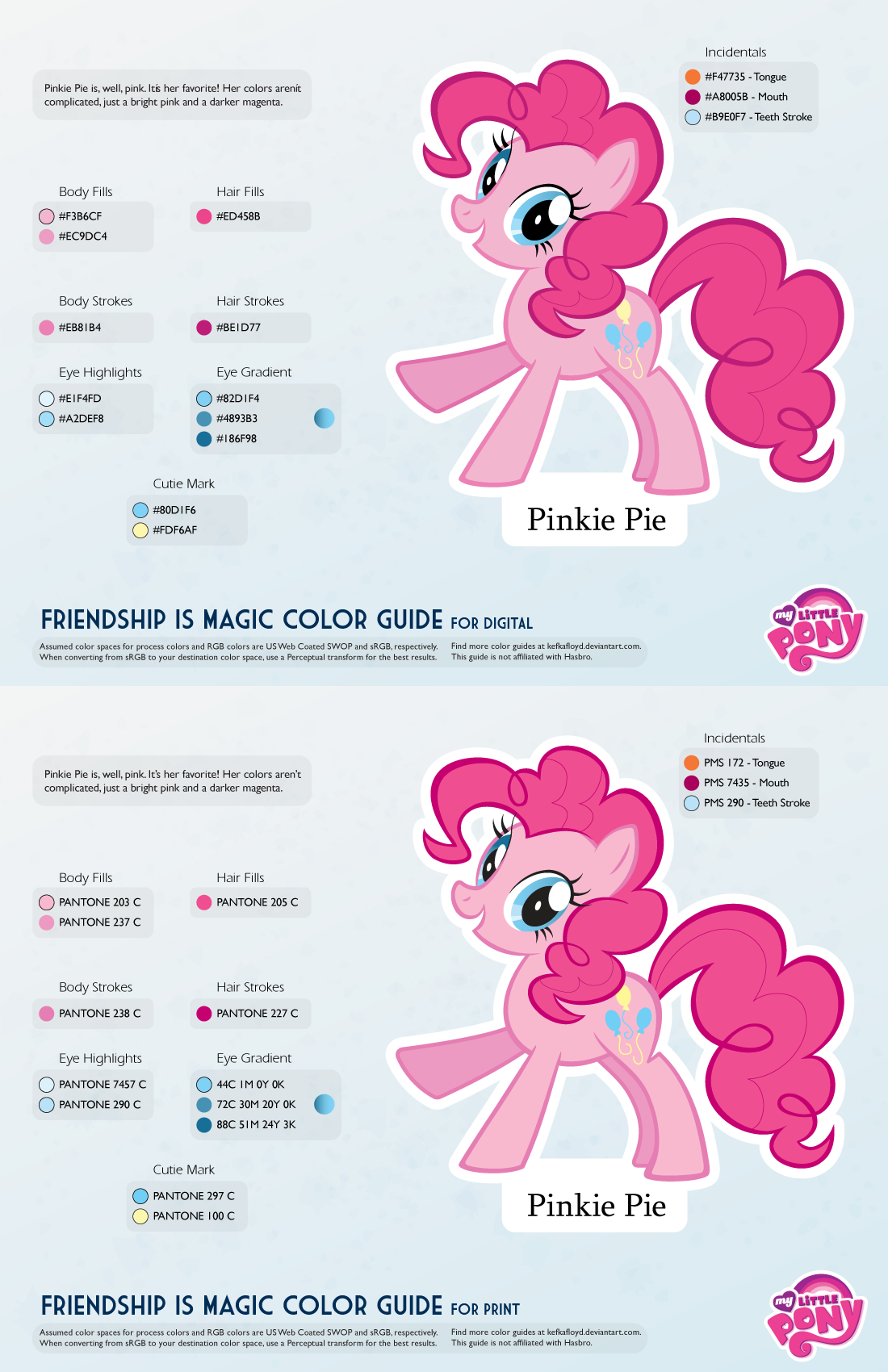
New and improved!All of the color guides are getting a revamp, and Twilight is the first to go. The guides are all now two pages, one for digital applications (such as vectors, painting in Photoshop, 3D modeling, etc) and the other for print applications (customs, merch, T-shirts, et cetera). The PNG preview for the digital guide should be OK to use as well, so the PDF is optional.
If you use Google Chrome or Safari, they will attempt to open the file in-line with Google Docs PDF viewer. DO NOT EYEDROP THOSE COLORS. SAVE THE PDF FILE. The Google Docs viewer displays in a very low bit depth that results in dithering of the colors. Until Deviantart gives me a way to disable this, you should use the download file link to view the guide!
They are also now more space efficient, and will be able to scale better with ponies that have more colors than normal.
The Digital guides aim to be as close to the show as possible, while the print guides aim to be as close to official merch as possible. When there's no merch of that pony (e.g. background ponies) then the print colors will be based on my conversions which will aim to reproduce the show without looking too weird or have obvious gamut problems.
It is safe to eyedrop the digital colors or use the hex/RGB codes - the swatches should match up just fine. Just make sure you're working in sRGB color mode.
For the merch guides, the spot colors are rendered using CMYK alternate color space. This is based on my own examinations of the merch boxes, where the spot colors are simulated straight to process anyway.
Related content


Comments: 90

i mean, in the pantone codes, they are listed as pantone 205c (Body strokes and Cutie Mark)
👍: 0 ⏩: 1
Thank you, and great guides btw ><
👍: 0 ⏩: 0

I know only 2 of the mane 6 are unicorns but do you happen to have a color guide of Twilight's magic when she uses it? (like when she uses magic to levitate an item)
👍: 0 ⏩: 1

The magic color is the same color as the pinkish purple on her cutie mark.
👍: 0 ⏩: 1

What about for her eyelid, like when she's frowning or blinking etc?
👍: 0 ⏩: 1
Use the same color as the body fill shadow.
👍: 0 ⏩: 0

I wonder if you could add a color guide for traditional painting. I had trouble figuring out how to mix paint to match Twilight's mane color. I tried purple and black. Pink and purple. Anyway, just a idea.
👍: 0 ⏩: 1
Due to the bajillion different kinds of paint systems, that would probably be impossible. Sorry!
👍: 0 ⏩: 0

Just to be sure I've got this straight, the top one's the digital and the bottom's print, yes?
👍: 0 ⏩: 1
They're labeled; look at the "Friendship is magic color guide" line at the bottom of each page. At the end of the line it says what version it is.
But yes, digital is on top, print is on bottom.
👍: 0 ⏩: 2
Now, I like how you included the "incidental" colors such as tongue, mouth and teeth stroke. You didn't have those in your previous color guides, and I had to go look up screenshots for reference on those colors. So thanks for that too.
👍: 0 ⏩: 0
Haha actually, right after I'd asked, I went back and double-checked, thinking "Surely this man is considerate enough to label which guide is which." I was right, and I found it. Then I thought, "Oh, now I'm going to feel stupid when he answers."

👍: 0 ⏩: 0

Thank you for the update! It’s much more handy when colors represented in hex.
👍: 0 ⏩: 0

Awesome! However, I feel that the body shade might be a little too greyish, so I used:
R - 204
G - 129
B - 222
Otherwise, Very good!
👍: 0 ⏩: 1


Thank you so very much for this! I'm making some art of the mane six and your palettes sure do help!  (Smile)")
👍: 0 ⏩: 1
You're welcome. Remember, these are just guides - use them to help spur your imagination!
👍: 0 ⏩: 0

Found a typo. I believe the first pantone given for the hair is supposed to be PANTONE 5265 C.
I think you switched the 6 and 2.
PANTONE 5625 C is some kind of green-ish gray.
👍: 0 ⏩: 1
I swore I had fixed this typographical error, as my latest version on my storage has the typo fixed. I will try reuploading it again. I blame deviantart.
👍: 0 ⏩: 1
No problem. Happened to me quite often that I uploaded some updated image but the deviation didn't undergo the change. Yes, blame dA. xD
👍: 0 ⏩: 0

could you repost this without the overlay? it makes it harder to get the colors.
👍: 0 ⏩: 1
That's the point. Download the PDF file by clicking the download button.
👍: 0 ⏩: 1

I totally used this guide for the Twilight Sparkle desktop background I made: [link]
Thank you for compiling it! You saved me a lot of time trying to figure this out myself.
👍: 0 ⏩: 1
Always glad to be of assistance!
👍: 0 ⏩: 0

Are you sure this is entirely accurate? sorry I'm just OCD and ive been working on a Twilight for a while and i found this for colors and I was elated, but the coloring just seems a little off for certain things, like I love the hair hightlight colors but the main hair color seems off, and same with the body fill
👍: 0 ⏩: 1
It depends on your definition of "correct."
The colors in certain guides (the mane 6, Princess C, Scoots, Applebloom) were taken from official Hasbro artwork with little to no reverse engineering. Most of them are spot colors which may have varying appearance across different color spaces when simulated.
They are also more optimized for printing, and the colors you see on TV are "juiced" a bit - that is, there's more contrast and saturation applied. They might also be better tweaked to fit in the NTSC gamut.
In the end, there's always going to be a bit of variance due to artistic choice and limitations of production mediums. If you picked up a box for a Twilight Sparkle toy, the colors in this guide should match that box.
I'm sure the color artists on the show and the people who make the merch have had these same kinds of discussion, and I wish I could get some insight from some of them, but I doubt they'd be willing to give out their craft so easily. Ultimately, only they are the ones who can talk about "correct" color, and even then I bet they'd be giving you the same caveats that I'm mentioning.
I also did this more for people who were trying to do things outside of Photoshop. The entire reason I put all these together was because someone wanted to paint a motorcycle Rainbow Dash colors, but all the colors available at the time were crap. RGB colors also mean squat to a paint mixer. Anyone can put together a list of hex codes, but if you wanted to color coordinate a room to T-Sparks, you could take this list of colors to a paint mixer that made paints based on Pantones and you'd get a nice set with almost zero effort and a minimal drift.
👍: 0 ⏩: 0

That first colour you have listed there, 5625, I think should be 5265.
👍: 0 ⏩: 1
Yes, this is a mistake, I'll fix it.
👍: 0 ⏩: 0

You made a mistake on one of the Hair Fills. PANTONE 5625 C should be PANTONE 5265 C. I was trying to make a vector of Twilight and I realized this when I was looking for the color.
Besides that, this guide is very helpful. Thanks for sharing it! ^-^
👍: 0 ⏩: 1
Ah, lovely typographical errors. I'll fix it. Thanks for the heads up. The actual swatch should be the correct color, though.
👍: 0 ⏩: 1
Yeah, it is. Don't worry 'bout it.
By the way, do you have any tips on making vector art? I feel like the way I do it is wrong and weird. I trace the outlines and body color separately, and I trace the eye elements all separately. If I continue doing it like this, I feel like my vectors aren't perfect...
👍: 0 ⏩: 1
I'm going to put a sped up version of how I made the Scootaloo poster up. The gist is that you're making shapes. It takes a lot of practice to be "good" at getting those shapes right quickly. Use the minimum number of anchor points necessary and make your beziers do all the work.
If you look at the Scootaloo poster or the Twilight Sparkle poster, most of those were drawn with the brush tool and then tweaked quite a bit with the pen and modify tools. I'd suggest picking up a book like Real World Illustrator, it's very good at learning all of the tricks on how to use the tools.
👍: 0 ⏩: 1

Thanks for sharing! These are awesome!
👍: 0 ⏩: 0