HOME | DD
 KenjisArtDump — Tangled

Published: 2014-07-07 18:52:05 +0000 UTC; Views: 2632; Favourites: 143; Downloads: 35
Redirect to original
Description
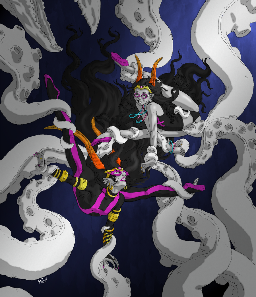
Another commission from Sudrien , this time with Gl'bgolyb "playing" with Feferi and the Condesce by twisting them into bizarre contortion poses.Not much to say about this piece, really. The basic composition is good, I think, but colouring remains my weakest suit.
EDIT: Obligatory inks post here .
Homestuck © Andrew Hussie
Date of completion: July 7th, 2014
Related content
Comments: 17

Wow. . .Fef is so flexible 0_0, oh and nice job btw ; o)
👍: 0 ⏩: 0

This looks very suggestive, I don't mean to put it that way it just has that vibe.
👍: 0 ⏩: 1

I can understand some people seeing anything with tentacles of any sort as erotically 'suggestive'. But with what I've seen artists do with 'tentacles'...
There is a lot of care here not to even be suggestive, given the subject.
It's more like playing with those little 1990s Polly Pocket dolls .
👍: 0 ⏩: 1

Seeing as how Feferi's expression is not of horror, I can see what you're saying.
Also how old are you to still know of classic Polly locket? Never mind
I see the care that was put into here, thanks to you pointing it out, if their expressions were different, then you and I were going to have a different conversation.
But I see what you mean.
👍: 0 ⏩: 1

Old enough to be able to afford this. Otherwise your guesses will probably be in the right range.
The intent with The Condesce was annoyance - another day that little shrimp gets to live - and resignation. It's not that this would be a new experiece - just a long time since she would have went through this stretching.
👍: 0 ⏩: 1

I clearly see the Condesce's expression as annoyance, like she really doesn't want to be there
👍: 0 ⏩: 0

lol Feferi okay with it, but I'm not sure if the Condence is...
👍: 0 ⏩: 0

Thank you, again, for your work.
...I'm afraid the setting I gave didn't exactly give you the context for the colloring to shine - all the black, blue, and white - considering that, I'm quite happy with your coloring job.
👍: 0 ⏩: 1

Well, I'm in no way pretending that this is an example of my best work. I also think that while the composition was okay in terms of sketching, I would have probably gone with something different had I given greater consideration to the colouring scheme beforehand. In light of this, if you have any throwaway request for a quick unpolished sketch from me in the near future I'll be glad to work on it free of charge.
👍: 0 ⏩: 0

Ouch that looks like it hurts! Then again it's really great and the anatomy looks spot on!
👍: 0 ⏩: 1

Sudrien always asks for contortion pictures. With the number of pieces he commissions from people, I think by now the Homestuck characters have gotten enough practice for it not to hurt.
👍: 0 ⏩: 2

80% isn't always
...just usually
👍: 0 ⏩: 1

Usually = always.
Ask any political poll maker.
👍: 0 ⏩: 0

That's true, I imagine them to be very flexible.
👍: 0 ⏩: 0

this is lovely! the composition is great and the lineart is really good quality. for your coloring, try shading with different hues and colors, and adding more hues to the background. you dont have to stick with saturation from the same blue- have some aqua near the top, royal blue down below, maybe some greens or violets, and since theyre underwater, maybe shading with a bluegreen tint instead of simply with darker shades of the base colors or black will bring a lot more life and color variation to it. ive found that adding an overlay layer over the whole of the picture in a specific color (or a few colors, sometimes) will also bring the colors all together! n vn
👍: 0 ⏩: 1

Thanks for the in-depth analysis. I'll try to keep all of it in mind next time I attempt something like this.
👍: 0 ⏩: 1


